Hands down, my favorite magazine in the whole world is COLORS. In my opinion, there isn’t another magazine that can combine captivating photography, expertly-crafted infographics, and written journalism in the same way with the same ‘in-your-face’ kind of attitude.
From their website:
“Established in 1991, under the editorship of Oliviero Toscani and Tibor Kalman, driven by the belief that diversity is positive and all cultures have equal value, COLORS is a quarterly magazine sold internationally and published in six bilingual editions (English + Italian, French, Spanish, Korean, Chinese and Portuguese).
Pictures are the prime expressive medium in COLORS: a method of communication that is universal and reaches the greatest possible number of people with a strong, immediate impact. The stories often have rich infographics and alternative story forms along with them. Using this visual language, the themes in COLORS range from the challengingly serious, such as environmental issues, conflicts across the world, or the fight against AIDS, to lighter topics such as shopping, fashion, toys and collectors – always viewed with a non-conventional eye.”
Visually Expressive, Heavily Topical
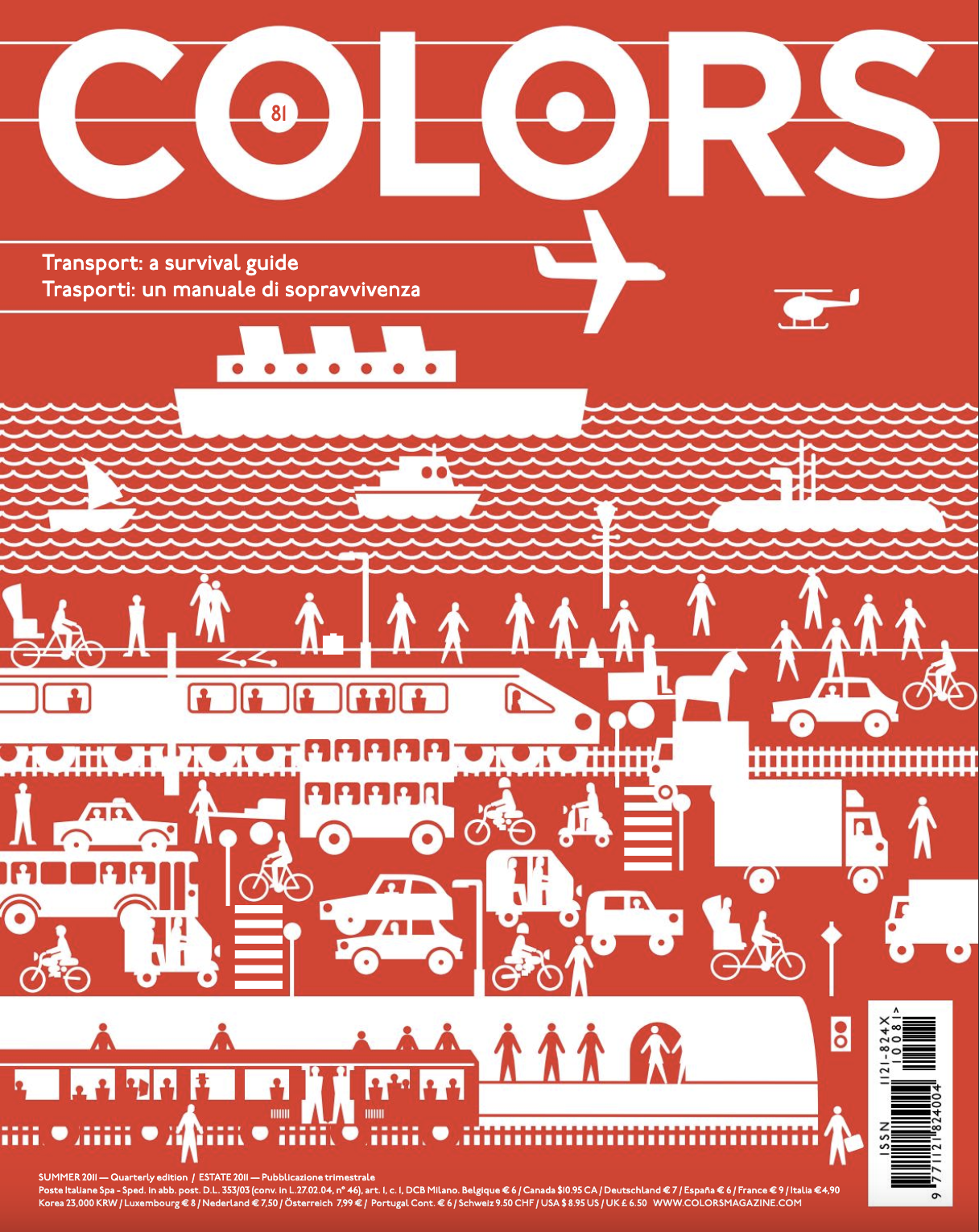
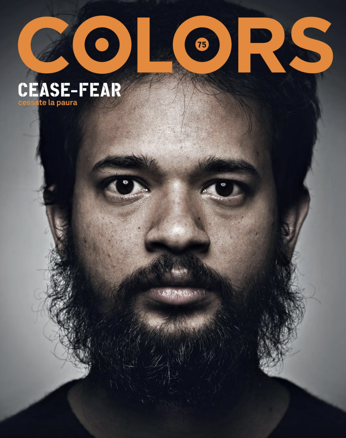
COLORS functions almost like a zine in that it is highly expressive visually and heavily topical in its subject matter. Each edition of the magazine focuses on a single broad idea that all the content is related to. Some are relatively normal—money, happiness, violence, teenagers, energy, travel, water—while other topics are more unique or even strange—collectors, drugs, the apocalypse.
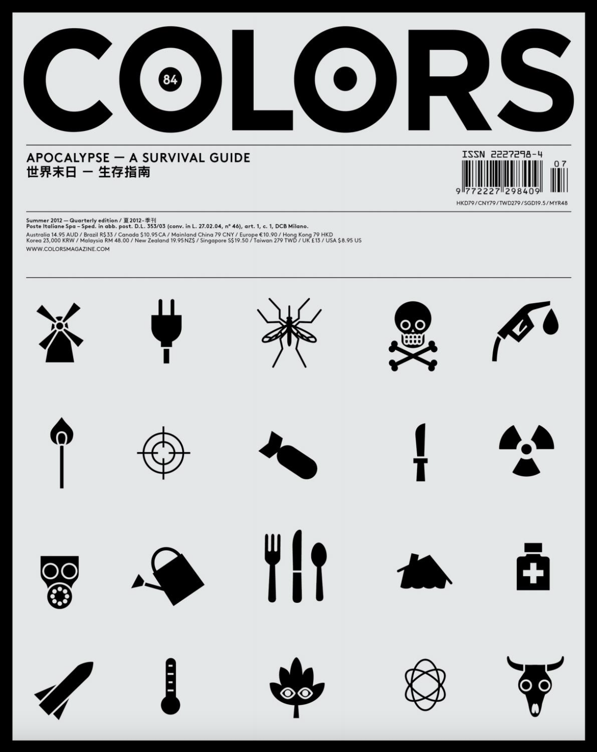
I mentioned it above, but it bears saying again how amazing the images and graphics are in this magazine. The publishers have a knack for pairing the most gripping and interesting imagery with heavily fact-laden and poignant text. And the fact that it is designed for two languages can make for some very interesting design choices. It’s very aspirational. It feels like they are speaking to a much wider audience. Even the paper it is printed on is non-glossy, which makes it feel more approachable and egalitarian. I feel like each issue really shows how powerful visual journalism can be. That’s why I want to share it with you all.
COLORS is actually pretty hard to find if you don’t subscribe to it. I have a bunch of hard copy issues myself which you can look at in class or if you stop by my office. But as part of a design seminar a few years ago, I was able to get access to some PDF versions that I will share with you below.
COLORS – Issue #86 Making the News (PDF)
COLORS – Issue #87 Looking at Art (PDF)