Use Grids to Organize
As with the placement of advertisements and editorial content on left or right pages, the consistency of a magazine’s layout makes it easier for the reader to consume information.
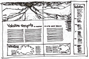
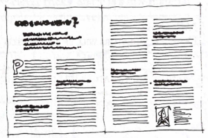
To build and maintain a sense of uniformity and consistency in our magazine layouts, we will use column grids. Please refer to our course curriculum page on Grids for a refresher.
Dividing the Space
Dividing our blank page into a grid of columns of equal width results in a standardized look because its own simplicity encourages standardized thinking. But we achieve variety in how our page elements—text boxes, photos, graphics, etc.—conform to the grid we set.
Elements of different type sizes and column widths create a functional variety in our layouts that help guide a reader toward understanding the content. Larger text is assumed to be more important and timely than smaller type and should be read first. Big type in wide columns is right for headline and/or pronouncements. Tiny type in narrow columns is right for informal bits and pieces of information.
You can combine elements of various column widths on the same page or even within the same story. But it depends on what you are saying and how “loud” you want it to be.
Getting Readers to Read
Magazine design is all about how to turn skimmers into readers. We have to use a bit of psychology to get readers to consume the content. We want to consider:
- Habit – What are readers accustomed to?
- Expectations – What is normal or abnormal to readers?
- Curiosity – What will either startle or fascinate readers?
We have touched on this topic earlier in the semester, but now we will fully explore the concept of Display elements. Display elements are all of the visual elements we will use to make readers stop, look, and listen. The addition of display is what transforms a simple collection of words into something that feels magnetic and inviting to readers.
The most effective display elements are those that are the most meaningful to the individual reader. In order to get anyone to read the content of your magazine, you have to get them excited about how the content relates to them personally. To attract a reader, your content should be able to answer the following: “What is in it for me?” or “How does it affect my life?” If a reader believes they will benefit in some way from consuming your content, they will do it.
Keep in mind that benefiting the reader can come in many forms. It doesn’t always have to be tangible. Sometimes well-presented, easily-consumable storytelling is enough to benefit people by simply helping them feel connected to the larger world that they live in. Teaching a reader something that they didn’t know before is always beneficial, but it is always better if the content also presents options for how readers can take further concrete actions to learn more about the topic or get involved in a cause.
Tips to Help Readers
- Images create emotion and curiosity in readers. Make them BIG.
- Put photos above headlines. Readers will view them as a twinned unit of information. This is good.
- Put the photo caption under the photo, never make a reader look for it. Never run a photo without a caption.
- Every page should have a welcoming entry point for readers
- Readers prefer clusters of shorter text/information elements rather than long essays when it comes to content. They will be more likely to take “bites” rather than eat the whole meal.
- Speed is of the essence.
- Someone skimming the story should be able to get what it is about just from the headline, the secondary headline, and any subheads that exist.
- Never assume that readers understand a topic. We need to think like readers to make sure someone who knows nothing about the topic can still understand and consume the content.


