Design is about finding solutions to the problems we face. In the realm of media design, that means figuring out the best way to direct users’ attention toward the things you want them to read or look at in order to communicate your message or tell your story.
For the purposes of this course, think of it this way:
THE PROBLEM: What is the most effective way to direct users’ attention to the information we are presenting in the order we want them to receive it?
Our main tools as visual communicators are imagery and text. Both photos and videos are included along with infographics and illustrations under the umbrella term “imagery.”
In regards to video/animation/motion graphics, remember that we rarely consume any type of “moving” media in isolation. Media players tend to be embedded within a website or app as part of an intentionally-designed experience—e.g. “Powering A Nation” or YouTube. So we, as designers, must learn how to present these types of content even if we aren’t directly involved in the creation of the media they are presenting.
When you combine images and text together in a thoughtful and intentional way, it is called a layout. In order to direct our users’ attention, we need to learn the four principles required to create purposeful layouts that will help organize our elements and let our readers know what is important, what is grouped together, what to expect, etc.
The P.A.R.C. System
There are four things to consider when building a layout, no matter what medium. They are—Proximity, Arrangement, Repetition, and Contrast.
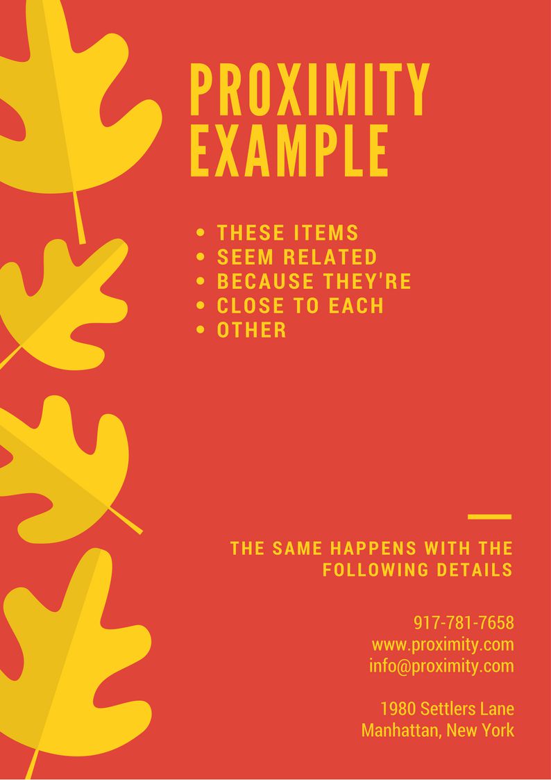
- Proximity – Text and images that are related should be placed near each other.
- Arrangement – Information should be arranged so that it can be easily consumed.
- Repetition – Repetition can let users know objects are similar.
- Contrast – Emphasizing certain elements or to show importance.
Learning to use these four techniques will ensure orderly, easy-to-understand, and functional layouts.
But remember, we are aiming for something more than that.
We want to transcend the act of simply informing our users. We want to also create delight and add meaning to their lives. We will do that by elevating our layouts to the level of artful compositions. We will do that by expanding our knowledge of Contrast and how to use it to direct users’ attention where we want it to go.
Building Striking Compositions
I know you must have heard the term “composition” before, most likely in a musical context. That example can be useful to us when we think about how we can use the elements of design to guide a user through a visual composition.
A classical music composer, for example, writes a piece of music and then has to decide which instruments in the orchestra should play which parts. They have to decide when the flutes come in, when there is a trumpet solo, when the cymbals should crash, etc. Part of creating the composition requires deciding when certain instruments need to be loud as opposed to quiet. This variation in “loudness” between elements is called dynamics. Dynamics offer a way to show expression and drive the emotional content of creative work. Because of the dramatic shifts in dynamics, the composition below—a section of Ludwig van Beethoven’s “9th Symphony”—has energy. It is full of life. It effortlessly carries the listener on a journey that swells with emotion.
All of these things are done in service of creating the most engaging and engrossing version of the composition in order to fulfill the composer’s artistic vision. Only then is it ready for the listening audience. The composer could just have all of the instruments play all of the same notes, at the same volume, and at the same time. That may give a listener a rough idea of what the piece of music sounds like.
But in order to truly engage and connect with listeners, the composer uses something called craft to design an artful interplay of all of the instruments that not only entertains but creates delight and can add meaning to listeners’ lives.
Just think of one of your favorite songs and how each element hangs together to create that perfect experience of listening to it. Then think about playing that same song with one finger on a piano. It is still the same song, but only one of them is constructed in a way that invites a deep connection between the listener and the music. The other is just a simple presentation of the notes that make up the song.
So while an effectively-designed layout is functional—i.e. it achieves its goal of communicating its message—what we aim to create are effective and striking compositions that connect with users, delight them, and add meaning to their lives.
Let’s explore a term I mentioned above, craft. Craft is the application of creative techniques to a process. When building our compositions, we will use the same elements we would use in building simple layouts. For example, we will often organize our body copy into columns. This is merely functional—a way to make it easier for readers to consume a lot of text in a small space. But because text can be used as a design element, columns of text can be placed artfully within a layout to make it more interesting. Columns of text can be wrapped around illustrations to convey ideas. Parts of the text itself can be scaled up and arranged into an illustration. Craft will be what guides these choices. Craft is what will elevate our simple layouts to the level of artful compositions.
“Craft, to me, is the skill developed, applied, and made manifest through practice and discipline in the fabrication of a work of art. Could be a chair, a lasagna, a painting, a symphony, or a monologue.” ~ Nick Offerman
“Craft is the dovetailing of discipline and imagination, dedication and inspiration. When those spiral around each other, and serious attention is given over to that alchemy, then one’s craft can be realized. My particular craft uses notes and words, and sometimes they are difficult to wrangle into a pleasing shape, but no more difficult than thread and fabric, wood and knife, canvas and paint, flour and butter.” ~ Rosanne Cash