Asking exploratory questions can be helpful, but when you want to ensure you’re on the same page as your client when it comes to narrowing down the look they look and feel of what they want, you should work with them to create some type of mood board.
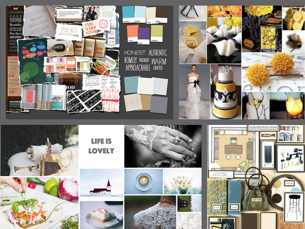
A mood board is a visual presentation or ‘collage’ consisting of images, text, and samples of objects. A mood board can be used to convey a general idea or feeling about a particular topic or the proposed “visual language” and style of the project. The idea is to visually display everything as a collection for a birds-eye view of the client’s preferences and big-picture vision.
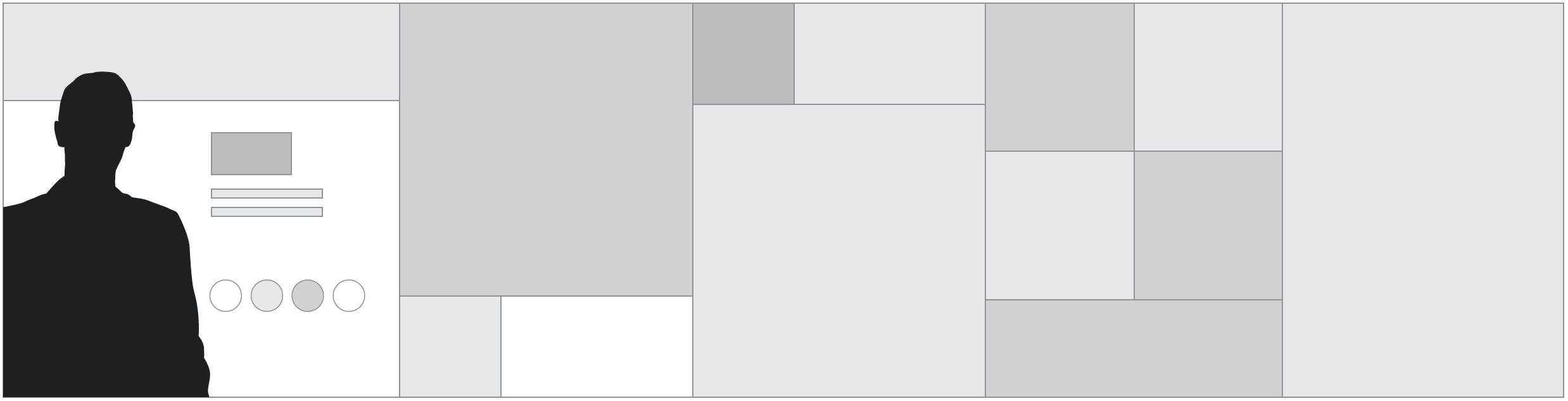
The image below has a few examples of what a traditional mood board could look like.
The Benefits of Using Mood Boards
At its core, a mood board is a focused and collaborative visual brainstorm between you and your client.
Nothing is worse than spending hours of your time working on a logo or brand identity, only to give the client some of your options and hear “Sorry, that’s not really what we were thinking.”
Many clients, even if they don’t realize it, have a solid opinion of what they like and don’t like in design. Using a mood board together gives them an avenue to communicate that to you, and gives you a sound jumping-off point to help your creative discussion.
Using a mood board for inspiration gets all of the stakeholders and team members on the same page quickly about the visual language of the project. After that, you’ll be able to get work done with the confidence you are on the right path toward designing exactly what your client is looking for.
It also helps with building relationships with your clients, which is always good. By seeing your design process unfold and their product take shape, they will see that you are a competent designer and know how to get results. They will also feel like they have had meaningful input into the design process and won’t feel like they have to constantly look over your shoulder and manage you. Their confidence in you will skyrocket once they see how the end product is a direct result of the visual language established in the mood board. You will have established a sense of trust between you and your client. And trustworthy designers get hired often.
Agree on the Approach
Some clients may prefer to gather their ideas and inspiration themselves and keep that private until they’re ready to reveal the mood board to you. Others may appreciate getting some help and creative input from you.
If they want to take the lead but they’re not sure where to start, you can guide a client’s mood board creation with suggestions of things that can help you be a more accurate designer. Ask them to include paint chips or colors, quotes, or ideas that inspire them or give context to what they do. If they are a retail business, suggest that they put some of their products or photos of retail spaces on the board as well. The more information you can get, the better. Doing your research BEFORE you start working is always the right move.
Mood boards can be created digitally in Adobe Illustrator or Photoshop, or virtually, like on digital sites like Pinterest, or they can be created “old school,” by physically collecting items such as photographs, colors, and fabric samples then mounting them on foam core or tagboard. I usually create mine in Illustrator. Use whatever allows you to work the most efficiently.
Beyond the Mood Board: The Stylescape
While mood boards can be used to great effect to visually demonstrate what an idea looks like, as designers, we need to go deeper.
Remember how design is supposed to, above all, solve a problem for users/viewers/readers? We need to focus on solving the problems of our users/viewers/readers while developing the visual language for a brand.
We do that by creating an enhanced version of a mood board, known as a Stylescape. A stylescape is similar to a mood board in that it portrays the visual language of a brand. But its crucial difference is that a stylescape is created by first considering the various types of user personas that may embody the brand’s users. A user persona is a semi-fictional character based on your ideal audience.
You have to think about who the users are—their motivations, their likes/dislikes, their passions, their education level, their household income, etc. in order to get to know them. Only then can you really design the visual language that will attract their attention. Once you know who you are designing for, every choice you make can be informed by that knowledge.
Step-by-Step: How to Create A Stylescape
Step 1: Explore and Decide on the Brand Attributes
Brainstorm for a good 15-20 minutes and write down a list of all the brand attributes. Is the brand fun or serious? Modern or rustic? Outdoors-y or tech-y? Think of every single adjective that would reasonably describe the brand and write those down.
Then take that list and narrow it down to the FIVE most appropriate.
Then take those five and narrow it down to the top THREE. Those three words are your main brand attributes. Examples: “Rustic, Authentic, Industrial” or “Vibrant, Trendy, Comforting” or “Flexible, Clean, Premium”
Step 2: Create Your Image Buckets
Gather high-quality (if possible) images from wherever you can to populate your stylescape. Use the sites below, but also look for any images you can elsewhere. Make sure to include examples of shapes and textures that may fit. Don’t forget to take reference images with your smartphone. Those can work, too.
Don’t just look for images that are high-resolution, try and find images that really portray the visual traits you are trying to show in the stylescape. We want every image we add to our stylescapes to add the most context and have the most impact.
- Behance
- Dribble
- Shutterstock
- Unsplash
- Creative Market
- DeathToTheStockPhoto
- Pexels
- Gratisography
- LifeOfPix
- SplitShare
- StockSnap
Step 3: Consider Your User Personas-Make an Empathy Map
Try to come up with at least three different user personas that you can use to inform to inform your design work.
Really try and delve into who these people are. Think about what they think, feel, and believe. Think about what they hear and see every day. What do they say and do? What types of pain and gain do they experience? What tasks do they have to do?
Ask yourself:
-
Who is this person?
-
Where do they live?
-
What do they do?
-
What do they eat/drink?
-
What places and spaces do they visit?
-
What do they see/hear/touch?
-
Where do they shop and relax?
-
What things do they crave?
Make a list of the answers and you’ve already started building a pretty decent user persona. Try and come up with between 2-4 user personas for any brand identity you develop.
Step 4: Color and Type
Whether a customer wants their business to be wild and passionate with reds, trendy with corals, or calm and serene with blues, color sets the mood for a project. Include your color scheme as well as strong examples. Use the web resources from the Color Combos page to build your color schemes.
You will need two solid examples of typefaces that work well together. You can include an entire alphabet if you want, or just a few different words in the typefaces you have chosen. I would suggest Your goal here is to see what the type looks like near and on top of other elements on the mood board such as colors and textures. We are trying to gauge how the type “fits” with the rest of the elements and see if it feels visually appropriate. We are also experimenting with sizes and combinations of different weights and colors.
Explore these sites to find typefaces:
- Adobe Fonts
- Monotype
- FontShop
- T26
- Emigre
- MyFonts
- TypoTheque
- BoldMonday
- Colophon
- Fountain
- GrilliType
- Hoefler&Co
- Type By
- BertholdTypes
- HouseIndustries
- FontBureau
- P22
- CamelotTypefaces
- Klim
Step 5: Curate Your Images
Assemble your images with intention. You want to use the best images you have been able to find in your stylescape. Those are the images that are going to convey the visual language of the brand the strongest.
Step 6: Present
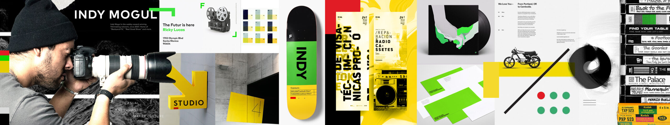
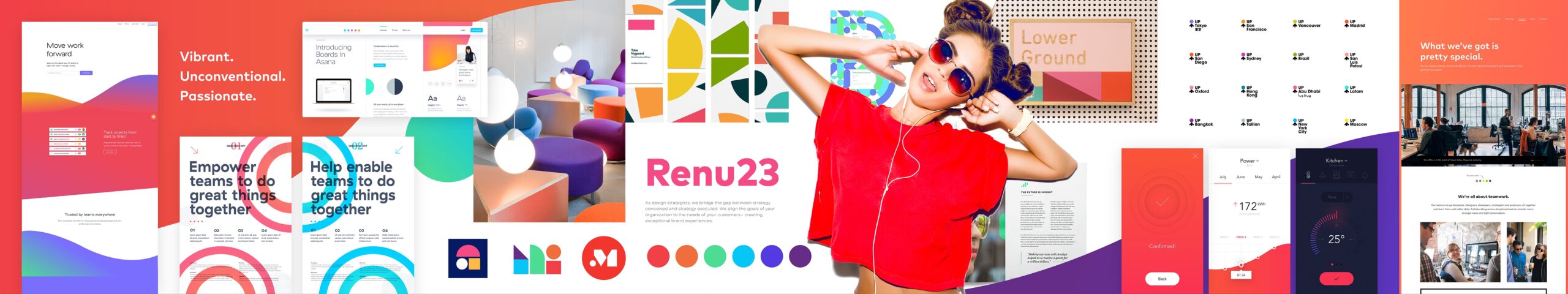
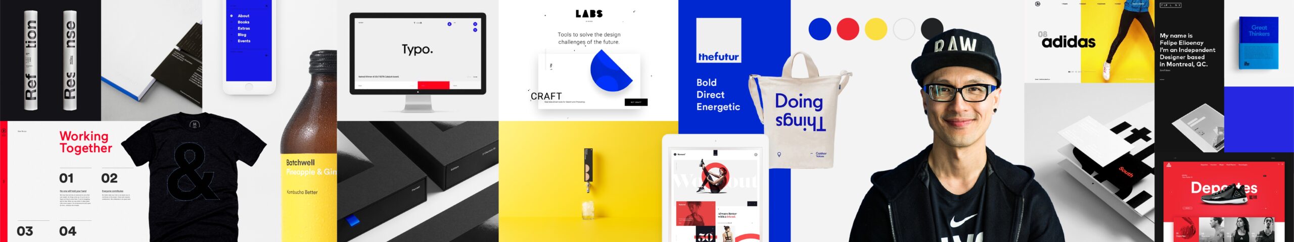
Don’t make every image the same size. Try and add visual interest to it. Emphasize the more important elements with size and prominence, while surrounding those images with secondary images that show the visual language with more context. Experiment! Use cut out images and make things overlap. Give it depth and richness. Make the whole thing feel unified. Experiment with different layouts such as the example below.
A Note About Quality
Remember, you are trying to convey these ideas as strongly as possible. You are going for maximum visual impact. Make the important things stand out and make sure that the whole thing looks really good. All images should be high resolution. Color-correct your images in Photoshop to make them all look the same, if necessary.