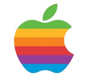
From an interview with Rob Janoff in Forbes:

“The apple shape itself didn’t have anything to do with computers. It’s to get people to notice that an Apple computer was not some piece of hard-edged metal that has no place in your home and that your kid wouldn’t want to be near. Lots of different fruits have a stem, are sort of round with a leaf dangling off of it. So the bite in the apple was initially meant to indicate that it was an apple, and not something else. Also metaphorically the bite indicated biting into all the knowledge users would get out of this computer.”
“What’s funny, though, is after I came up with it my creative director, Chip, said “Oh guess what, Rob. You just designed something you didn’t realize. The word ‘byte’ is a computer word. And you took a bite out of Apple.” I wasn’t computer literate enough to see that initially. And I was like, there’s a bit of wit that will last! Any logo that makes a joke or engages you in that way you’re going to remember. And the rainbow colors had to do with the USP of this product. The Apple computer was the only one that could show images in color.”
From another interview with Rob Janoff at the Creative Bits blog:
“The main thing is to make it simple. Because designers, especially young designers, tend to over-design or clients want too many things in there. I think people who tried to work a logo too hard, having too much meaning, wind up with something that’s too complex. Logos usually have to be interpreted from very-very small to very-very large and that’s not always easy. So, I think simplicity and readability is key. You’re designing for an audience that really doesn’t care as much as you do and unless it catches their interest right away they are going to pass right over it. So having it very readable is also important. Capturing the audience’s imagination by having something revealed to them as they look at the logo is also important. Also, it’s an opportunity to give whatever you’re trying to portray a personality — this is something I try to do.”
