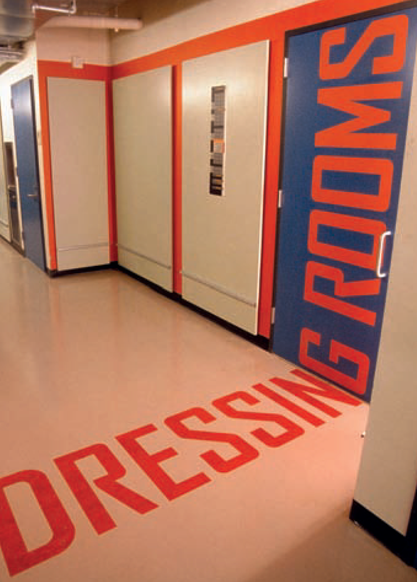
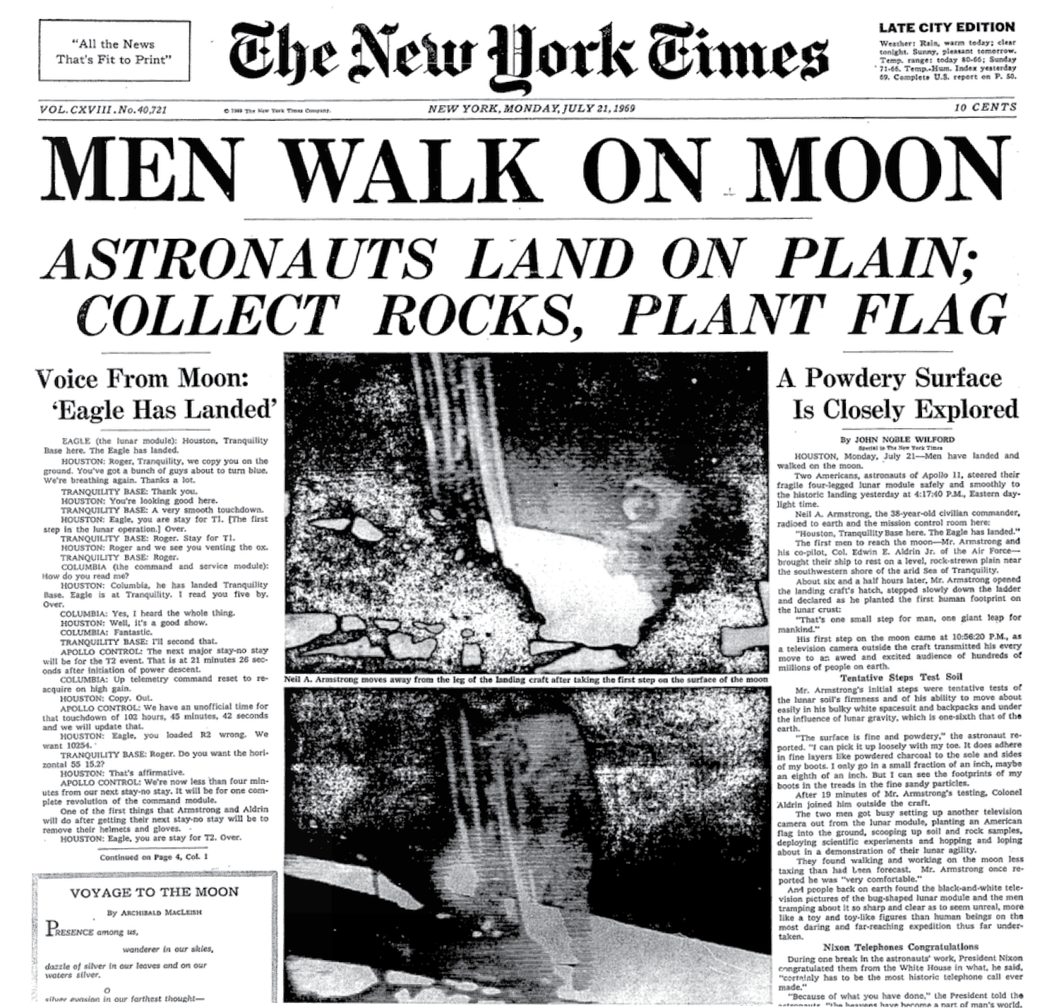
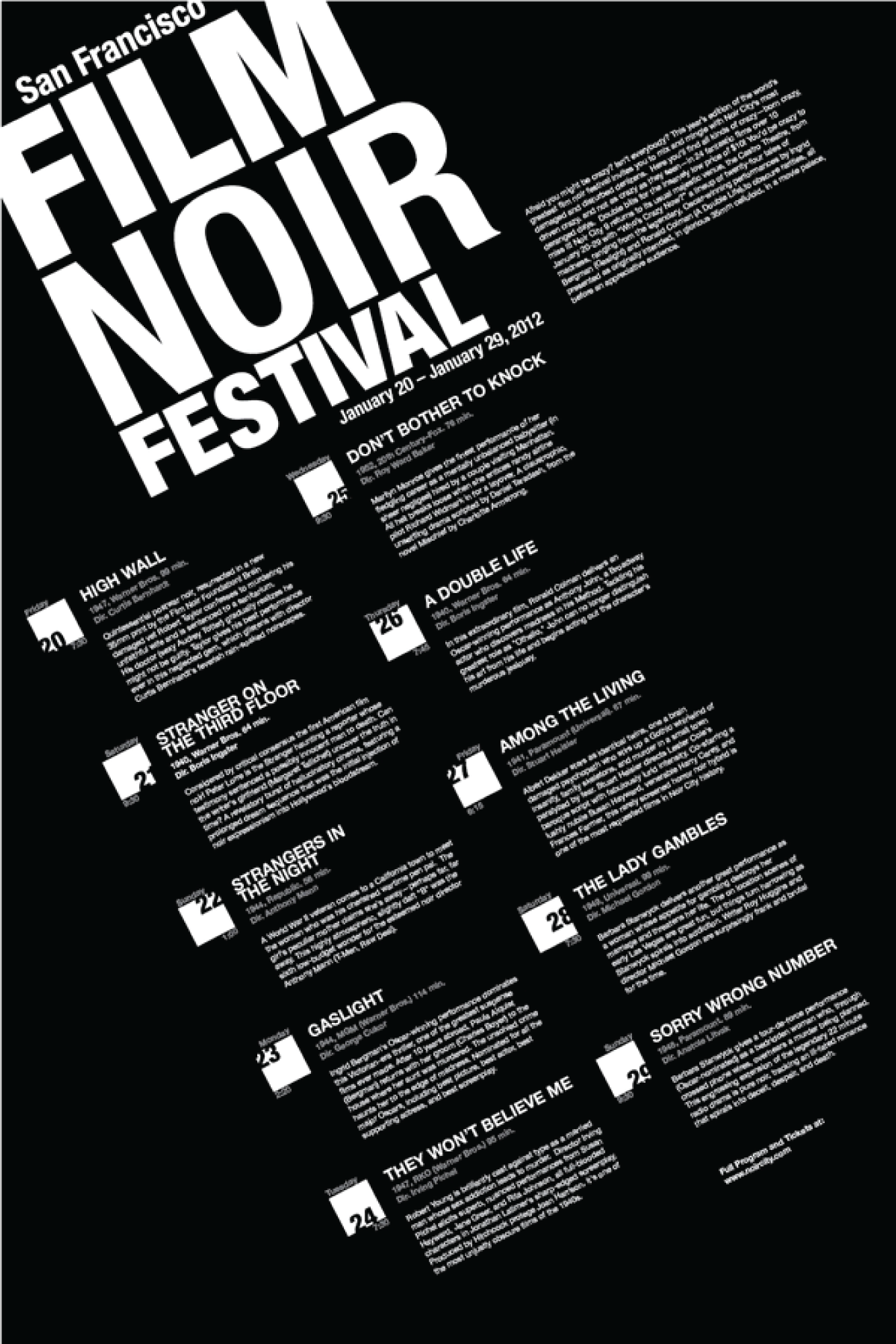
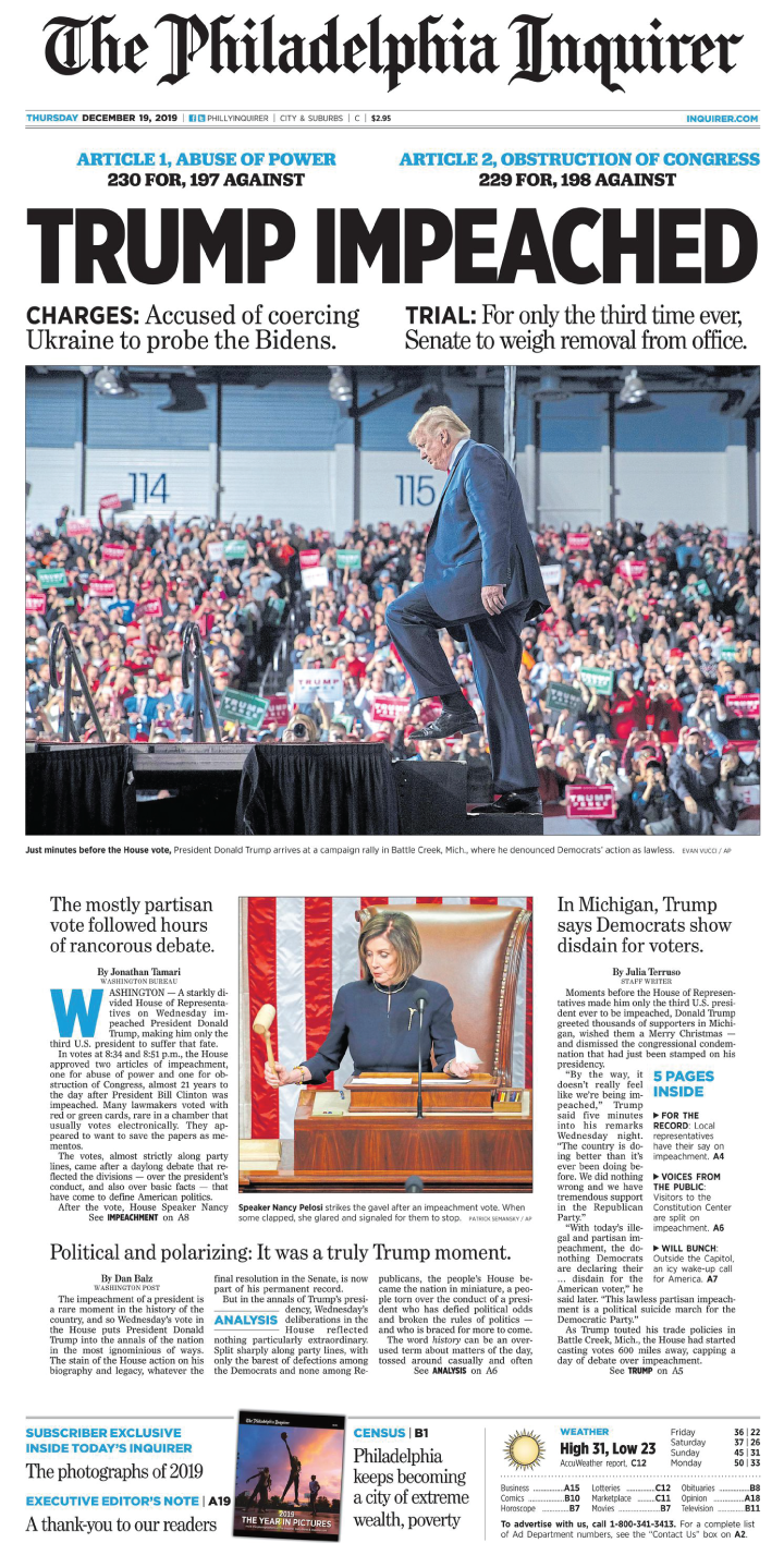
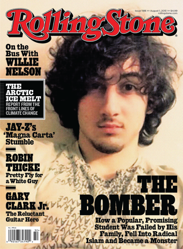
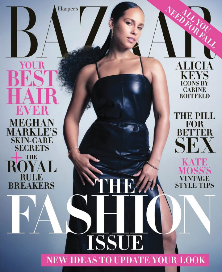
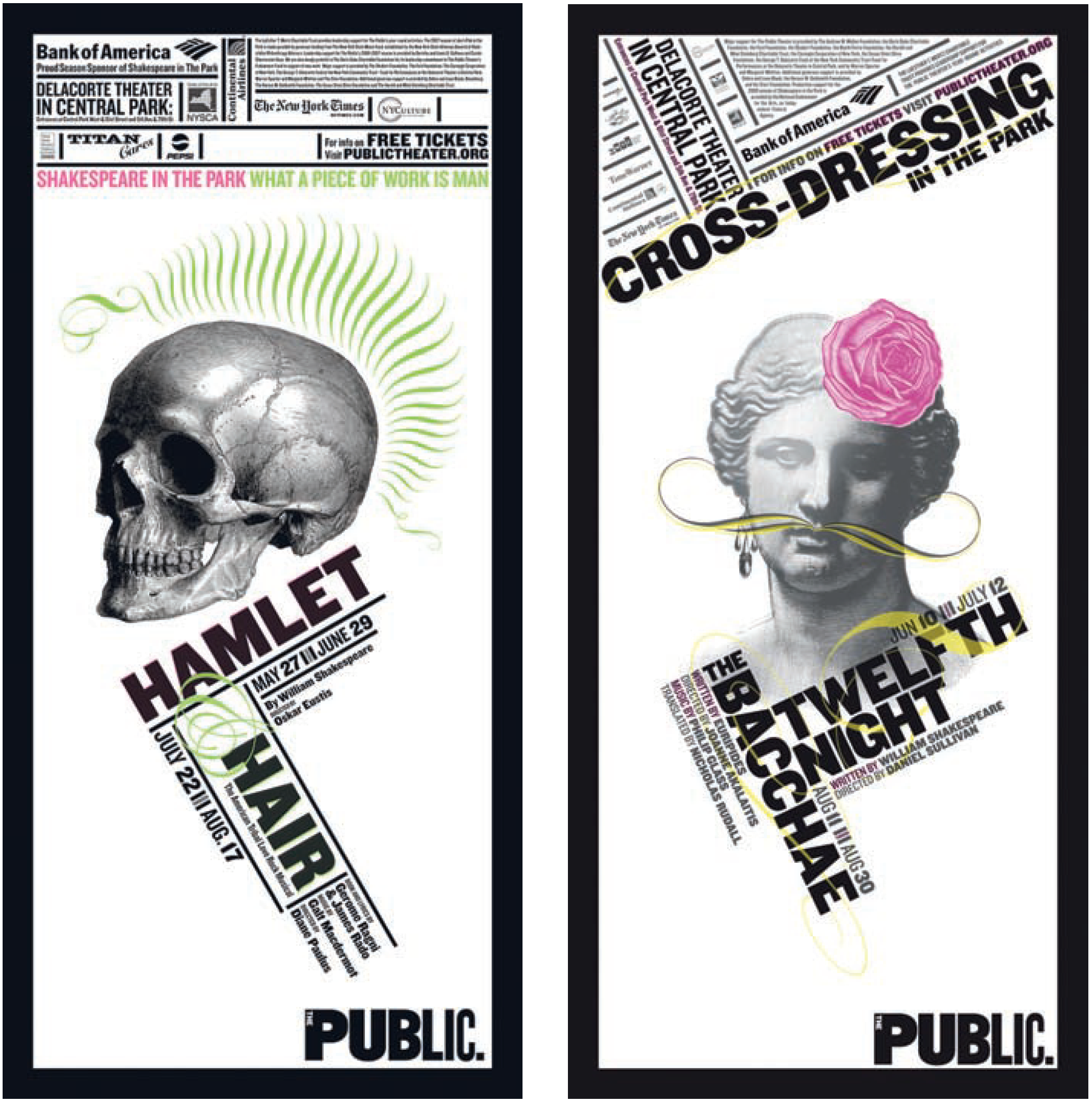
Type can be used to convey information, like on a newspaper page or a poster promoting an event.

Type can also be used as a design element in our compositions.
Two Ways to Use Type to Build Structure Into Your Designs
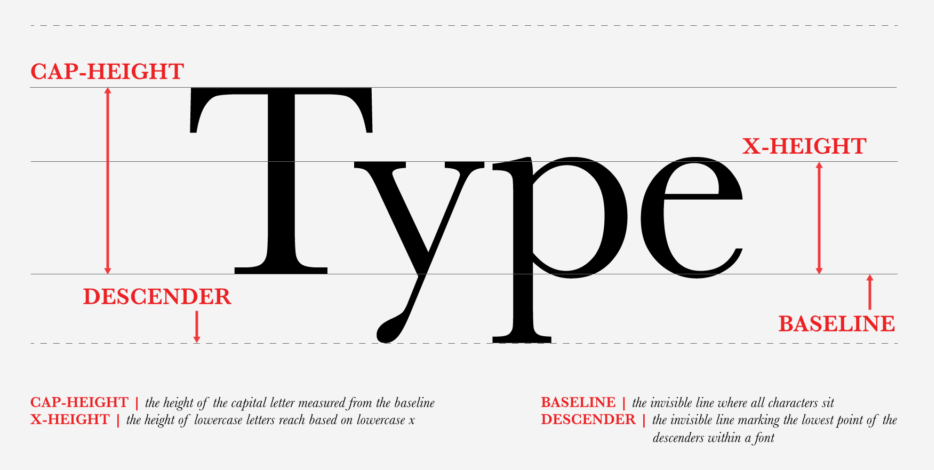
1. Character Anatomy
The structure of the characters themselves
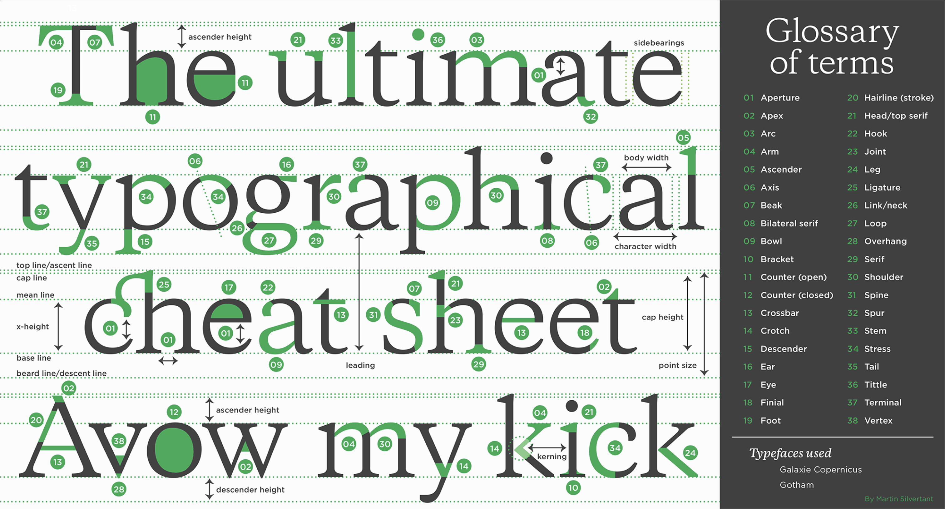
2. Typeface Anatomy
The overall design of a given kind of lettering is called a typeface. The term encompasses all of the possible variations—Light, Regular, Bold, Black, Italic—within it. Each of these individual variations is a font. For example, Helvetica is the typeface, while Helvetica Bold Italic 12pt is a font—i.e. one of the many individual variations of Helvetica.
Serif or Sans-Serif?
Examples:
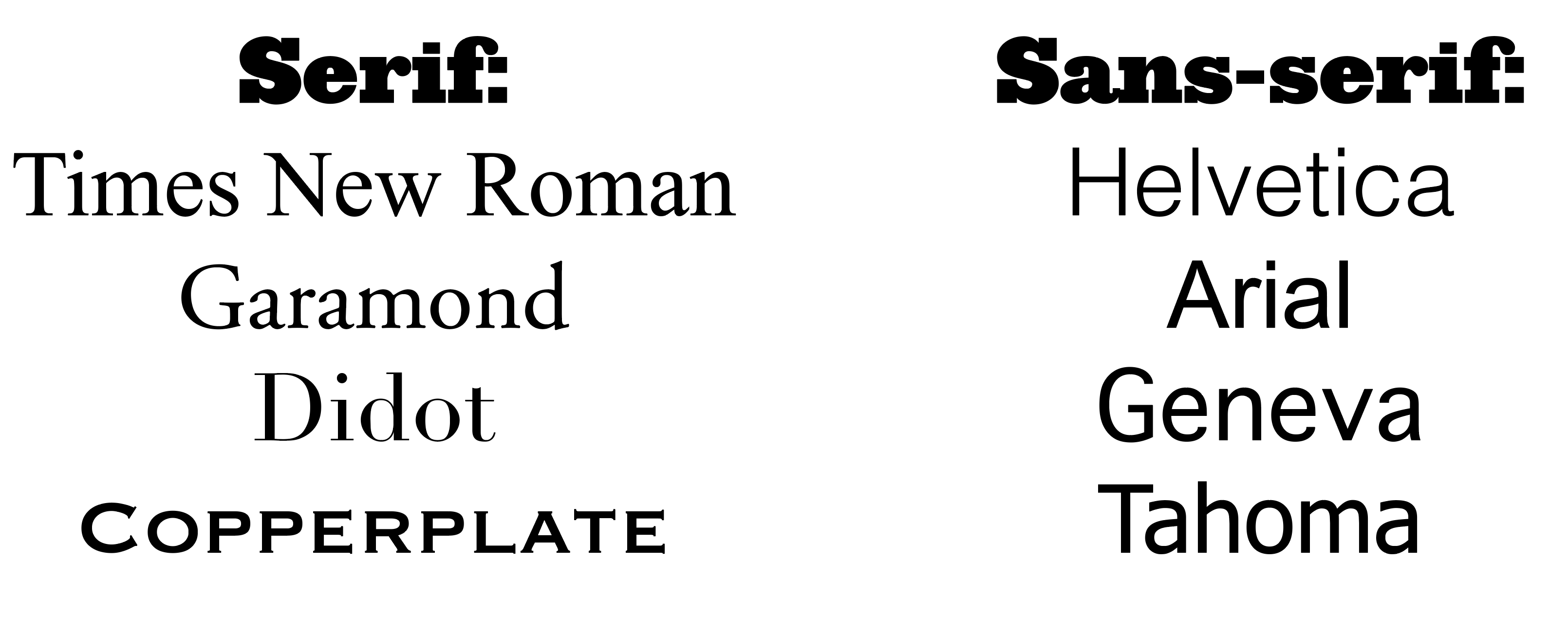
Serif typefaces are easier to read as the serifs help lead a reader’s eyes along from character to character and word to word. This is why they are often chosen for the body copy in magazines, newspapers, and printed books.
Sans-serif typefaces are more often used as display type. Display Type is the much-larger, less-used typography in a layout that is used to draw attention to certain information.
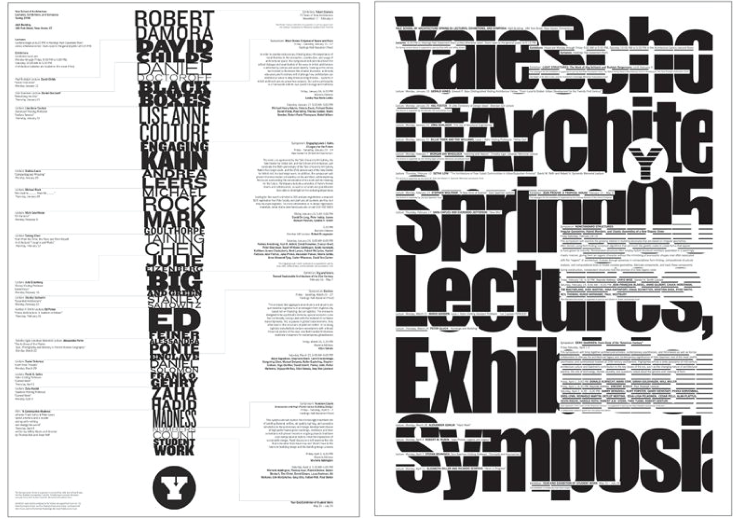
Building a Hierarchy of Type Sizes
By using different sizes and weights of various typefaces, we develop a hierarchy that we can use throughout the publication or project to uniformly lead a user/viewer/reader’s attention around the page or screen. Use the size of the various kinds of text to lead a viewer’s/reader’s eyes around your layout.
Drawing Attention
Don’t make information compete against other elements on the page or screen. Use different fonts for different groups of information. Use your hierarchy to guide the reader around the work.
Choosing typefaces
When choosing typefaces for any project, avoid silly choices such as most script fonts and Comic Sans. The wrong typeface becomes an eyesore, while an effective typeface brings order and ease of consumption to a layout.
How many typefaces do I need?
You should avoid using too many typefaces in a project. A good rule is no more than 2-3 for any project. Using two typefaces that work really well together is better than four that don’t.
Readability Considerations
Remember, we are trying to convey information so that it is as easy as possible for a user/reader/viewer to consume it. That can’t happen if they can’t read the text.
Be mindful of:
- Leading – This is the space between lines of text, measured in the space between the baselines that the text sits on. Too much and the text looks “airy” and spaced out. It will be harder to read. Too little and text will start to be jammed together and be harder to read.
- Tracking – This is the space between letters, in general. Unless you are going for a specific look, you can usually leave the tracking of a typeface alone.
- Kerning – This is the space between certain characters that “fit” together-e.g. AW vs. A W. As with tracking, you can usually leave this setting alone.
Some tips for readability:
- Size – Make sure the text isn’t too small. If people are interested in the content, they will read lots of small text. But it is best to never go below 9-10pt in any typeface when designing body copy. Sometimes things like photo credits or citations at the end of a magazine article can be a smaller-than-usual font.
-

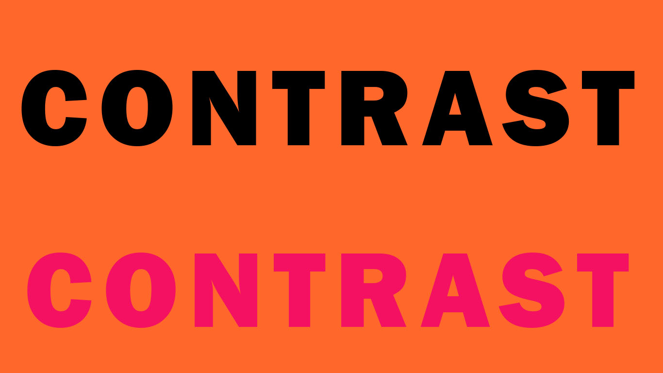
Which word is easier to read? Color – Combining different colors of text can present a lot of issues. It is usually best to stick to black (or just really dark) text on top of a lighter background. But there will be times when you will have to work with colored text. You will have to use your training and experience as a designer to overcome these challenges. You can put white text on top of a darker background but is best to make it large enough so that there is no question if it is readable or not. Try not to have white body copy on a dark background. It is really hard on the eyes.
- Typeface – Pick typefaces that are easy to read. Nothing weird, sci-fi, spooky, ancient, or graphical. Script typefaces are always difficult to read.
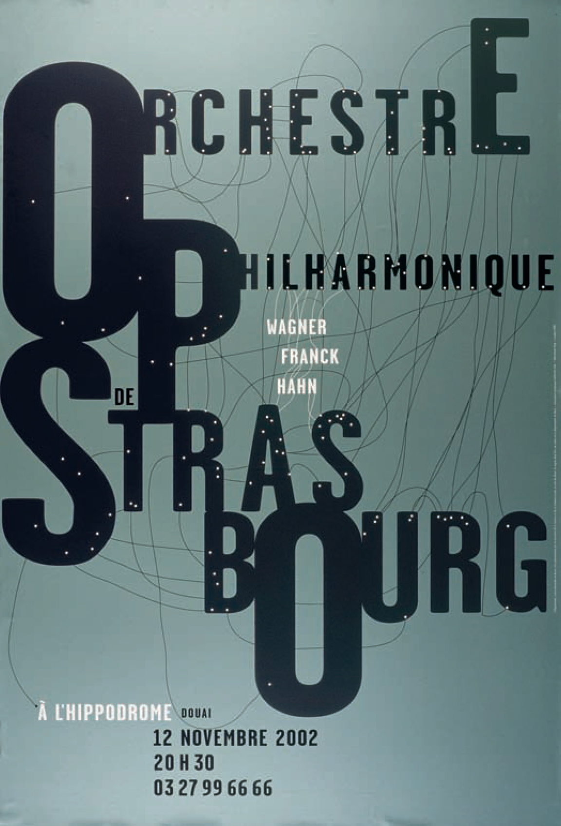
Using Type as A Form in Design
Understanding Gestalt psychology is important when learning how to use typography as a form in our design work.
 The term Gestalt means ‘unified whole’, which is a good way of describing the over-arching theme behind the Gestalt principles. These refer to the way in which humans, when looking at a group of objects, will see the whole before we see the individual parts. As designers, we can take advantage of this tendency.
The Six Gestalt Principles
 Similarity
When objects look similar to one another, viewers will often see the individual elements as part of a pattern or group. This effect can be used to create a single illustration, image or message from a series of separate elements.
 Continuation
Continuation is the principle through which the eye is drawn along a path, line or curve, preferring to see a single continuous figure than separate lines. This can be used to point towards another element in the composition, and is seen where a line is cut through one object, often in a curve, aligning perfectly with a secondary element.
 Closure
Closure is a common design technique that uses the human eye’s tendency to see closed shapes. Closure works where an object is incomplete or the interior space of an element is not fully closed, but the viewer perceives a complete shape by filling in the missing information. This technique is often associated with stenciled artwork but is also closely associated with logo forms.
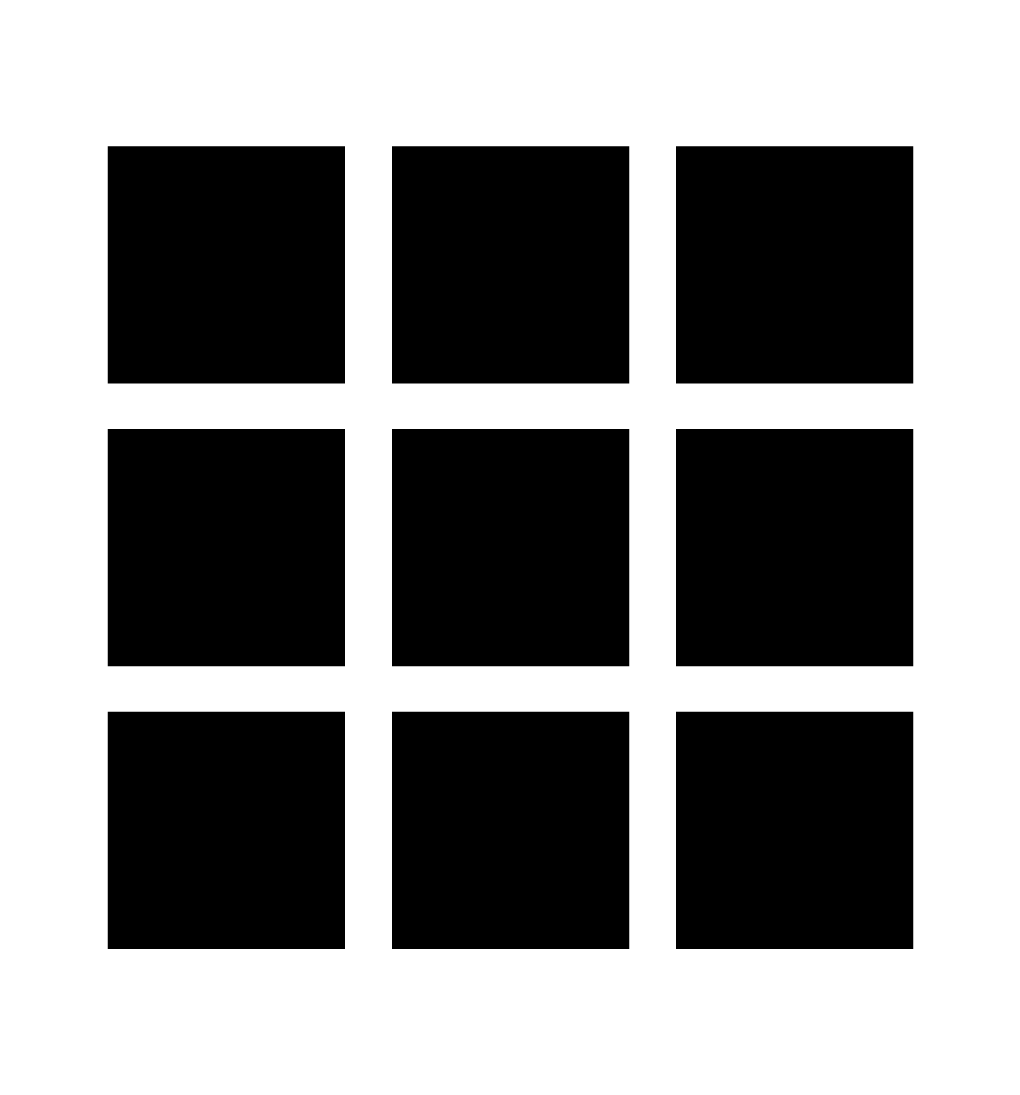 Proximity
Proximity uses the close arrangement of elements to create a group association between those objects. If individual elements are also similar, they will tend to be perceived as a single whole, even though they are separate elements.
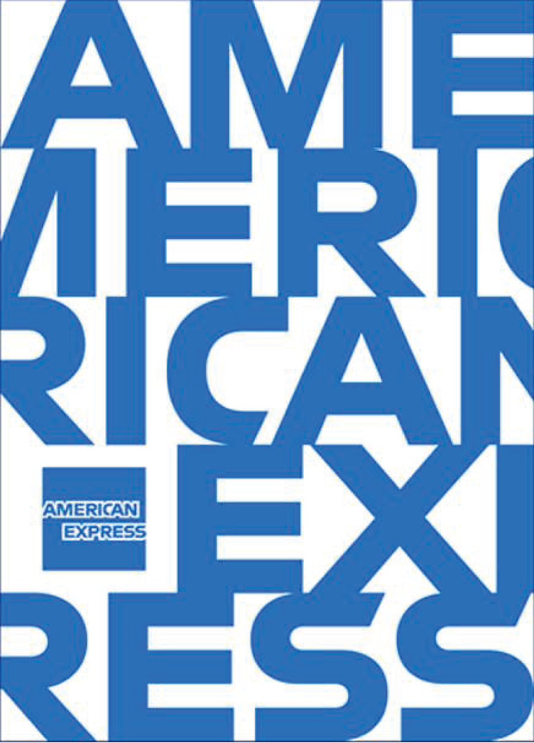
Figure/Ground
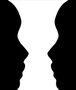 This principle describes the eye’s tendency to see and separate objects from their surrounding background. A classic example uses a vase/candlestick illustration to show two faces peering at each other, but you can also see this effect in a variety of logo designs. It works because human eyes want to see the figure (foreground object) and background (ground) as two different planes of focus.
 Symmetry and order
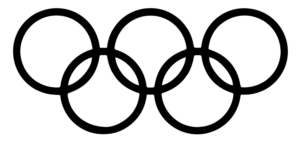
What this principle says is that your brain will perceive ambiguous shapes in as simple a manner as possible. For example, a monochrome version of the Olympic logo is seen as a series of overlapping circles rather than a collection of curved lines.
When applying Gestalt principles to typography (especially any kind of typographic illustration), it is important to take into consideration the Read Order of your text. Try and make the user’s/reader’s/viewer’s eyes flow through the text naturally.
Gestalt principles can be especially important when designing typography for unconventional media. Pay special attention to what the text is intended to do and try and design it toward that end.
Special attention must be given when designing text that is meant to give the reader instructions on how to do something or go somewhere. Always ask yourself, “What problem am I trying to solve with this text?” and that will help guide your decision making.