Hello MEJO482 students!
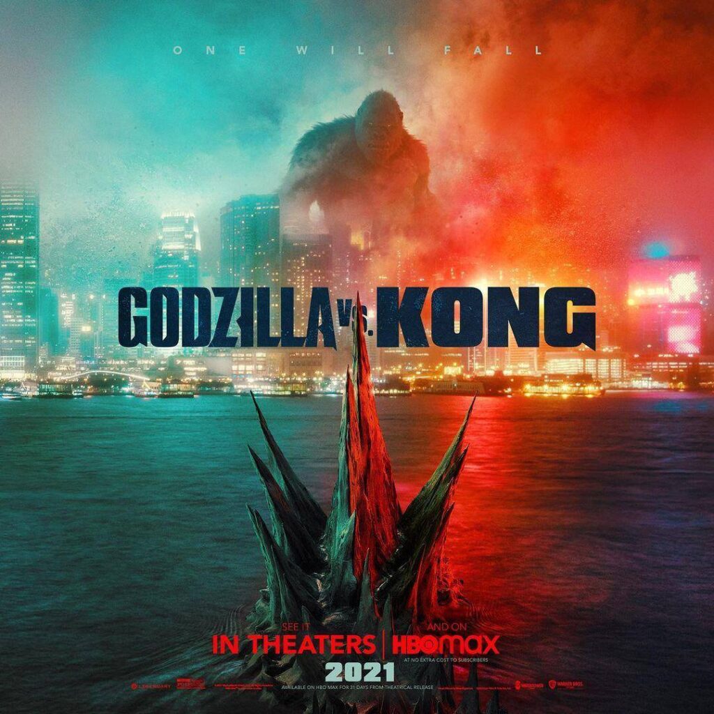
I just came across the newly-released teaser poster for the upcoming film “Godzilla vs. Kong” and it’s a pretty good study in the use of the basic elements of design. We can learn a lot design-wise from looking at movie posters.
Since you are all designing some posters yourselves, I figured I’d take a chance to just point out a few things about the layout, colors, and typography of this poster that make it a pretty effective piece of visual communication. Also, I LOVE “kaiju” monster movies like Godzilla, Mothra, Pacific Rim, Cloverfield, etc. and the posters used to promote them.
Click on the image for a larger version.
 From the first look, you can tell that the story being portrayed here is one of opposing forces. There is a conflict going on between these two creatures.
Those Colors!
The poster is almost evenly divided between a deep red-orange and aqua-blue color. There is a stark color contrast there that not only portrays the two sides of the conflict, but also the two distinct personalities and “brands” of the creatures themselves:
- Godzilla – a lumbering, ocean-dwelling, radioactive, fire-breathing dinosaur
- Kong – a wild, temperamental, tropical island-dwelling ape that leaps from building to building
The way each opposing creature is bathed in both the red and green colors implies an even match between them. You don’t really know who to root for. There is a sense of uncertainty here. The designers of this poster want the viewer to have no idea who is going to win this crazy fight between two giant monsters. And that sense of drama created here will hopefully “sell” people on seeing the movie and finding out what happens.
King of the Monsters?
The placement of both Godzilla and Kong is well-thought-out. It maintains a level of mystery for the viewer.
One may think that by placing Kong at the top of the poster and Godzilla at the bottom, the designer is clearly implying that Kong is in some way better, more superior, or favored to win. “He will come out on top.” Right?
But by placing Godzilla almost completely in the water (his natural habitat) you can’t even really tell how big he is. You can see, due to the way the designer placed Godzilla in the “camera frame,” just his back fin alone looks bigger than Kong himself. So, again, there is that uncertainty about who will win that the designer is trying to foster in the viewer to create a high sense of drama that will hopefully sell the movie.
When Trying to Create Drama, Less Is More
The typography on this poster works really well because there isn’t much of it.
There is such a strong narrative being portrayed visually, that all they really need is the name and the release date. But they did include a tagline, as all great monster movies have. It is well-executed and maintains the heavy sense of drama created by the visuals.
“One Will Fall” of course means one of these monsters is going to lose this epic battle, right? Well, not really. The restraint and simplicity of the words and how they’re styled (increased font tracking to horizontally space out the letters) imply ambiguity. Maybe the “one” who will fall isn’t Godzilla or Kong, but another monster we haven’t seen yet. Classically, these “kaiju” monster movies often show Godzilla teaming up with other monsters to defeat a much larger threat (the prequel to this movie did just that).
And finally, the title of the movie has both monster names styled to match each beast (tall and sleek vs. bold and heavy), with pointed serifs on the letters to unify them.
The placement of the title is well-done and a nice final touch to the design. You can see the tip of Godzilla’s backfin obscuring part of the “vs.” The words themselves sit between and separate these two giant beasts from each other. The title is almost like the hand of a boxing referee, placed between two fighters in the ring who are rearing to go. It is the only thing holding them back from battle until it is released. It’s a nice little reference to movies themselves. You see the title at the very beginning, but once it fades and is gone, the action begins.

