Creating a simple layout requires following a few simple rules regarding the placement of text and images. But when it comes to building a striking and artful composition that not only informs but delights and brings meaning, we will have to learn to work within, to bend, and ultimately to break these rules.
As media designers, our number one job is to facilitate the communication of information. Presenting and then delivering information can only be achieved by drawing and then holding the attention of a user/viewer/reader. We will do that by employing various types of contrast in our compositions.
I want to take a moment to remind everyone about the concept of Craft. Even though what we are doing may seem like common sense, we must always strive to elevate our work through the thoughtful and deliberate application of creative techniques. Only then can we delight and add meaning to the lives of our users/viewers/readers. Remember the example of a classical music composer: It’s not just every instrument, playing every note, all at once. The composer has to decide just the right moments to emphasize certain instruments in the orchestra.
So, let’s talk about how you lead a viewer’s attention around a composition.
Say you have a simple black dot against a white background. It is very easy to see and your attention is directed right to it because there is a high amount of Contrast between the black dot and the white background color. With such high contrast, the shape is very easy to distinguish from the background.
If we begin to shift the black toward more of a grey color, the amount of contrast between the shape and the background decreases. The dot becomes a little harder to see against the white background.
Again, we shift the color toward a lighter shade of grey. Now there is very little contrast between the dot and the background. It is starting to almost blend into the background and become hard to see.

The three examples above show just one way that we can use contrast to draw attention to various elements in our design work. The above example uses Value contrast (more on that below…) but there are others.
In our quest to elevate our layouts into striking, artful compositions, we need to get to know how to apply different types of contrast to our work. Utilizing different types of contrast will allow you to lead a viewer’s eyes around the work and direct them to information in the order you want them to consume it.
Let’s explore the different types of contrast.
Value
As in the first example above, simply changing the value of the colors of shapes can create contrast.
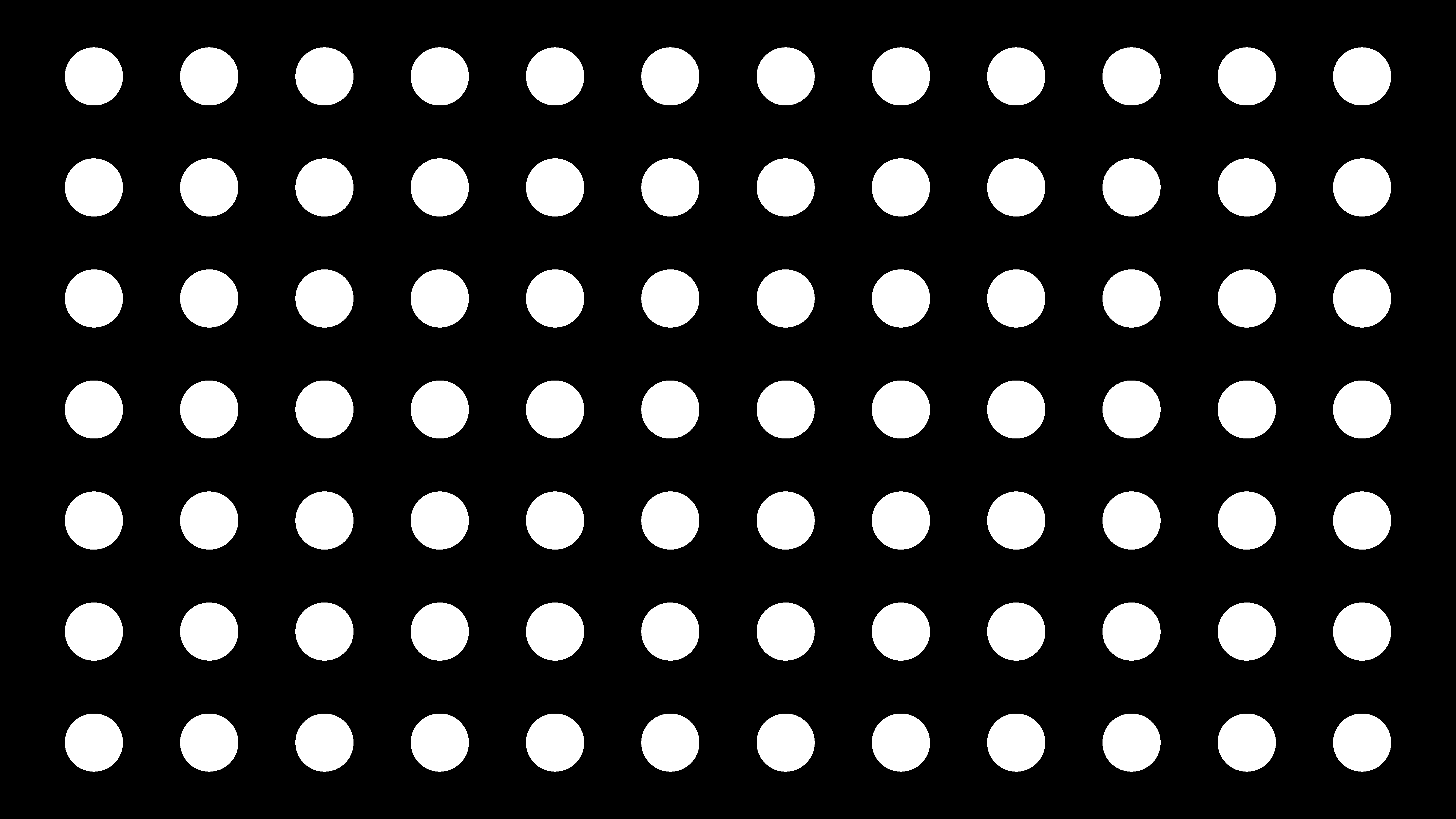
Look at the four white circles below. There is nothing exciting or necessarily interesting about them. They all look the same.

By randomly shifting the value of each circle to a shade of grey, we can see a couple of things happen. First, a couple of the circles get darker and become harder to see. Second, one of them (top left) starts to stand out. It’s still just a circle, but because it is on top of black it really grabs your attention as opposed to the darker circles that kind of blend into the background.
Let’s go a little deeper. See the group of smaller circles below? When they are all the same value, nothing stands out. Your eyes look at it and don’t know where to go exactly. They kind of just scan around trying to find something interesting to look at without ever finding it.
But if we make the value darker for all of the circles but one, that lighter one all of the sudden catches our eye. It becomes special. Our eyes go straight toward it. In a field of darker circles, there is one highlighted. By the time we notice the one lighter circle, our brains already begin making associations and asking questions on a subconscious level about this group of circles. You could put together a simple narrative just about that image if you wanted to. Maybe the white dot represents someone isolated or marginalized within a group? Maybe it represents someone who feels lonely? Maybe this is part of an infographic and the dot represents the last person left alive after a tragedy such as a plane crash? As you can see, the simple application of just two or three types of contrast can already start to help us build a visual communication narrative within a piece of work.
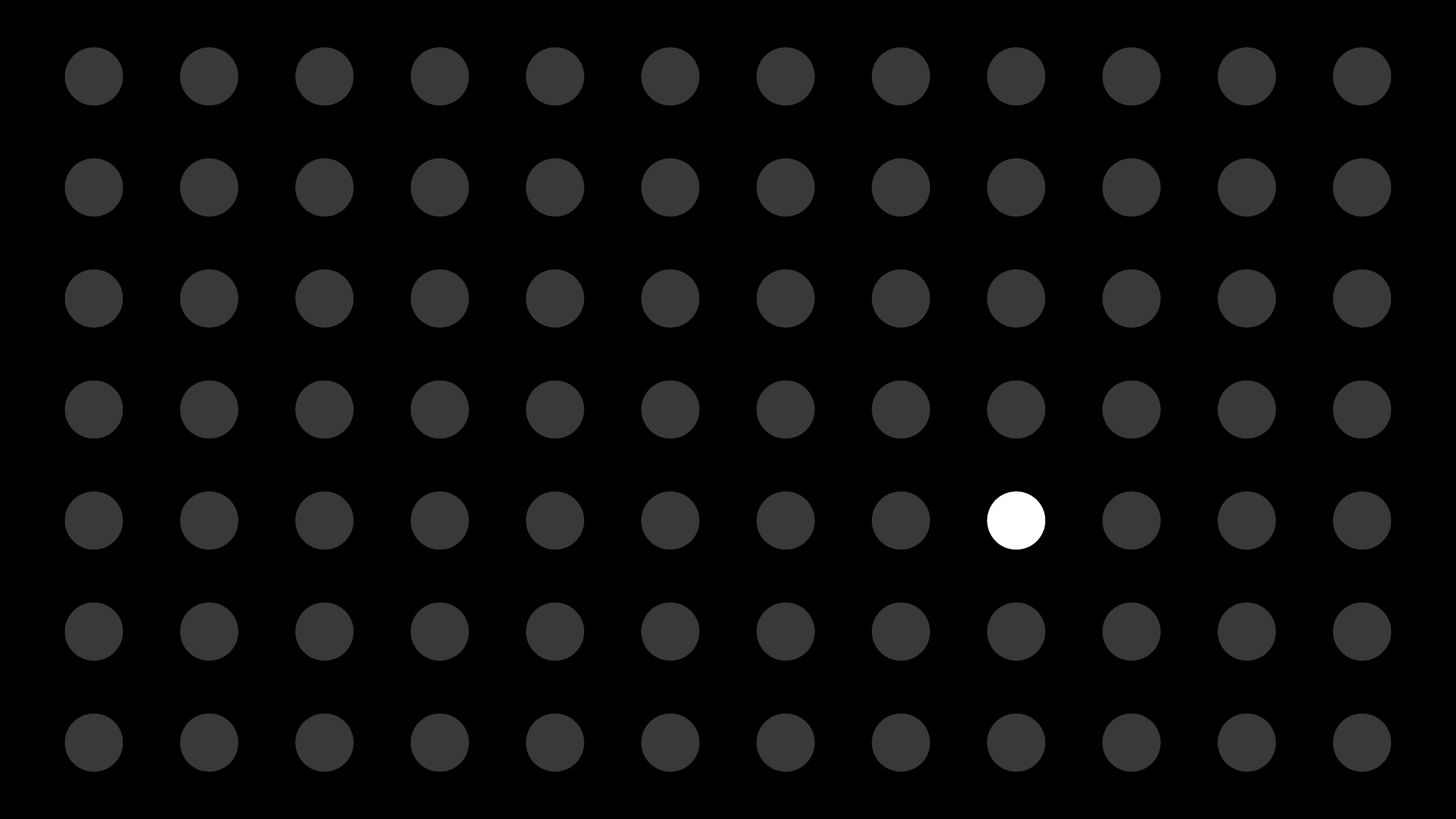
Now while the image above has good contrast, it’s not necessarily pleasing to look at and it doesn’t literally “say” much except to say that this one dot is different from all of the rest.
But what happens if we randomly increase the value of all of the circles?
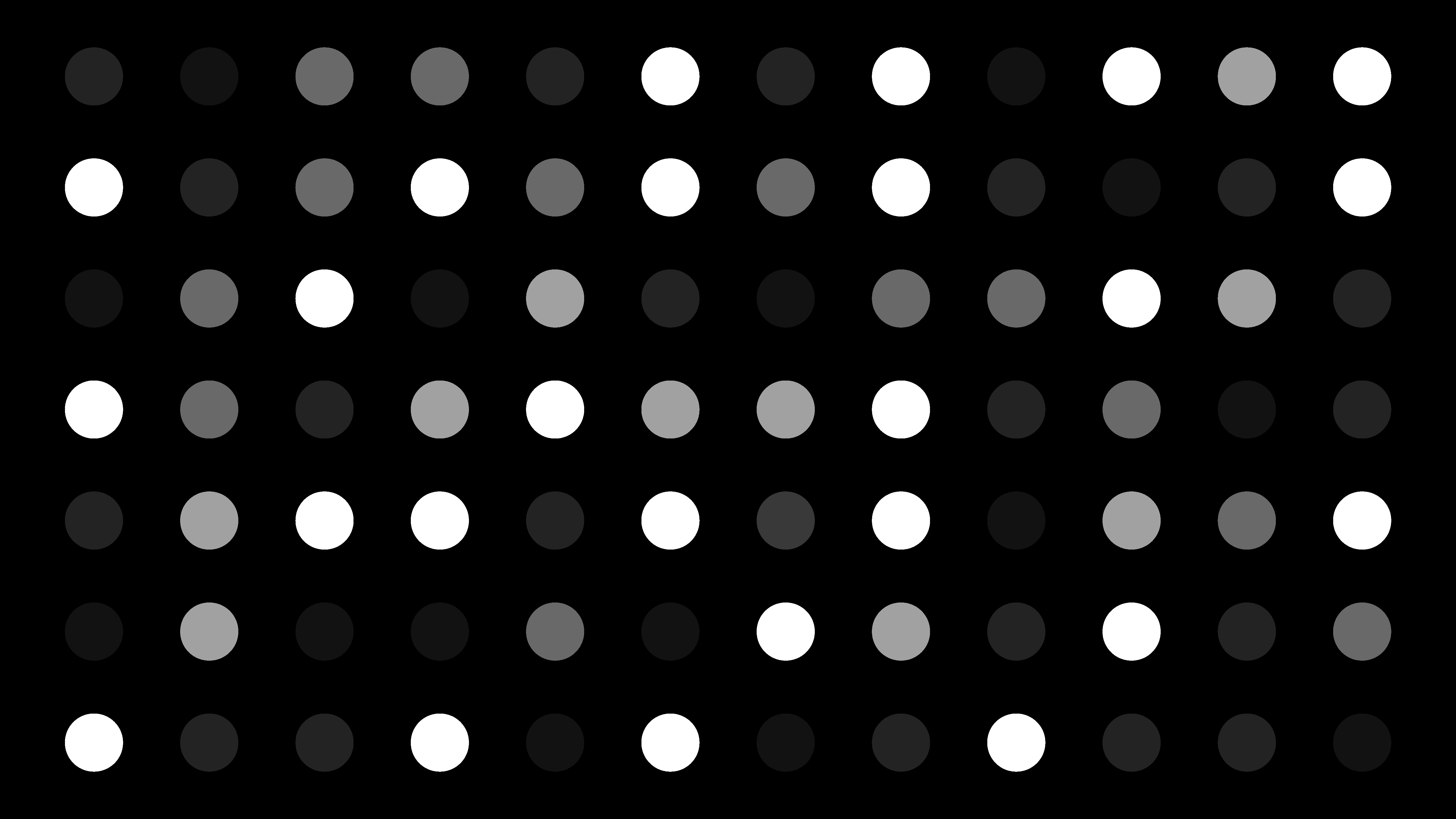
We’re back to not really having something to really focus on, but this feels better. It’s more dynamic than just a grid of white dots, but how else can we grab the viewer’s attention while keeping the benefit of having a range of color values?
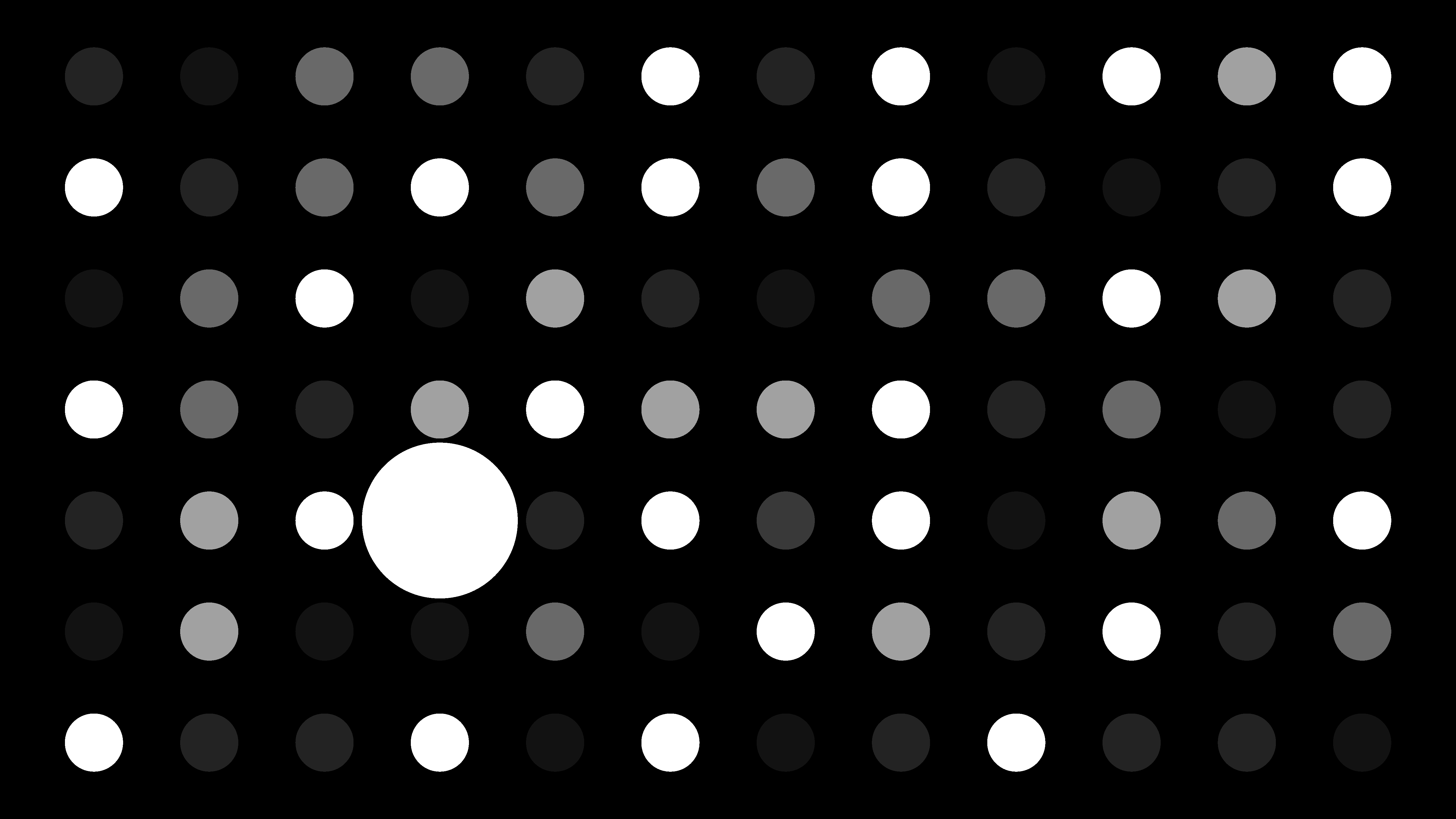
Size/Scale
One thing we could do is increase the scale of one of the circles. When we do that, we see that one circle is now the focus again simply because it is bigger than the others. Larger shapes will always attract attention away from smaller ones.
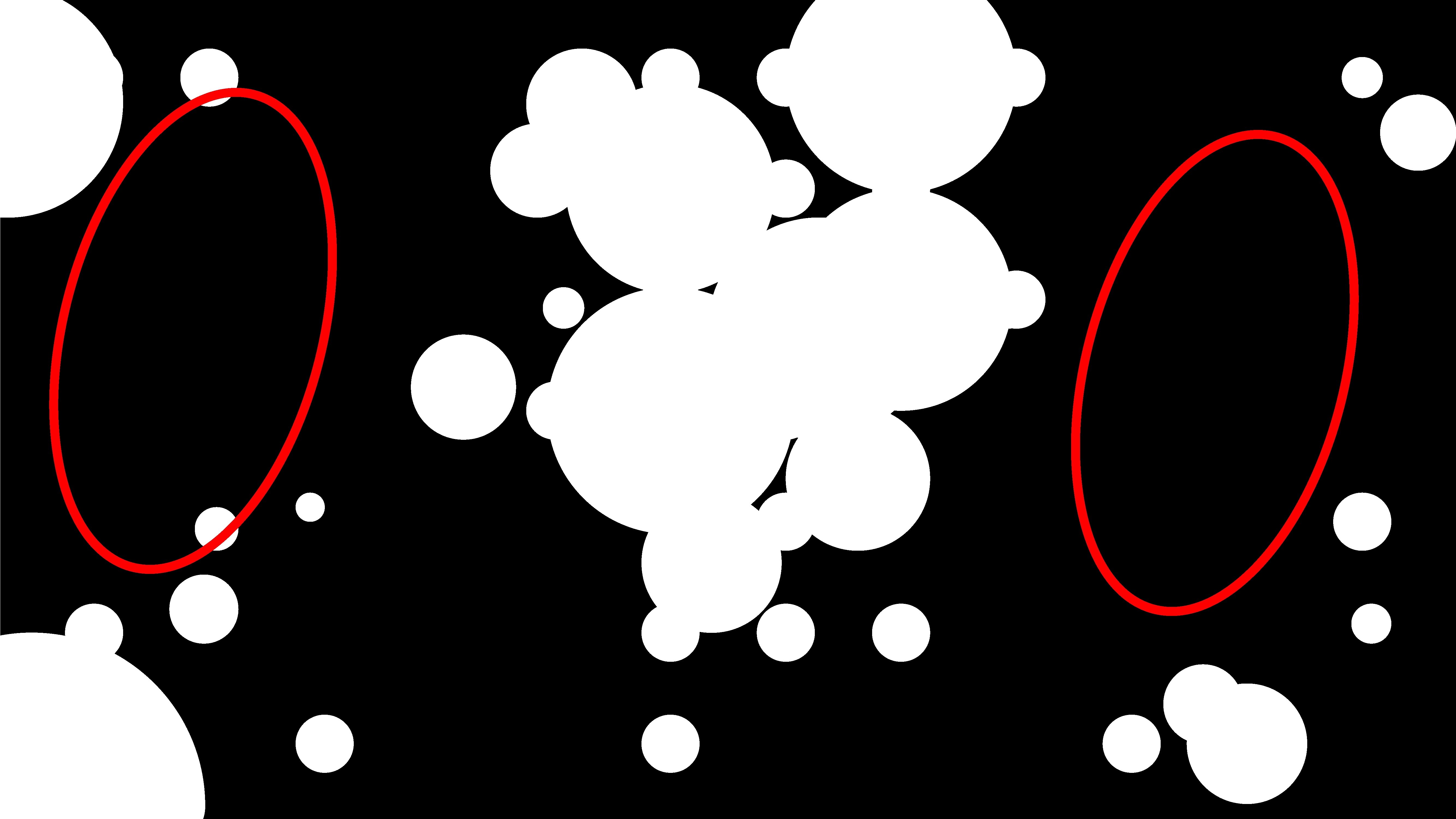
What if we randomize the scale and the position of the circles so that they start to form little groups. Where do your eyes go to first when you look at the image below?
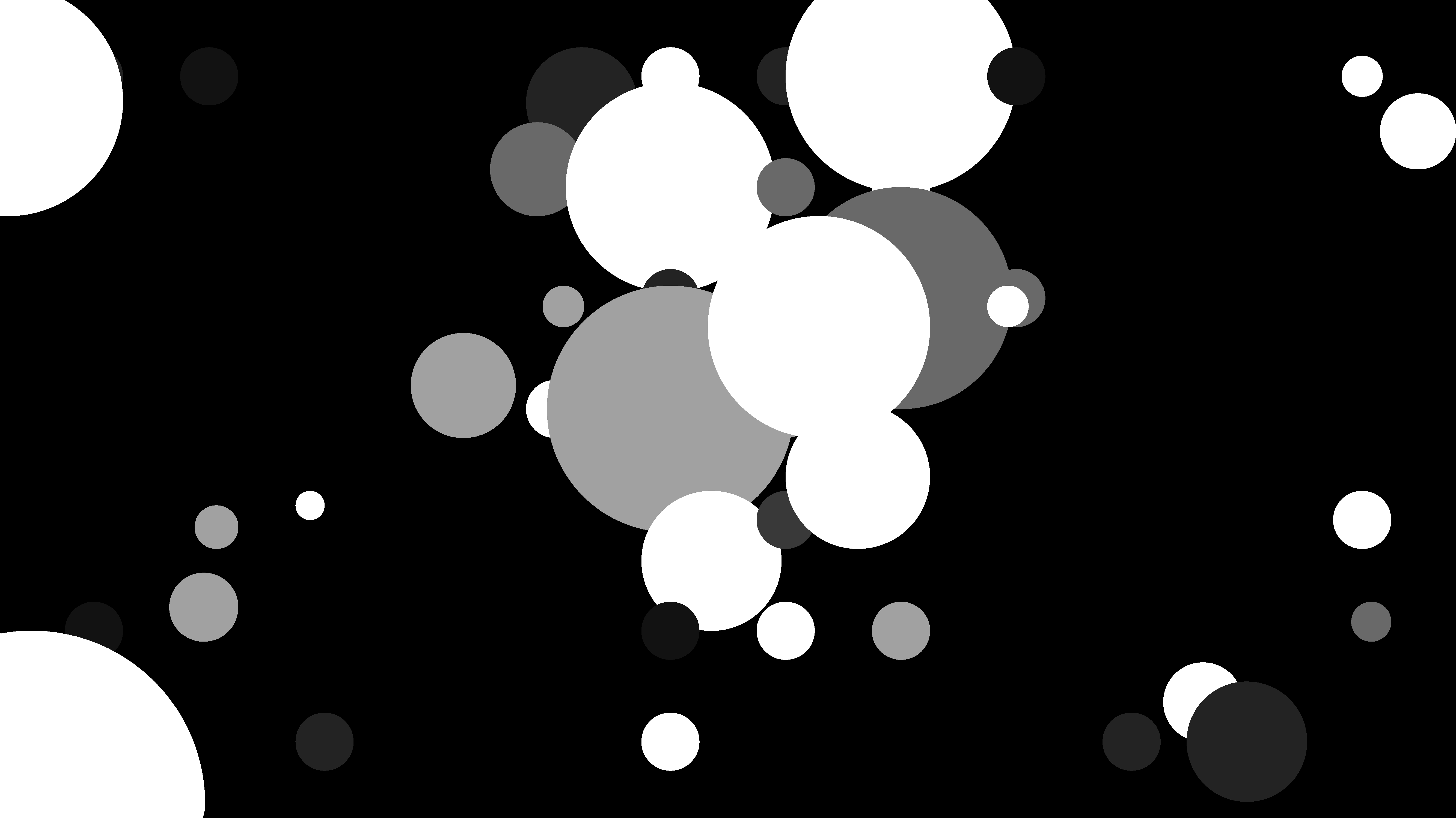
The large clump of different circles in the middle of the frame draws your eyes because it is the largest shape (irregular as it is…) in the composition.
But not only does the contrast in size compared to other shapes draw your eye to the center. There is also a contrast in density and detail within that larger shape that draws our eyes.
Density/Detail
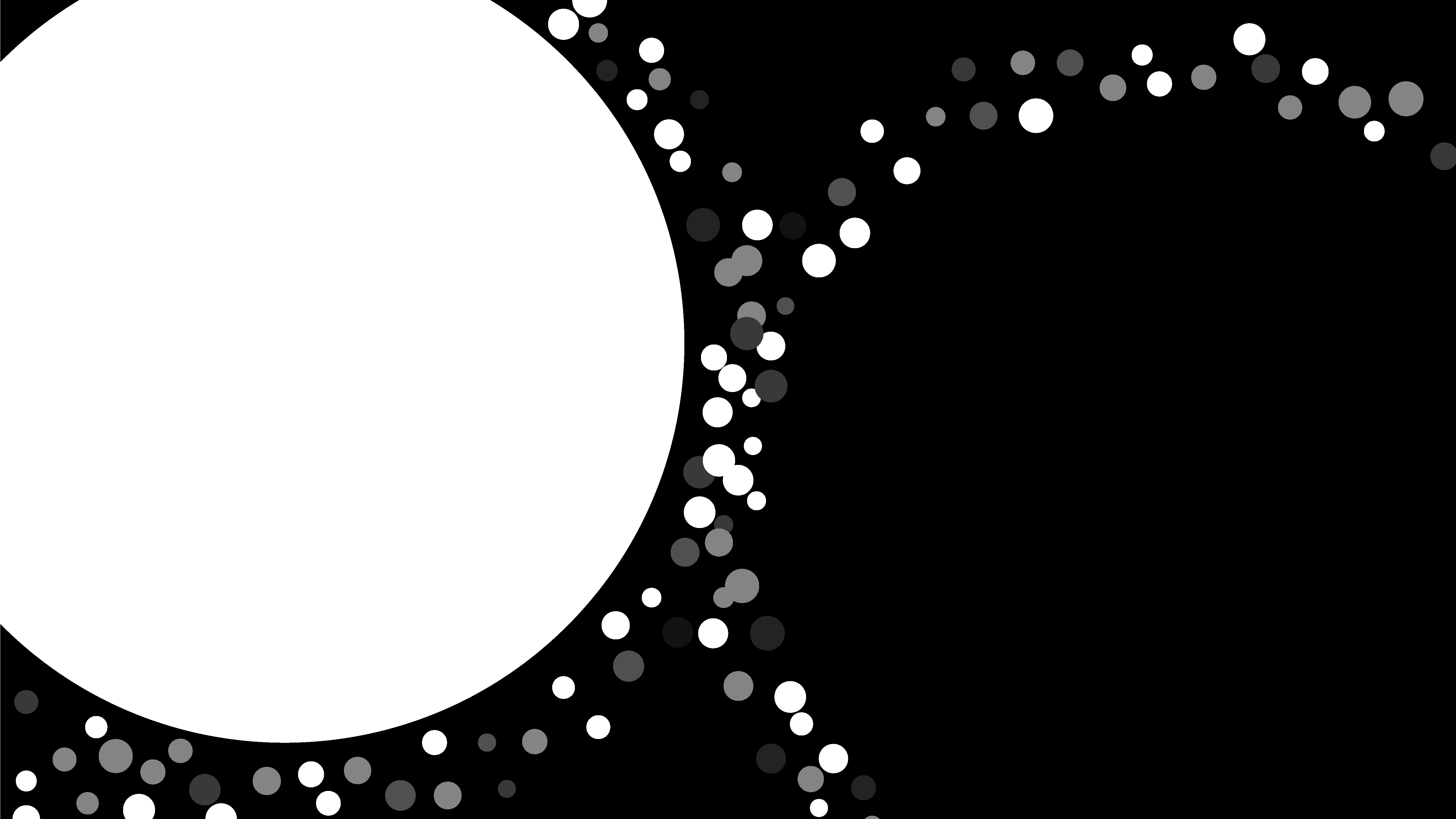
Areas of great density and detail attract attention. See how the areas on either side of the large group in the center are relatively empty?
Even if we shift the value of all the circles to pure white again, we still get the same effect. The shape in the middle, which is dense with shape and form attracts your eyes first while the spaces on either side of it do not.
Space
This one is similar to Density. We can take advantage of the space in our compositions by thinking about how to artfully balance visual elements with empty space. While you can use areas of high detail and density to attract attention, you can also use empty areas to attract attention in a certain direction toward other content.
In the example below, let’s imagine this is a two-page magazine spread. If the large white area was filled with some kind of photo or illustration then the empty black area to the right of it would make an ideal location for a headline and some text. Because of the space contrast, the reader’s eyes move naturally from the area with space that is filled to the area that is more empty. You can use this to move a reader’s eyes in specific directions.
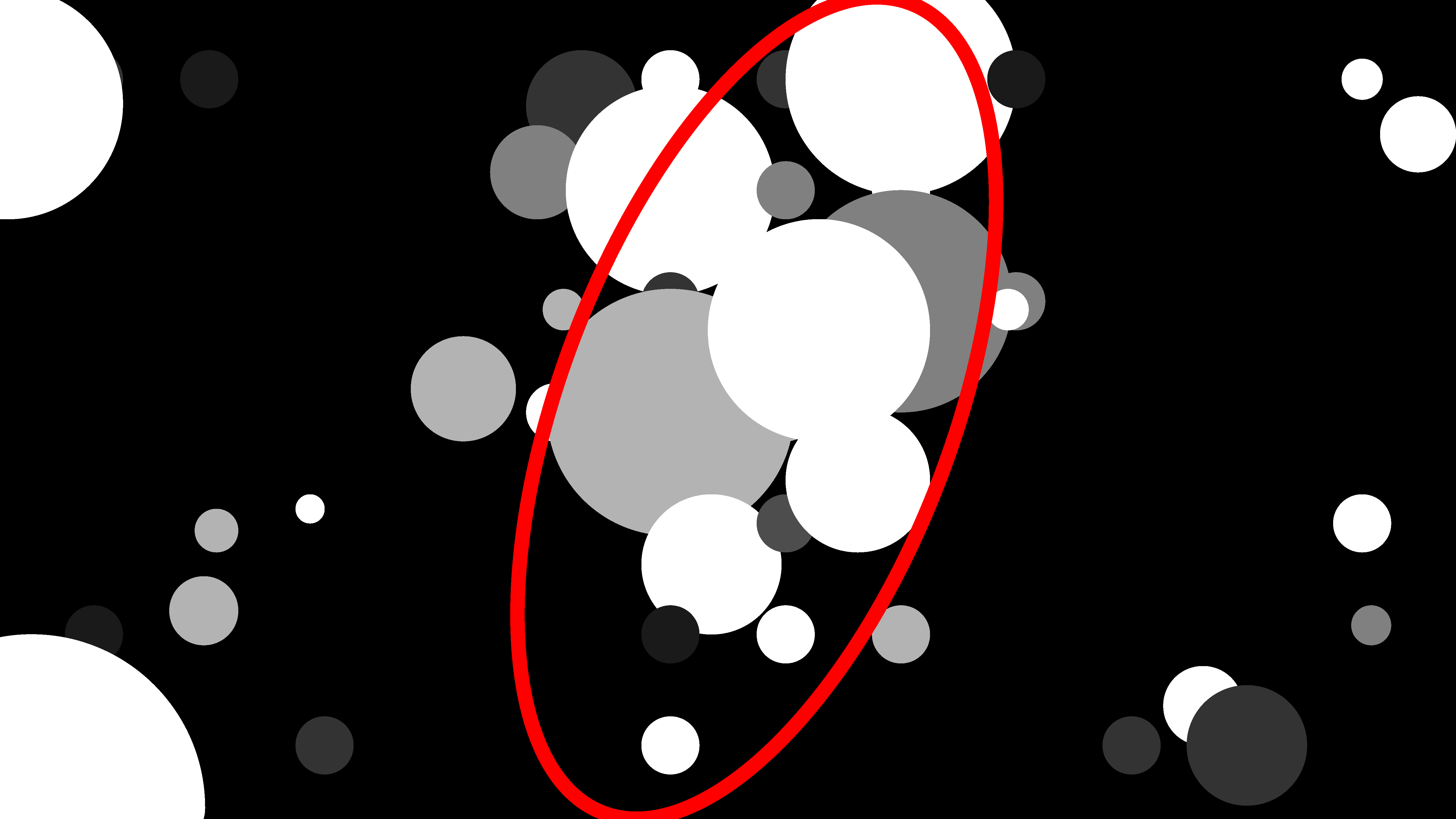
Direction
We can place elements on the page so that there is a sense of directionality to them that leads users/viewers/readers to the spaces where our content is.
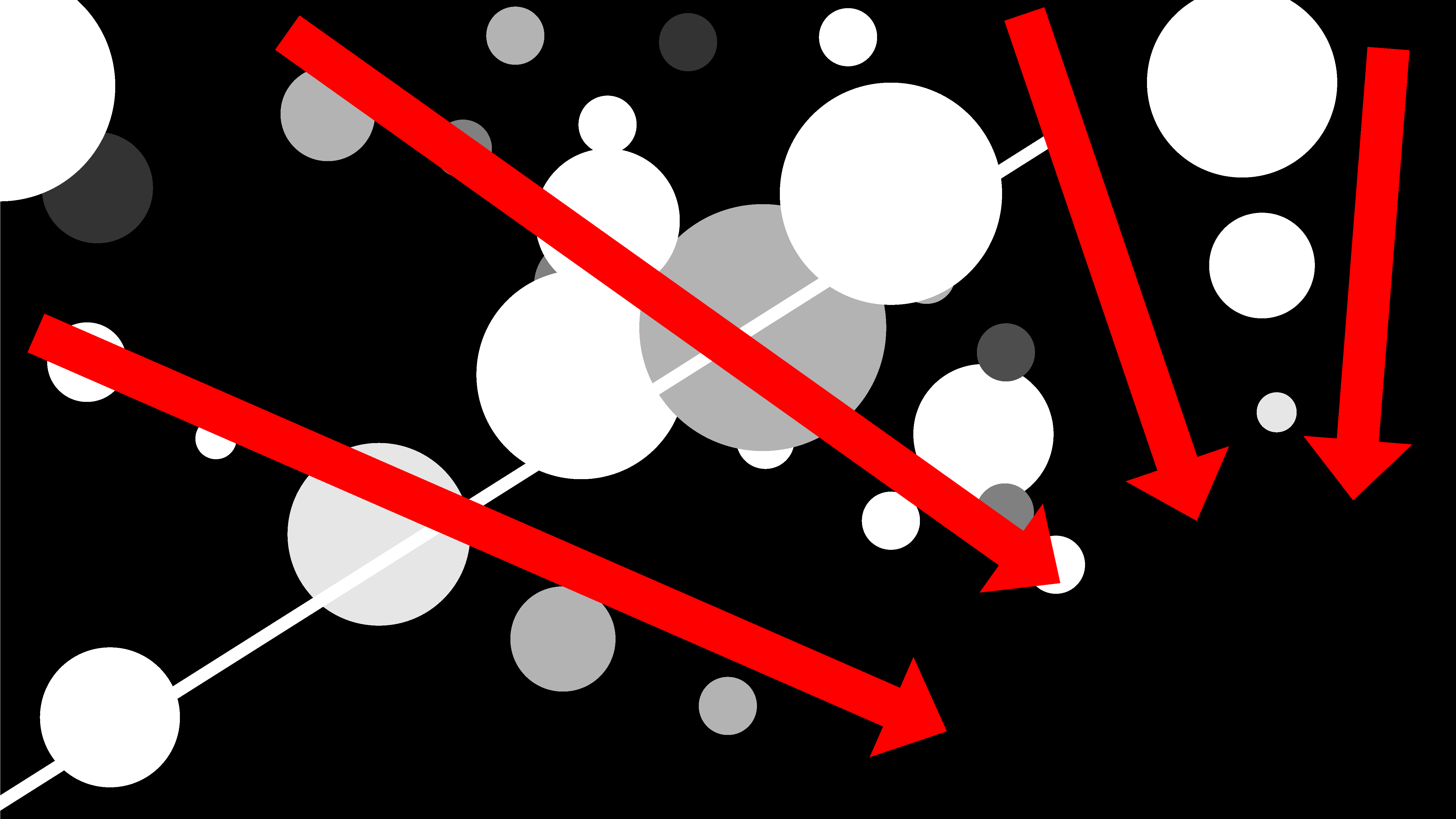
In the example below, we just have a few more randomly scattered circles with random values.
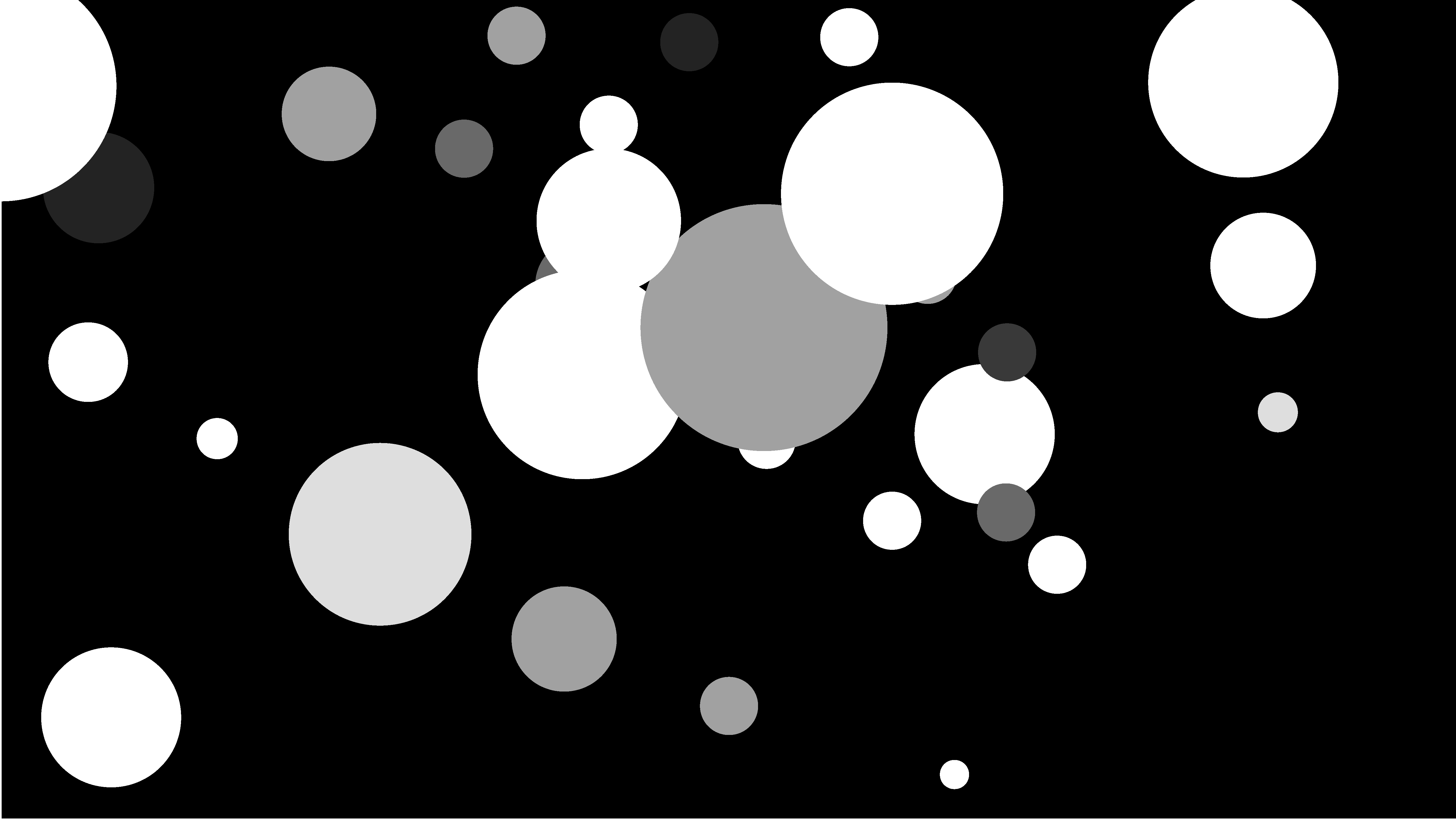
It feels like our eyes are being drawn in a certain direction, right? Remember Gestalt principles? When objects are aligned (or close to being aligned) our brains perceive them as part of a whole. In the example below, the individual elements (the circles) are lined up in orientations that all point to the bottom right of the image.
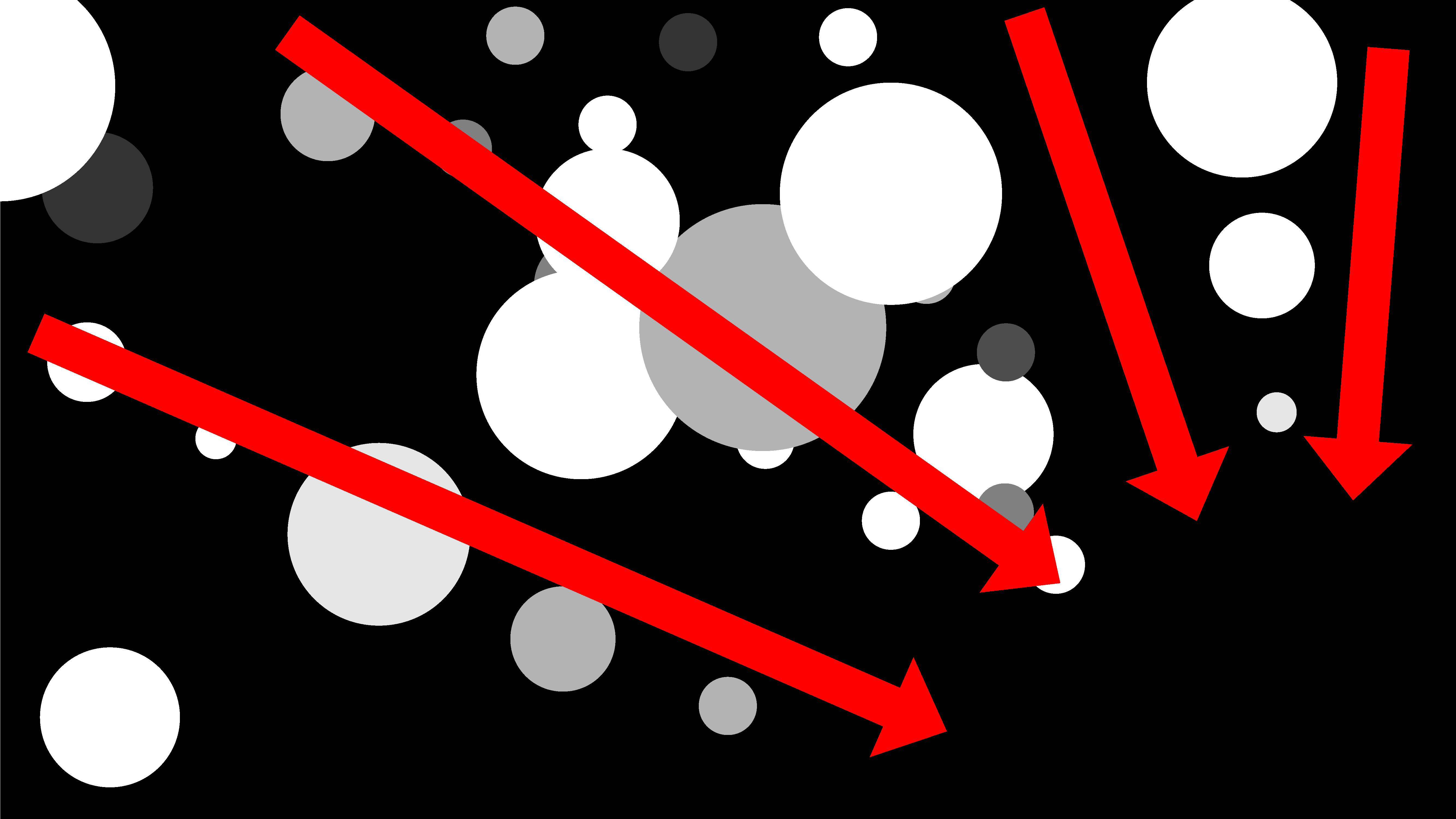
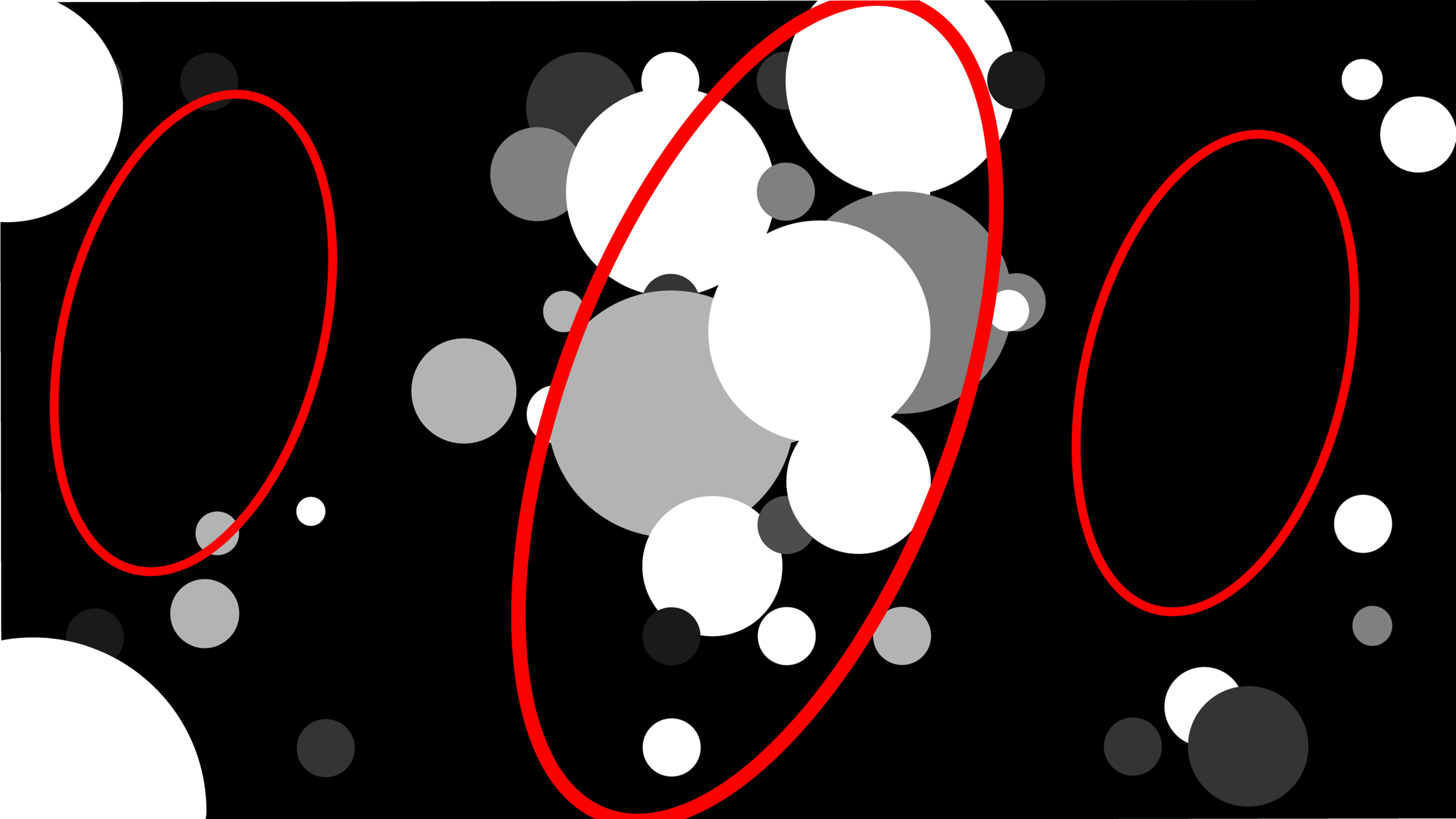
We can get a better sense of this if we add in a line that points in a perpendicular direction than the direction of the elements in the layout. The thin, diagonal line interrupts the visual flow of the layout.

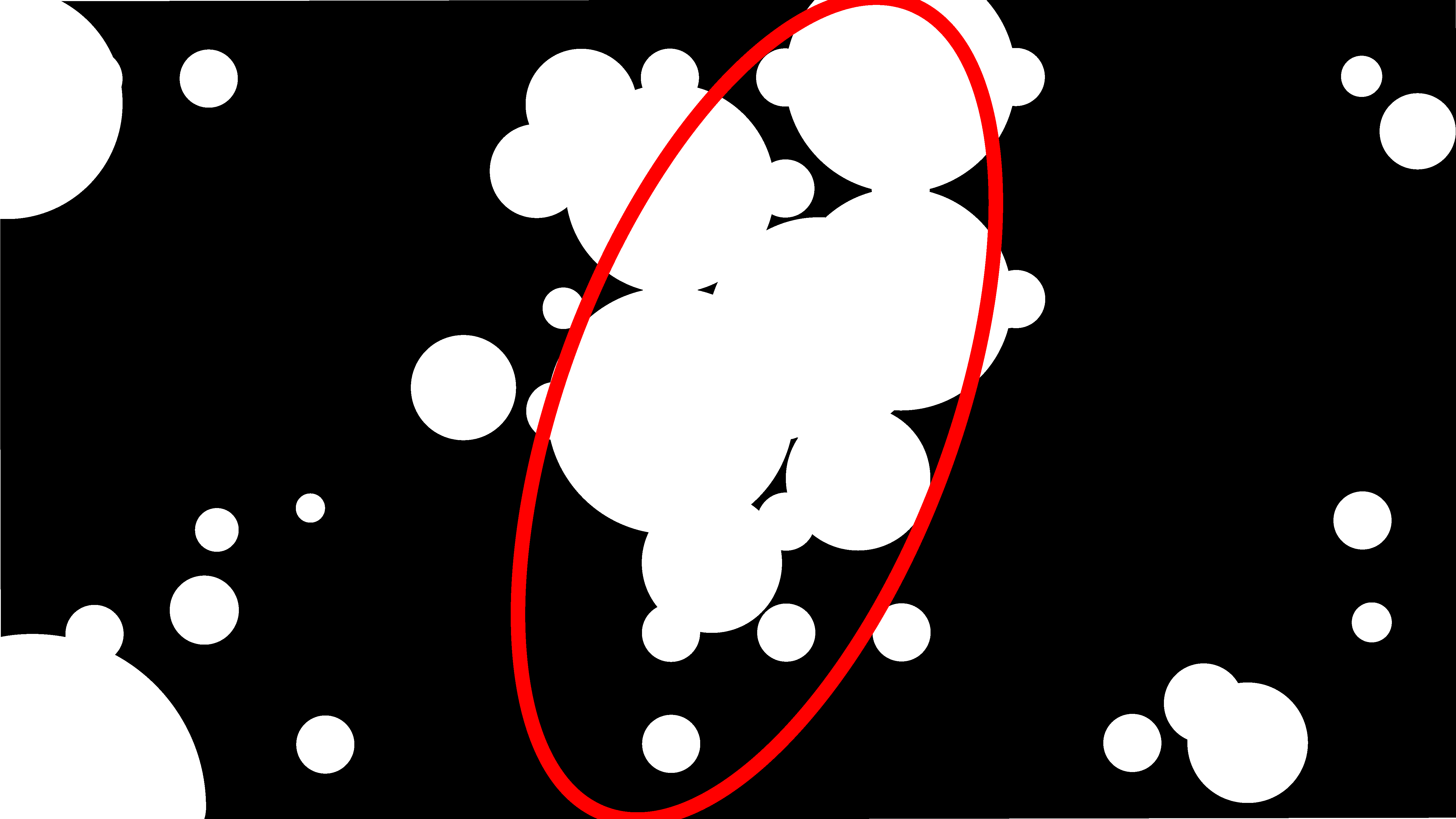
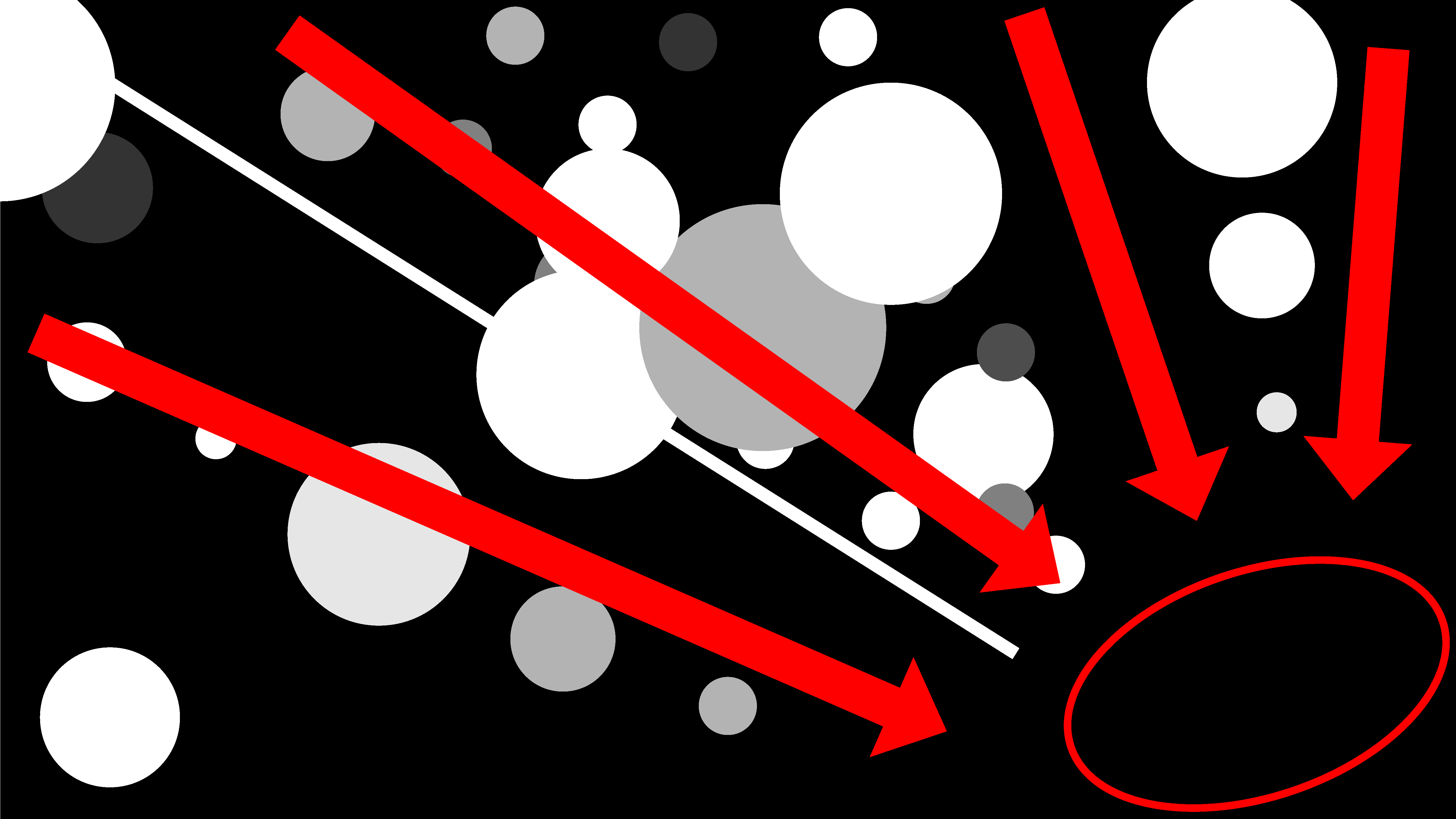
If we rotate the thin line, it becomes incorporated into the layout. Its direction matches that of the other elements.

Texture
We can use texture contrast to set elements apart from each other to guide readers’ attention as well as use them to enhance the richness and aesthetic quality of our work.
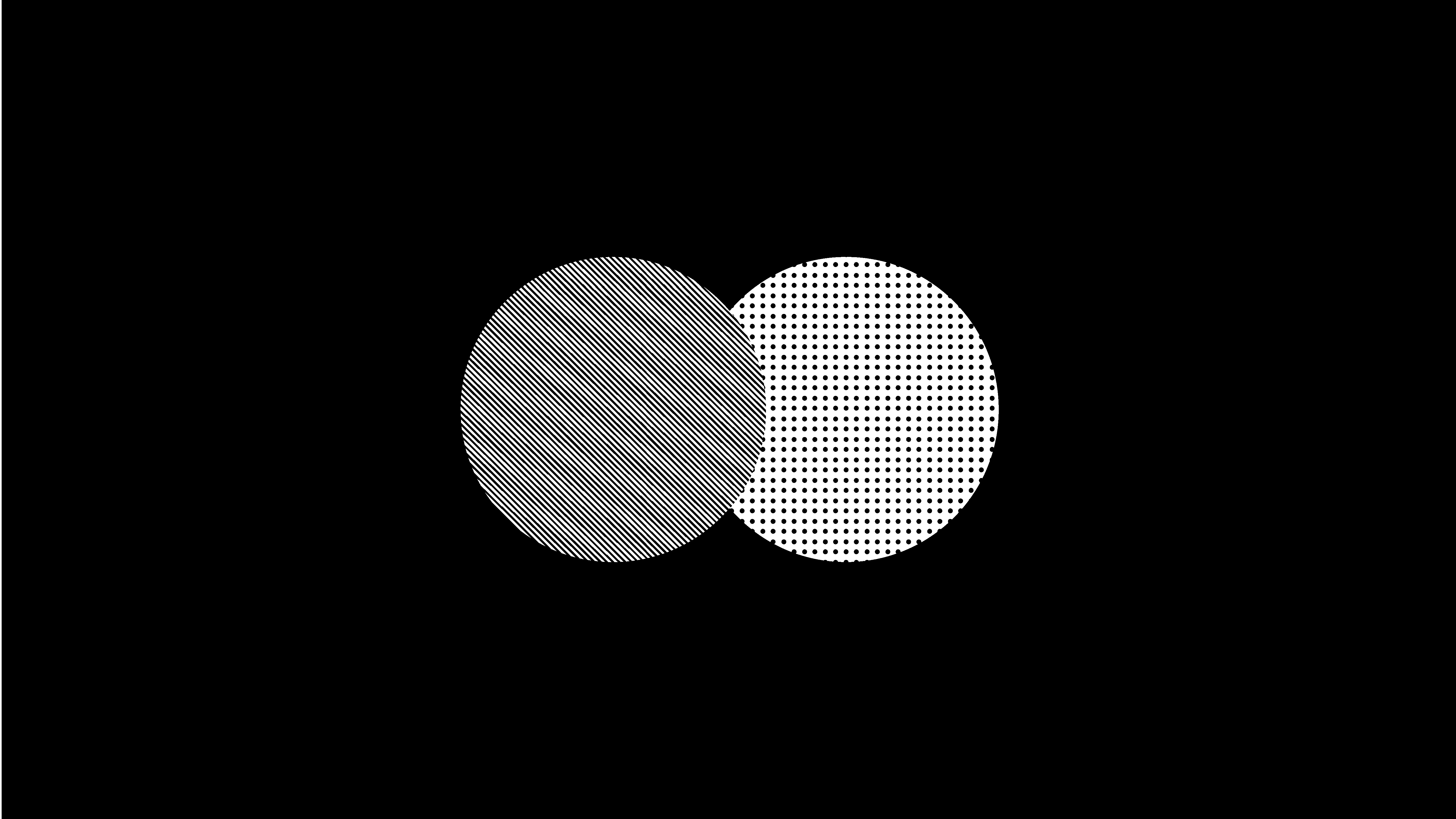
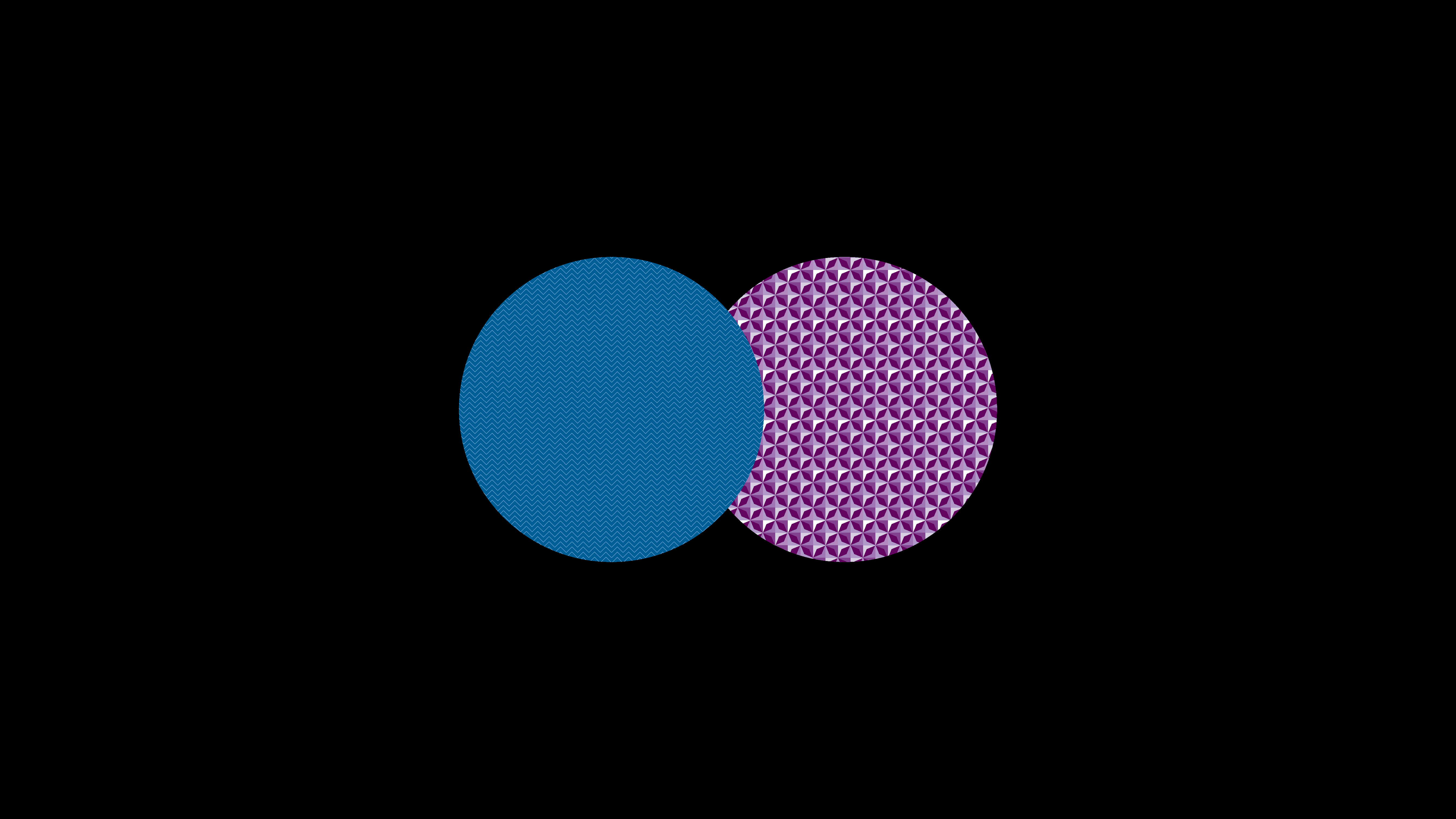
In the example below, the two white circles have no texture. They appear to be one object.

But when you add contrasting texture to both, you can see the separation between them.
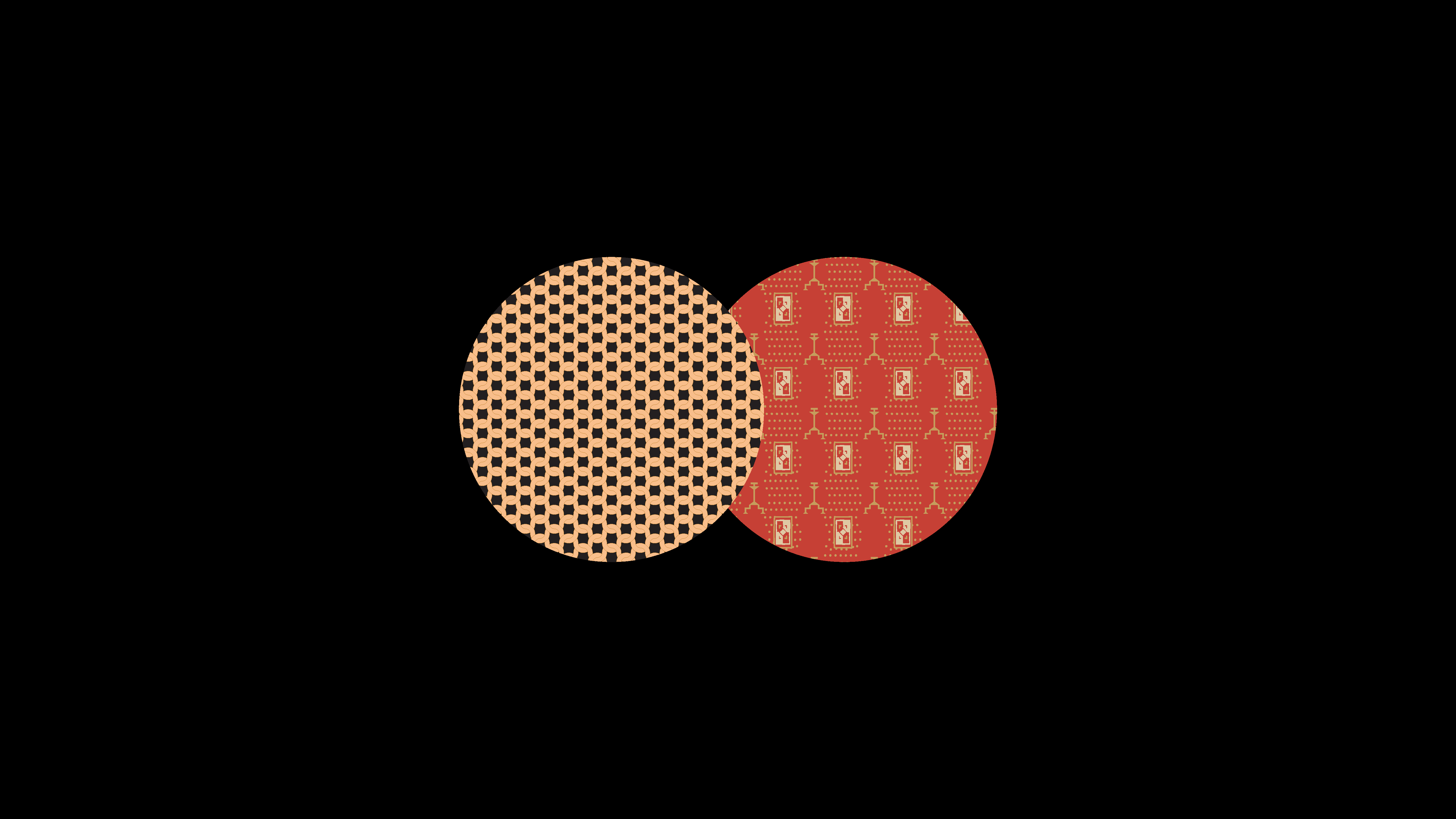
We can also add visual style to objects using texture contrasts. In these cases, we want to be aware of any color relationships we may create as a result.
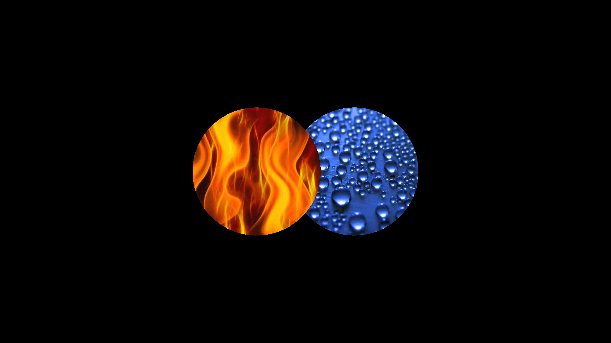
Images can be used as textures artfully to build a narrative or highlight differences in ways that a simple surface texture may not. The image below does just that by using photos of fire and water droplets on a surface. We aren’t quite sure what the specific story to be told is, but upon first glance we know just by looking at the texture contrast that it is a story of opposites or opposing forces.
Color
Color contrast is another way to set elements apart from each other.
In the below example, there are two circles. They are the same green-blue color as the background so you can’t see them.
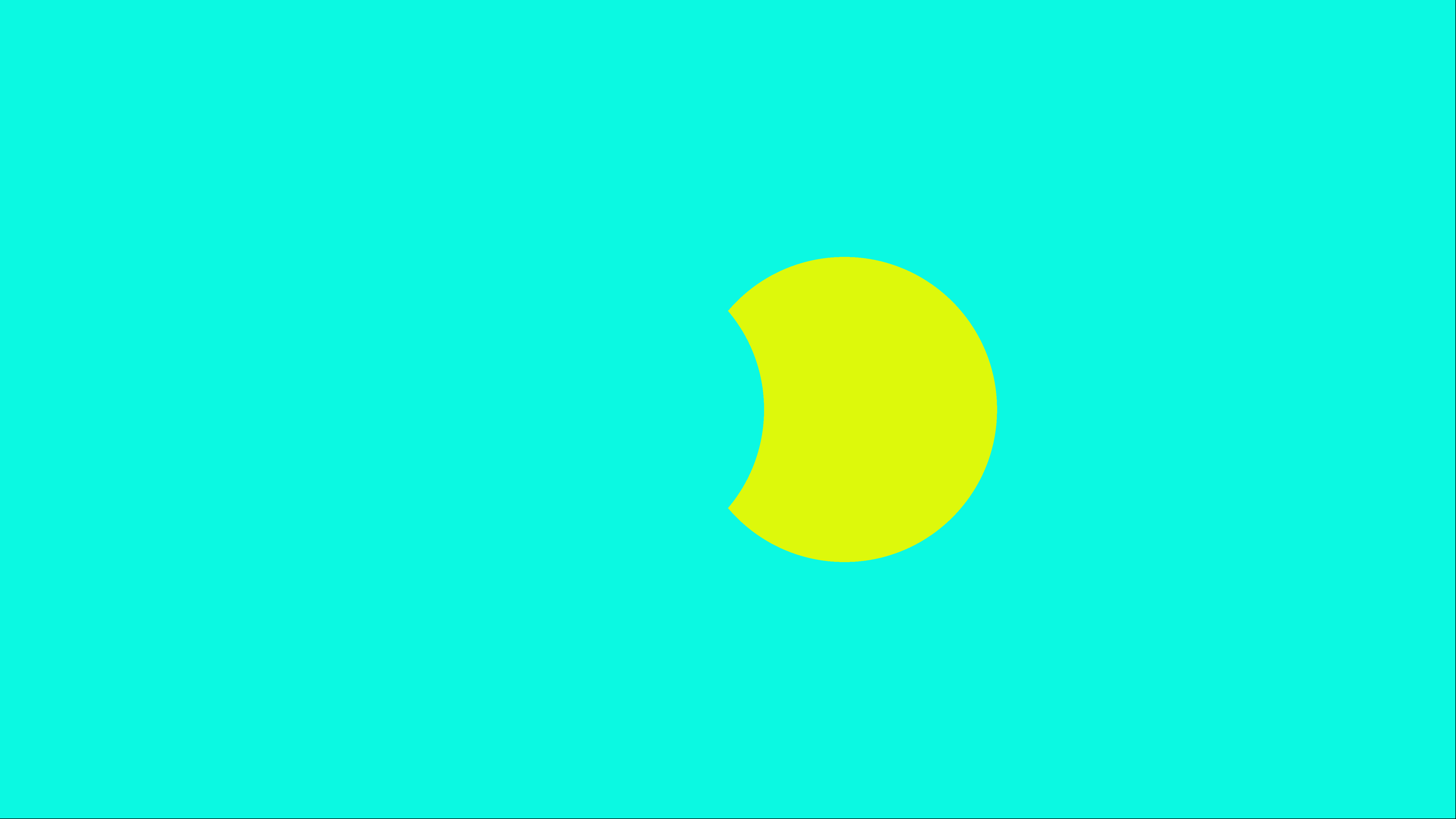
But, as you can see in the example below, if we shift the Hue of the circle on the right to yellow, it clearly stands out from the background.
And if we shift the Hue of the circle on the left to magenta, it also becomes set apart from the background.
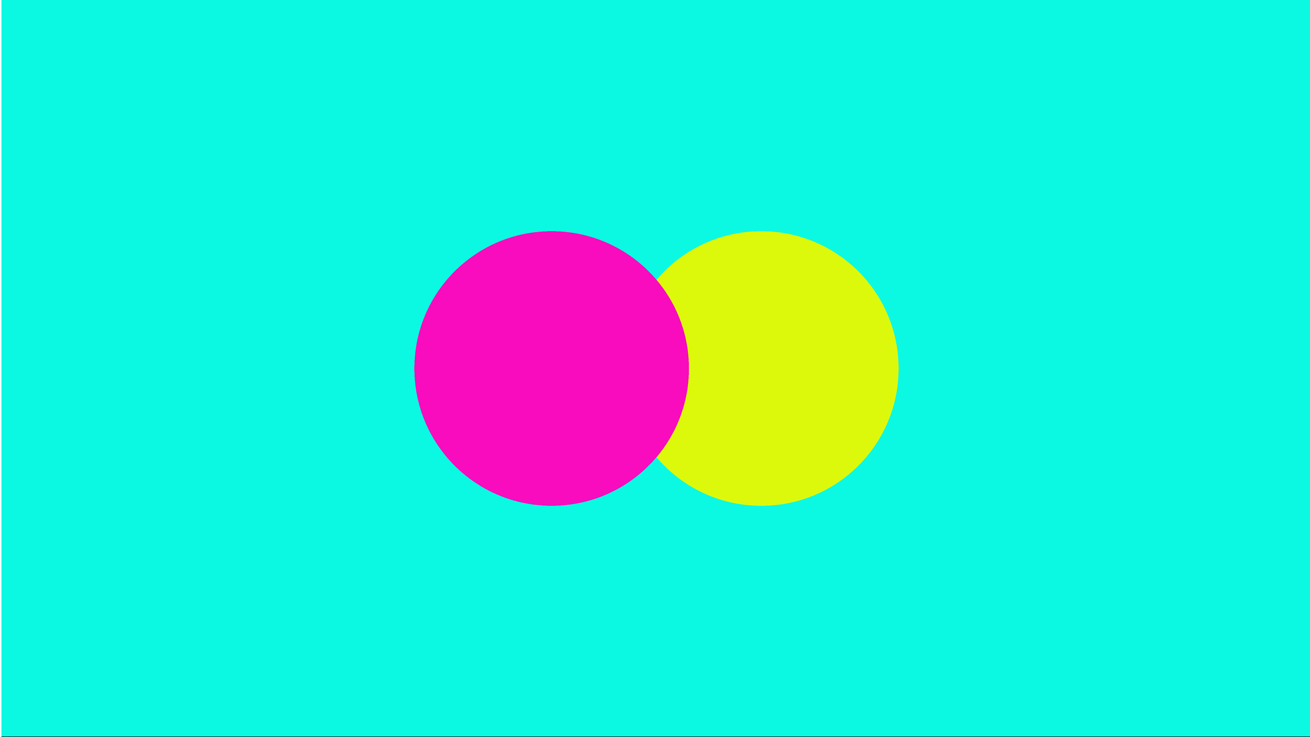
When choosing color schemes for any project, always make sure that the colors you lay on top of each other contrast well. Without good color contrast, all of your page elements can start to blend together.
Depth
Adding three-dimensional depth can create a sense of pulling the viewer into the composition, which always makes for more engaging content.
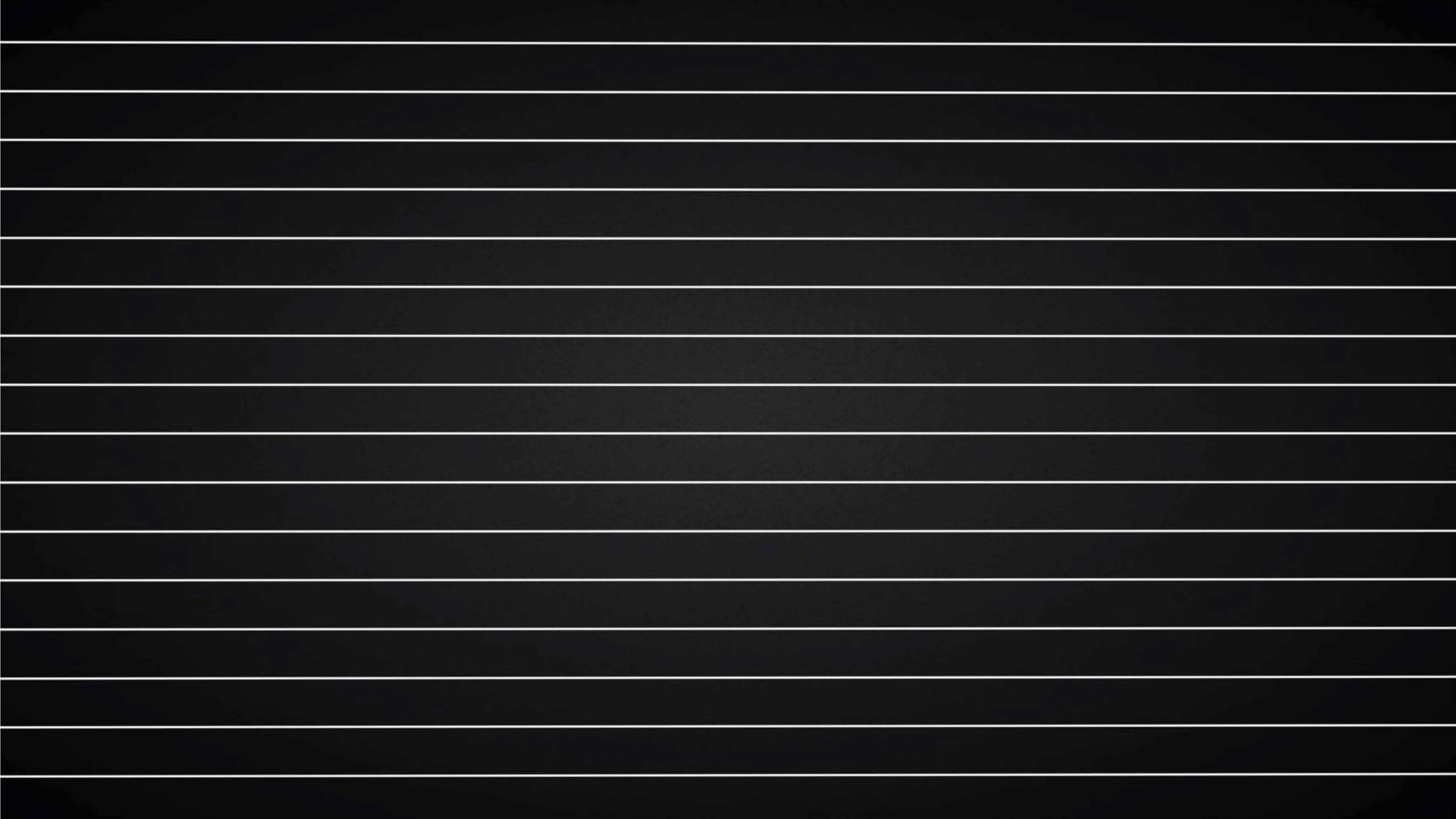
In the example below, the white lines are pretty useless. You can’t really tell what they are and they don’t point anywhere but from side-to-side.
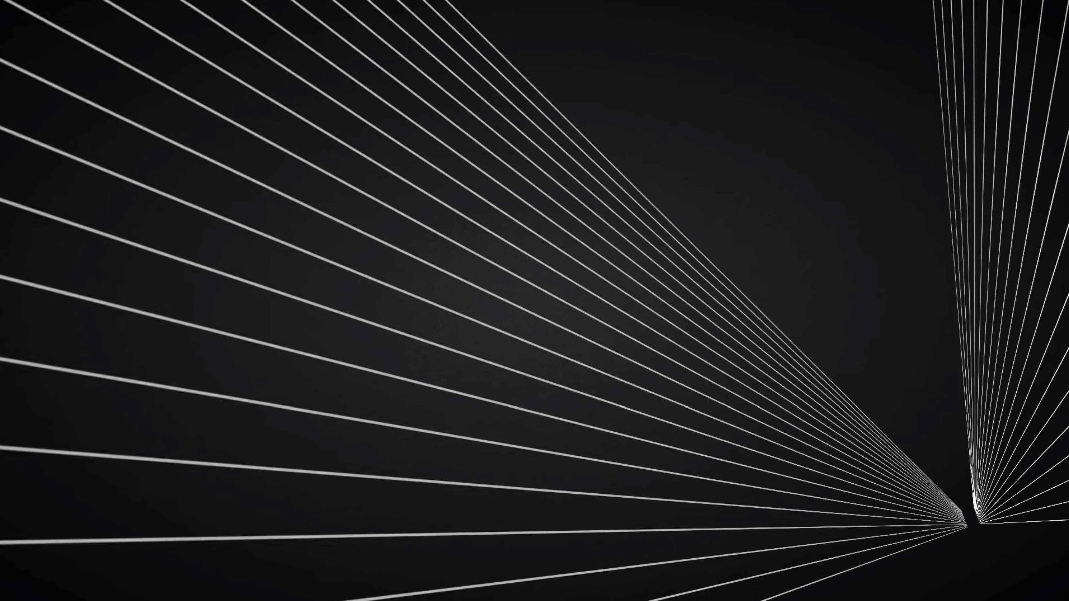
But once we place these lines into a space that has three-dimensional depth, we all of the sudden have the ability to focus the viewer’s attention based on where objects sit in 3D space.
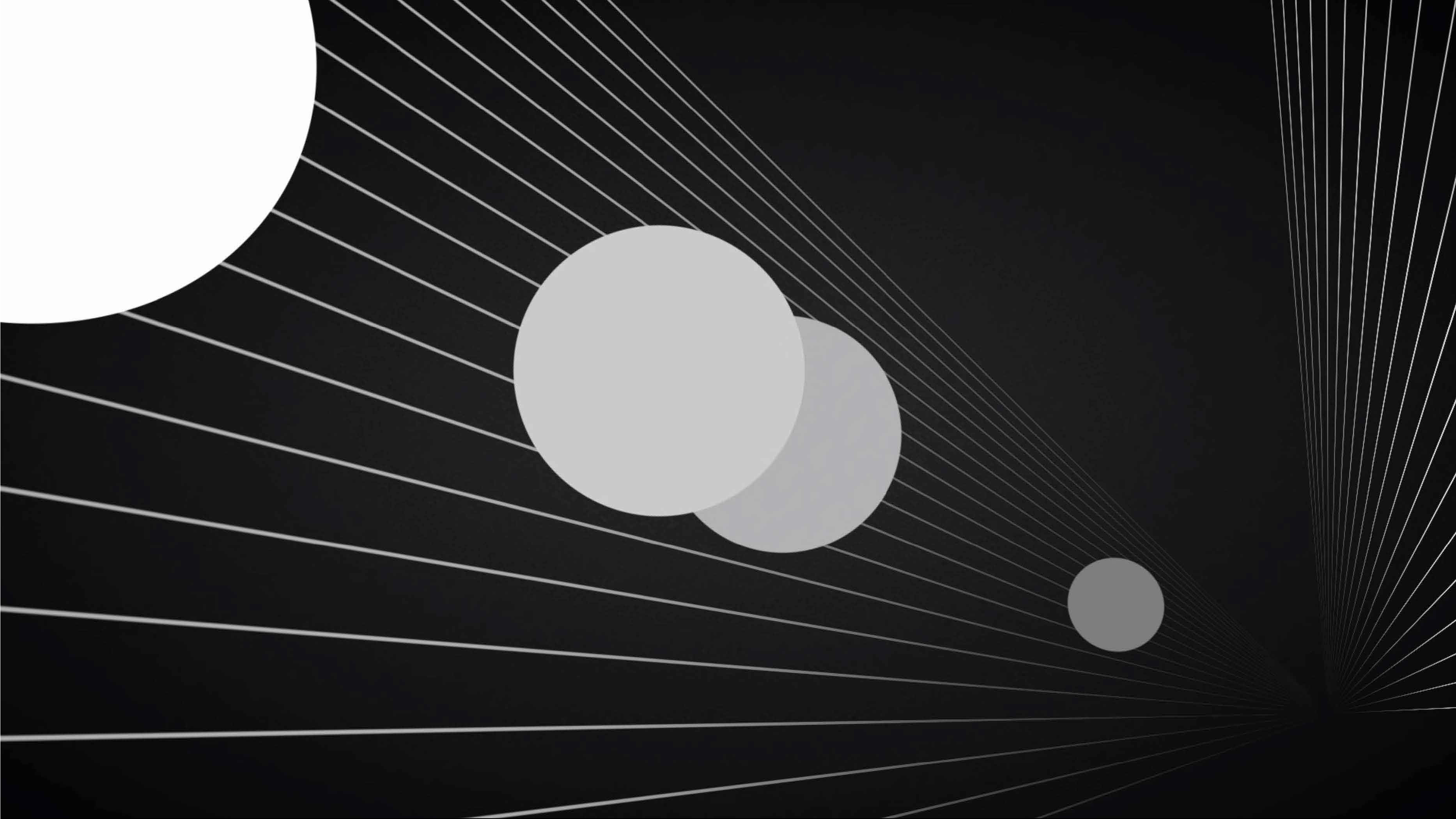
Let’s add some circles into this deep space we have created. We kind of have an idea of where these circles sit in 3D space, but they don’t have much detail so it is hard to tell what we should focus on.
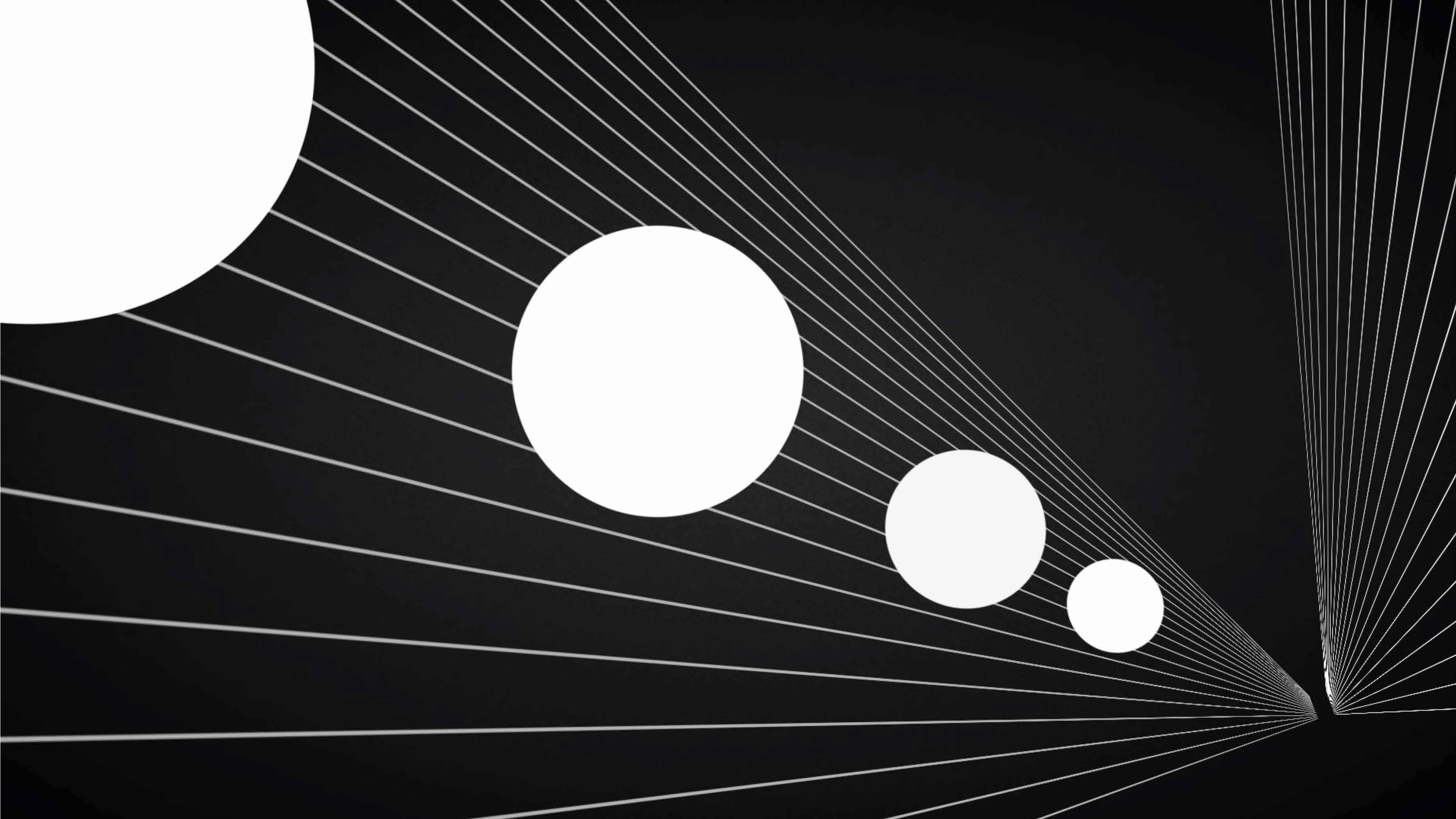
In the example below, we have altered the value of the circles slightly to better show where they sit in 3D space. Objects get both smaller and darker as they get farther away from our eyes.
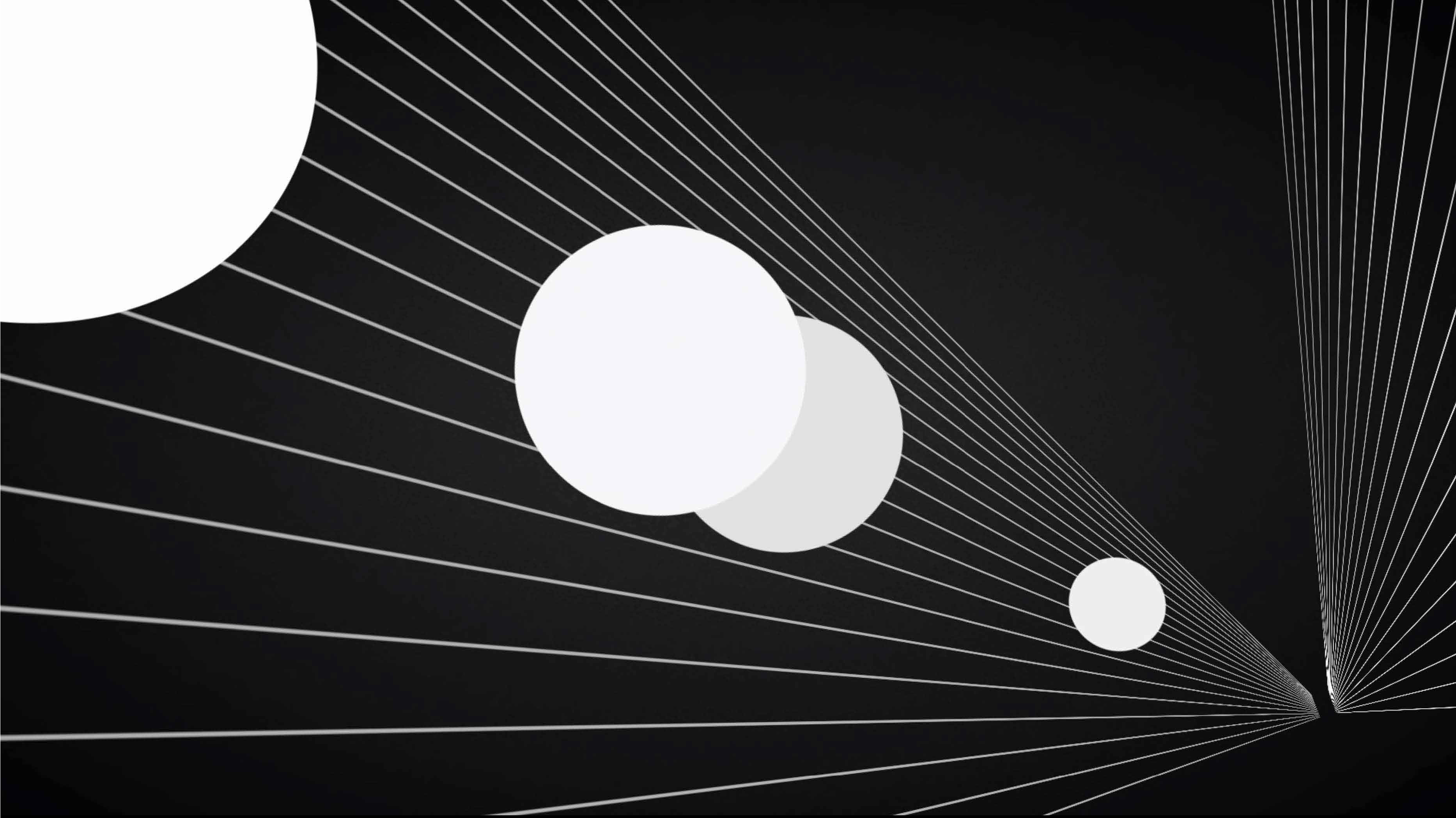
We can draw further depth contrast by adding what is called atmospheric fog into the background. Atmospheric fog is a phenomenon where light is scattered by the planet’s atmosphere, creating a fuzzy and blurry effect.
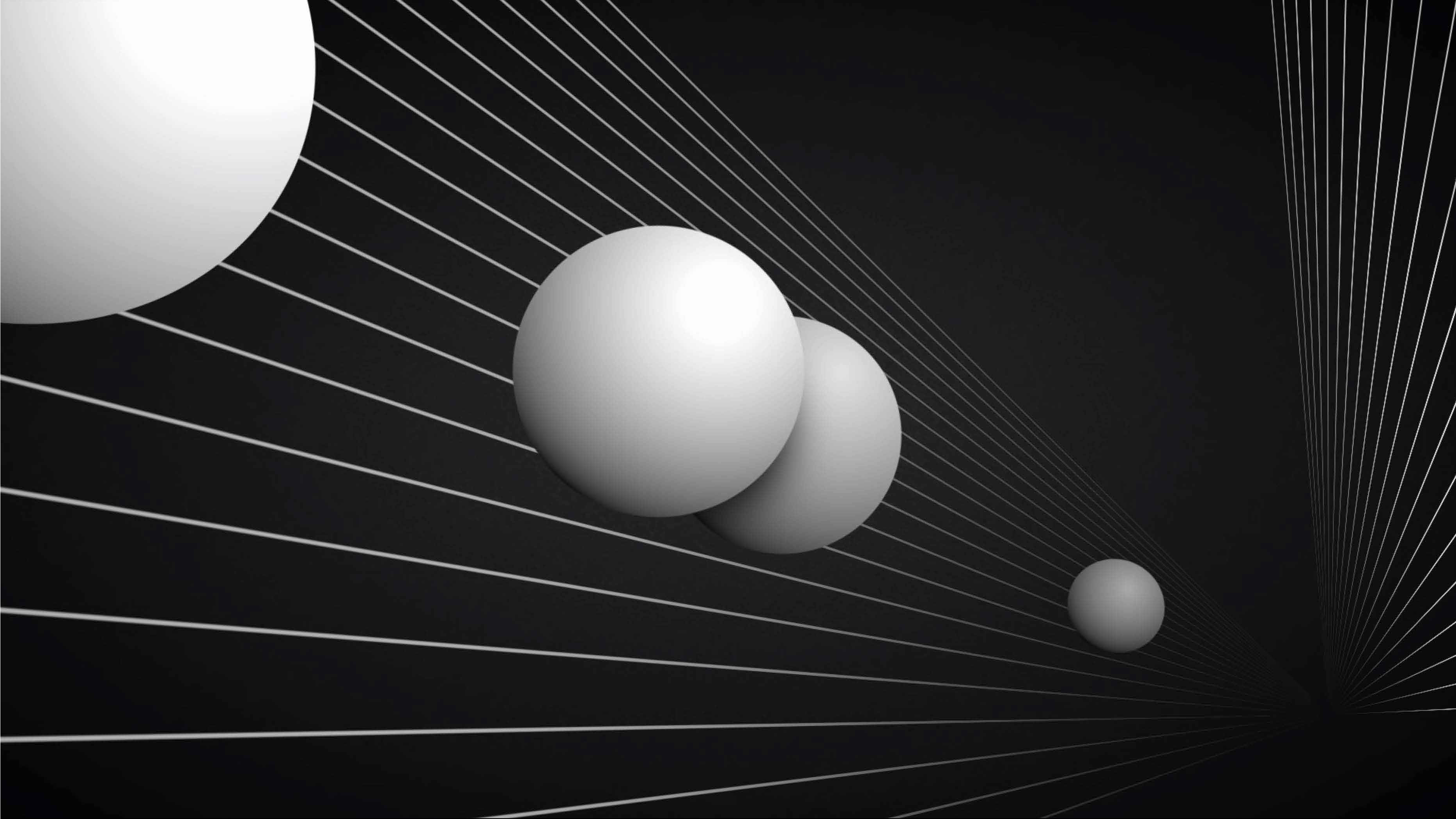
Another way to show depth contrast between objects is to give them 3D contours. In the example below, you can see that realistic shadows have been added to turn these circles into spheres. We can now clearly see where these perfectly-round objects live within the depth of this 3D space.
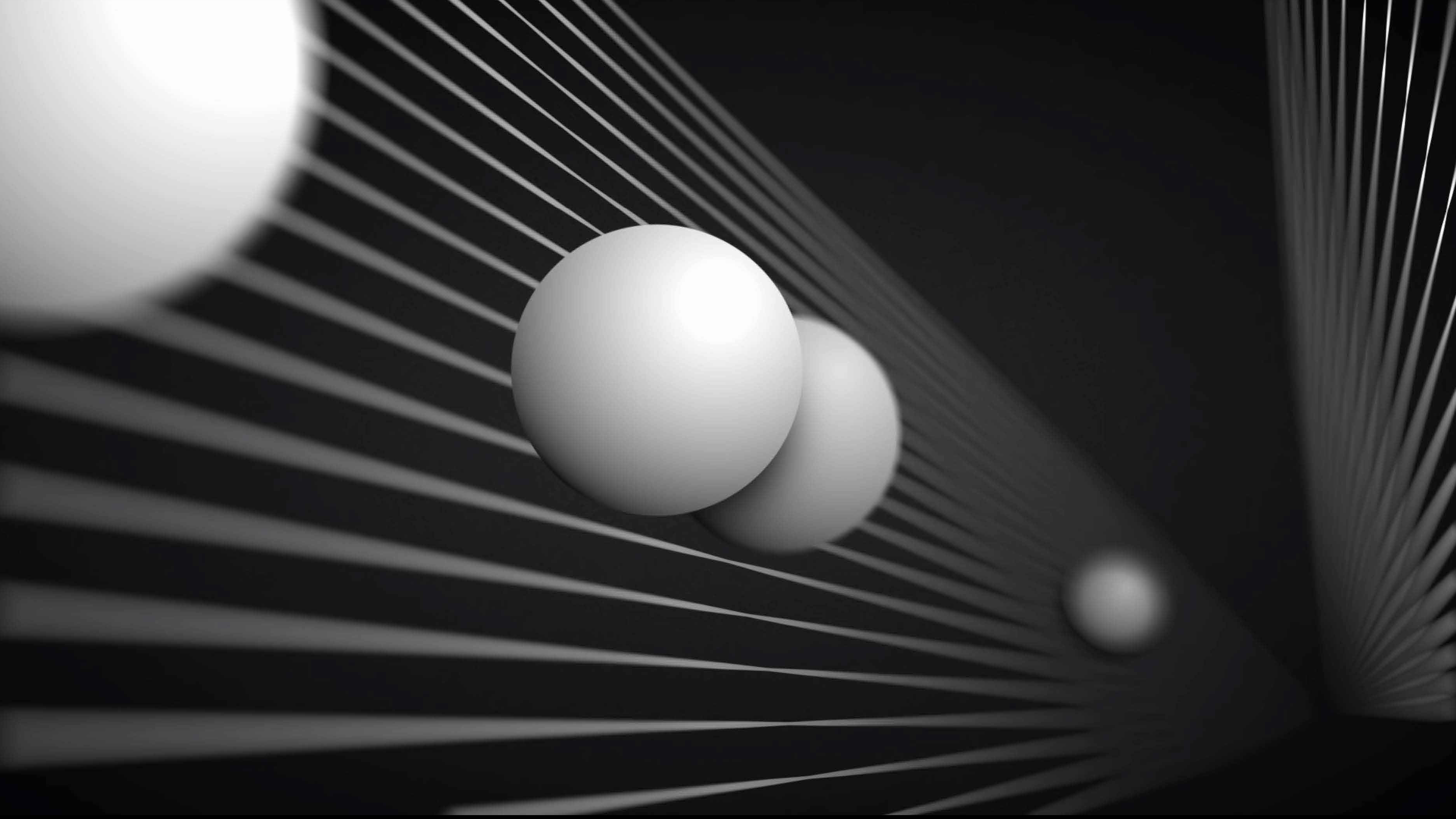
One final way to add a bit of stylized contrast and emphasis is to add what is called depth of field effects. Depth of Field is the distance between the nearest and the farthest objects that are in acceptably sharp focus in an image. In the image below, you can see that the objects that are in the foreground and background are blurred while the one sphere slightly to the left of the center is in focus. Our eyes know we are supposed to focus on that specific sphere over the others.
Simple Strategies For Using Contrast to Draw Attention
Negative Space
Keep the user focused while keeping areas around it relatively empty. This helps highlight the most important content in the composition.
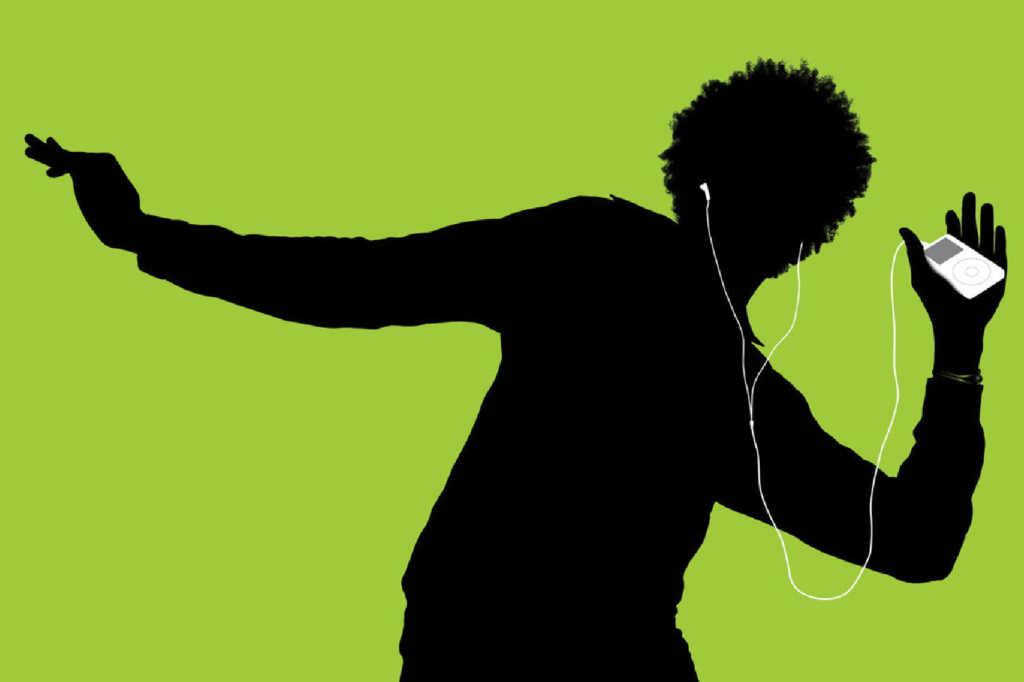
Silhouettes
One way to draw people’s attention is to use silhouettes of familiar things such as animals, common objects and recognizable symbols.
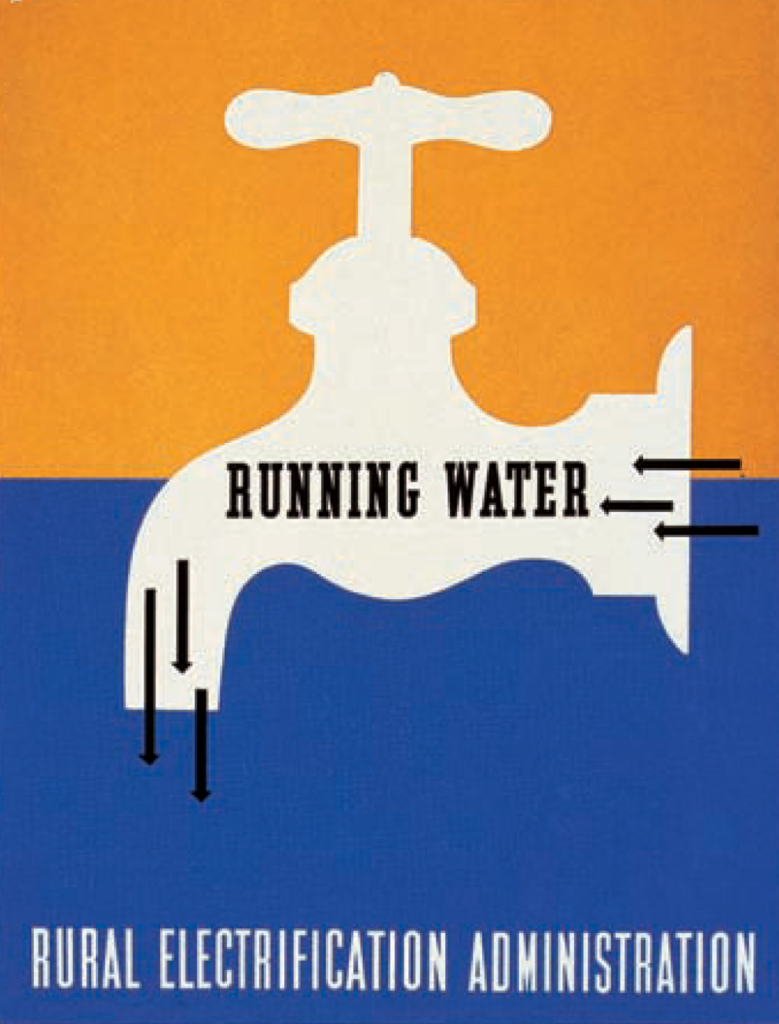
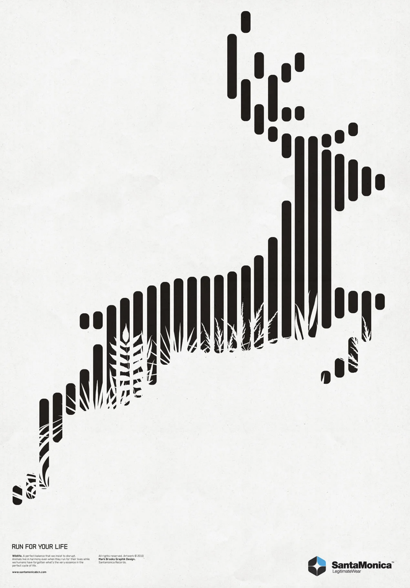
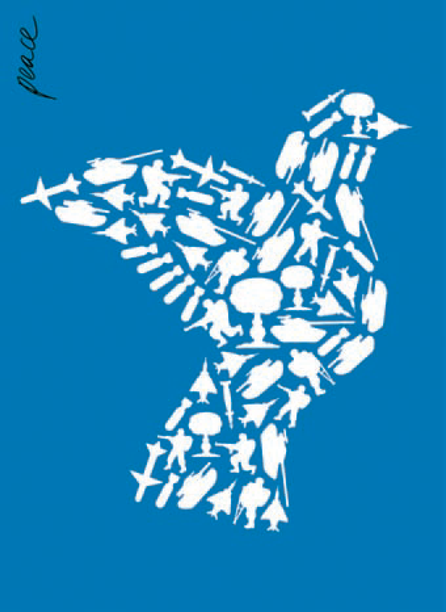
The silhouette of the human body is one of the most recognizable shapes in the world. Use that to your advantage when you can.
Framing
Always be conscious about how you “frame” your compositions. Use the Rule of Thirds to organize your composition and put the most important elements at or around one of the four focal points.
These four intersections are the areas around which to place the most important elements in a composition.