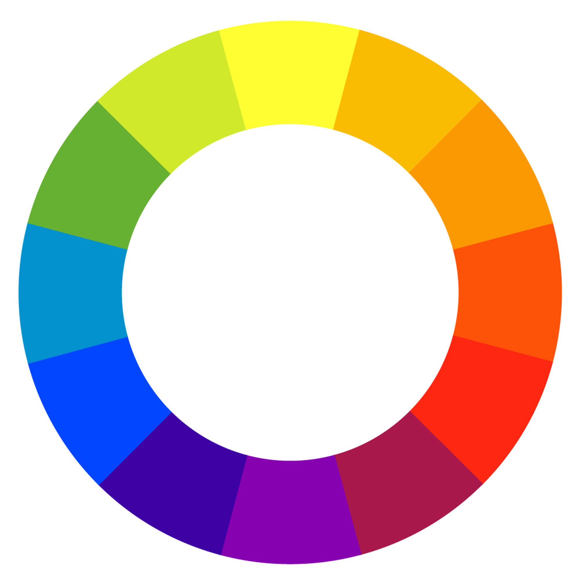
The Color Wheel
The first color wheel was created by Sir Isaac Newton in 1666 after he saw light refracted through a prism. In the image below, you can see an illustration portraying what it looks like when white light is refracted through a prism.
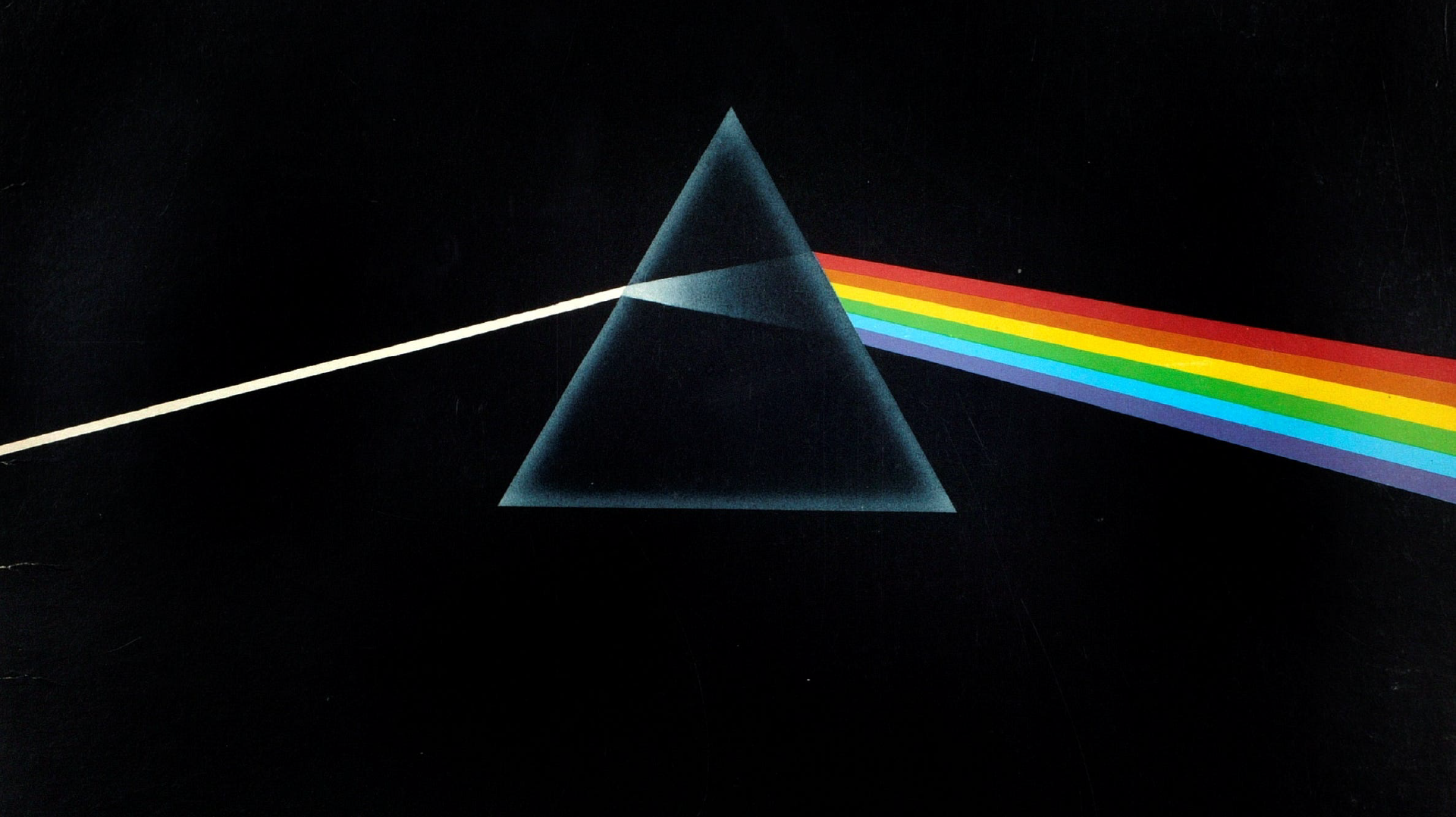
When light is refracted through a prism, it is separated into a spectrum of individual colors. They are, in this order:
-Red
-Orange
-Yellow
-Green
-Blue
-Indigo
-Violet
You can remember them using the mnemonic ROY G BIV.
For our purposes, we will not worry too much about the color Indigo. But just know that it exists as a color in the spectrum of visible light.
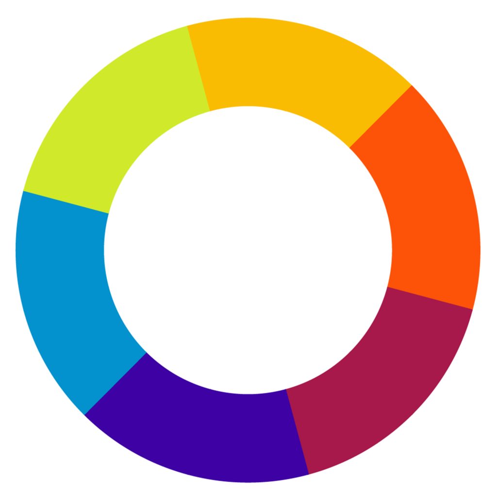
Types of Colors
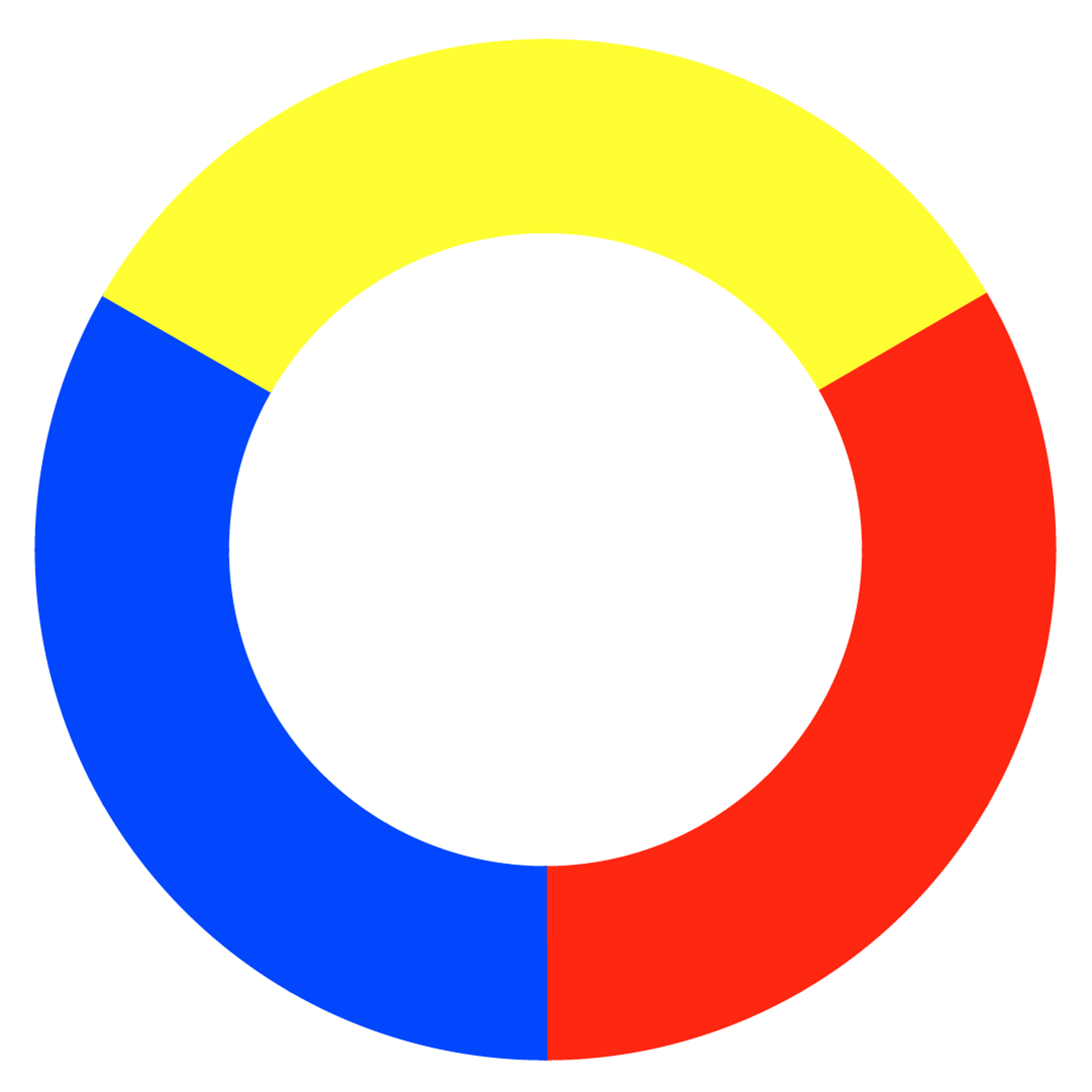
We have three different types of color:
Red, Blue, and Yellow.
Primary colors are the three colors that cannot be formed by mixing any other colors. All other colors derive from mixing these three.
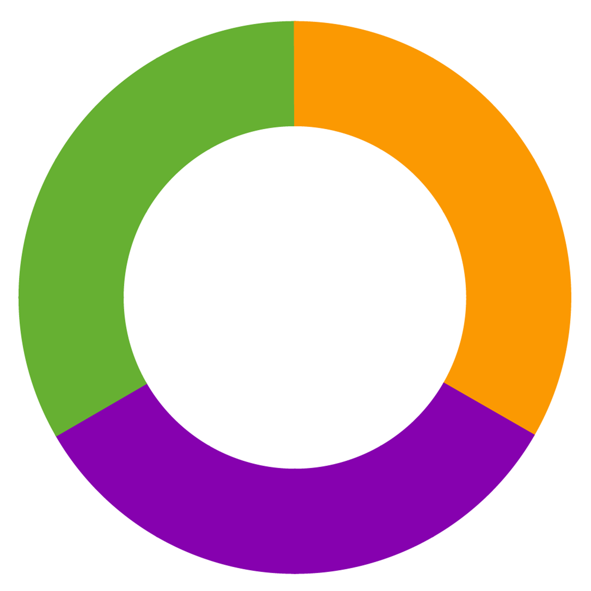
Green, Orange, and Violet
Secondary colors are formed by mixing different pairs of the three primary colors.
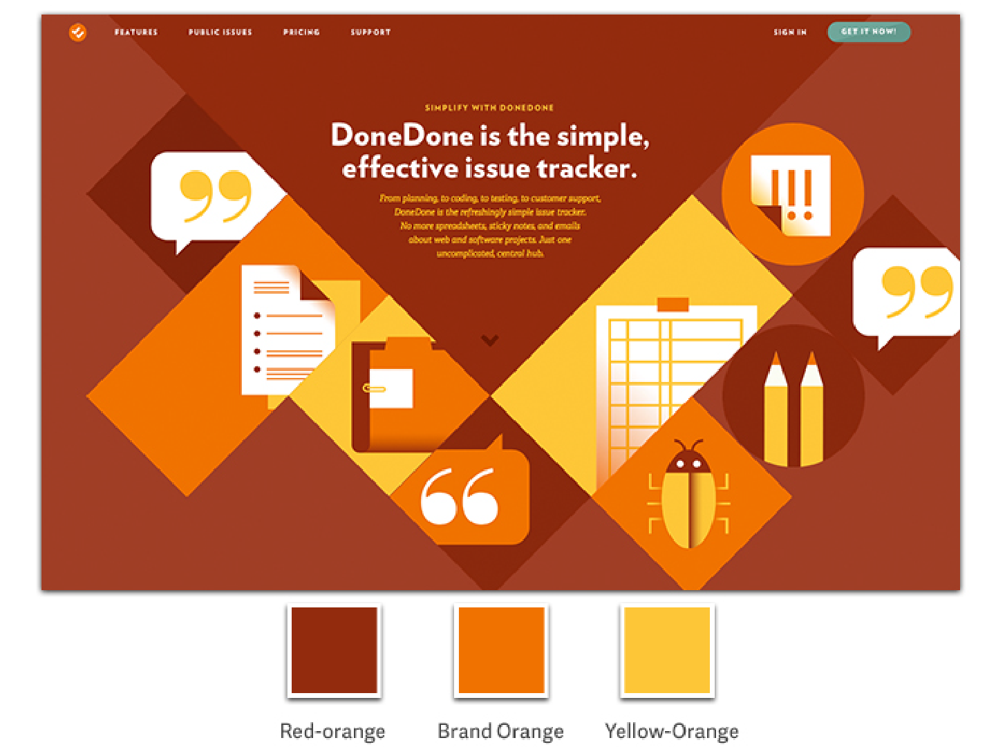
Red-Orange, Yellow-Orange, Blue-Green, Yellow-Green, Blue-Violet, Red-Violet
Tertiary colors are formed by mixing one primary and one secondary color.
Basics of Color Theory
Color Quality
Hue – Distinct color identity
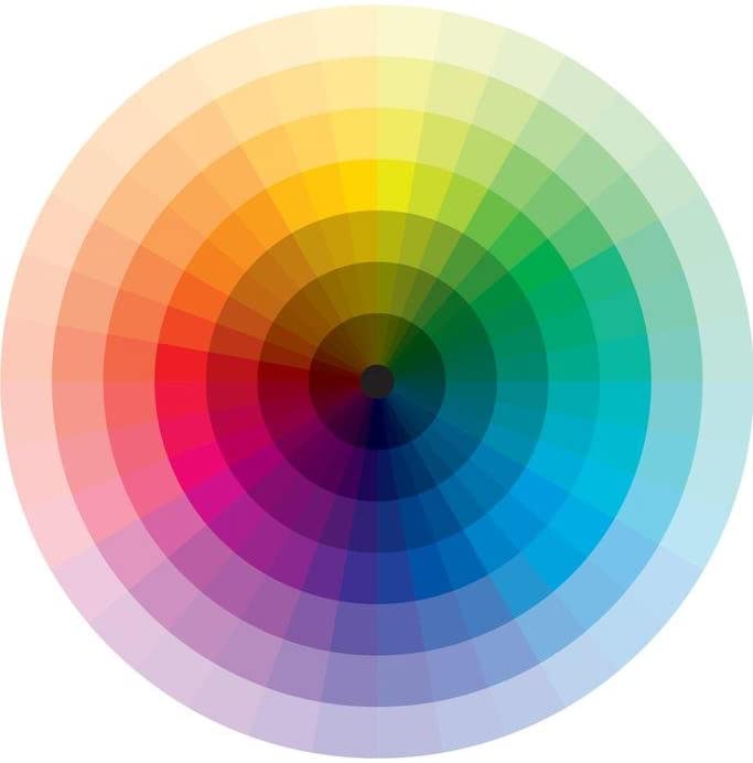 Saturation – How rich or how dull is it?

Value – Light or Dark?

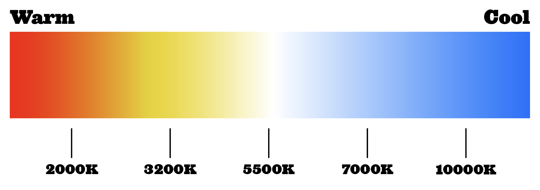
Temperature – Warm or Cool?
Color Harmony
Harmony creates a sense of order and balance within a composition. When choosing a color scheme, you want to consider the themes, associations, and feelings those combinations may evoke in a user/viewer/reader.
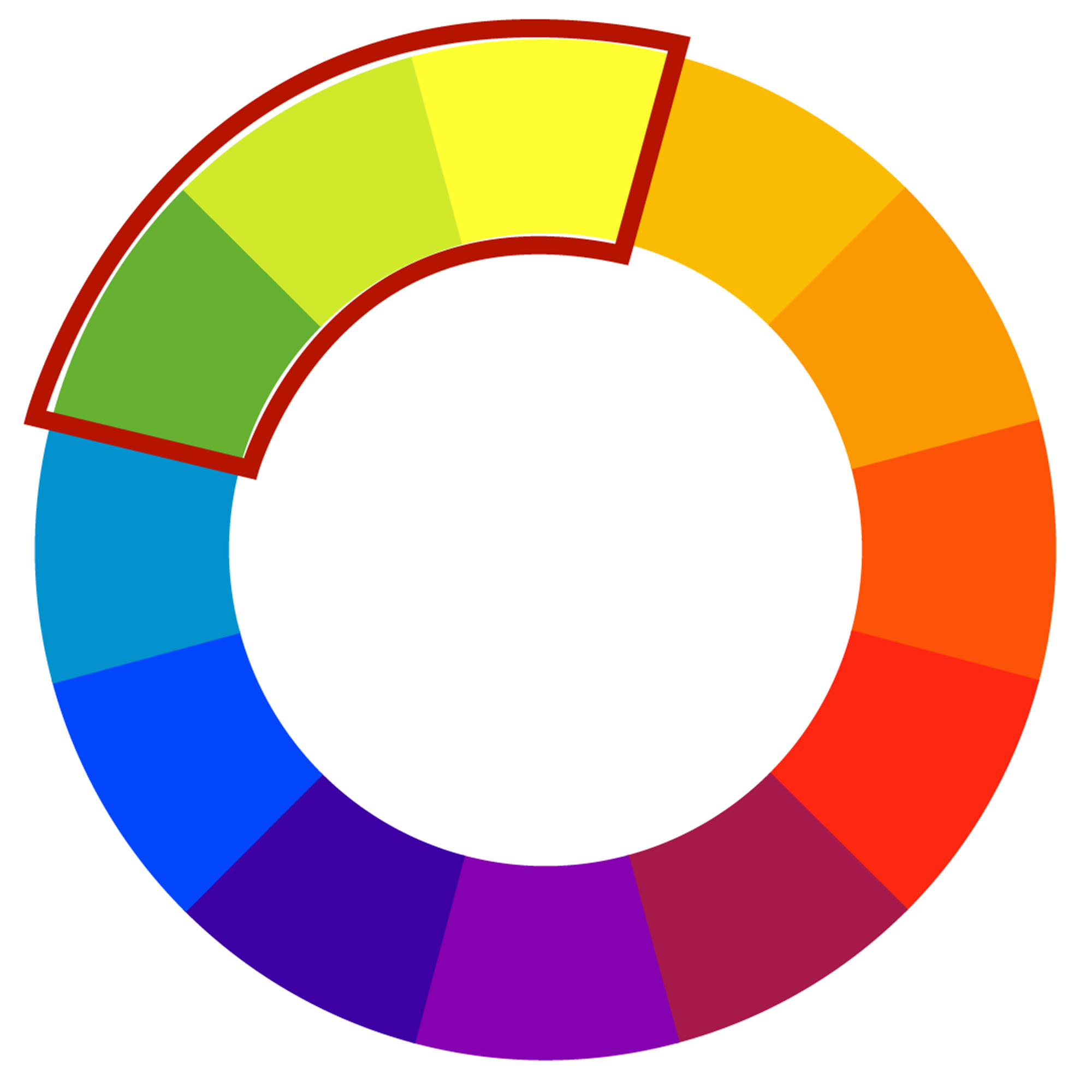
Color Schemes
There are many types of color schemes:
Any three colors that are side-by-side on a 12-part color wheel.


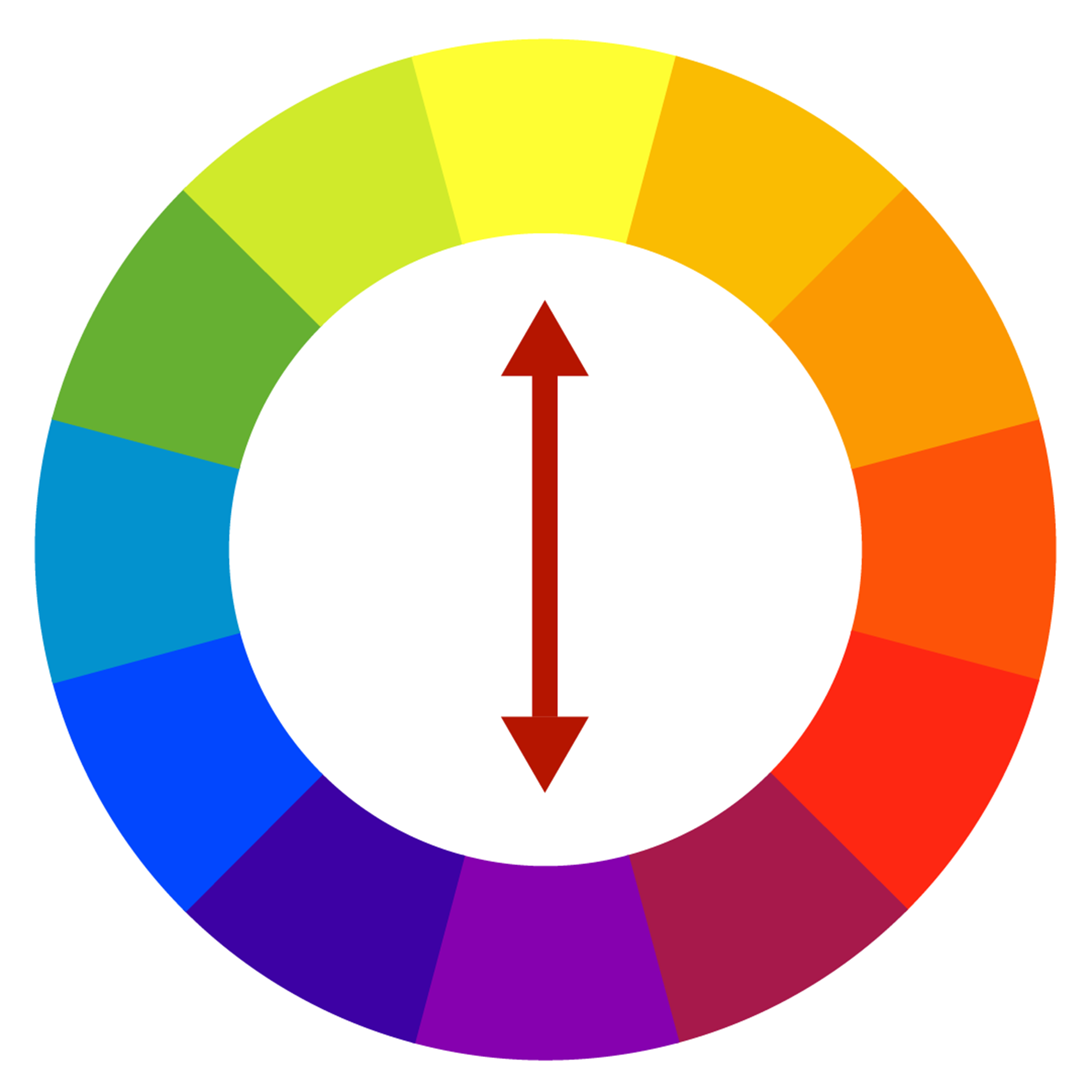
Any two colors that are directly opposite of each other on a 12-part color wheel. Such as Yellow-Purple, Blue-Orange, Red-Green


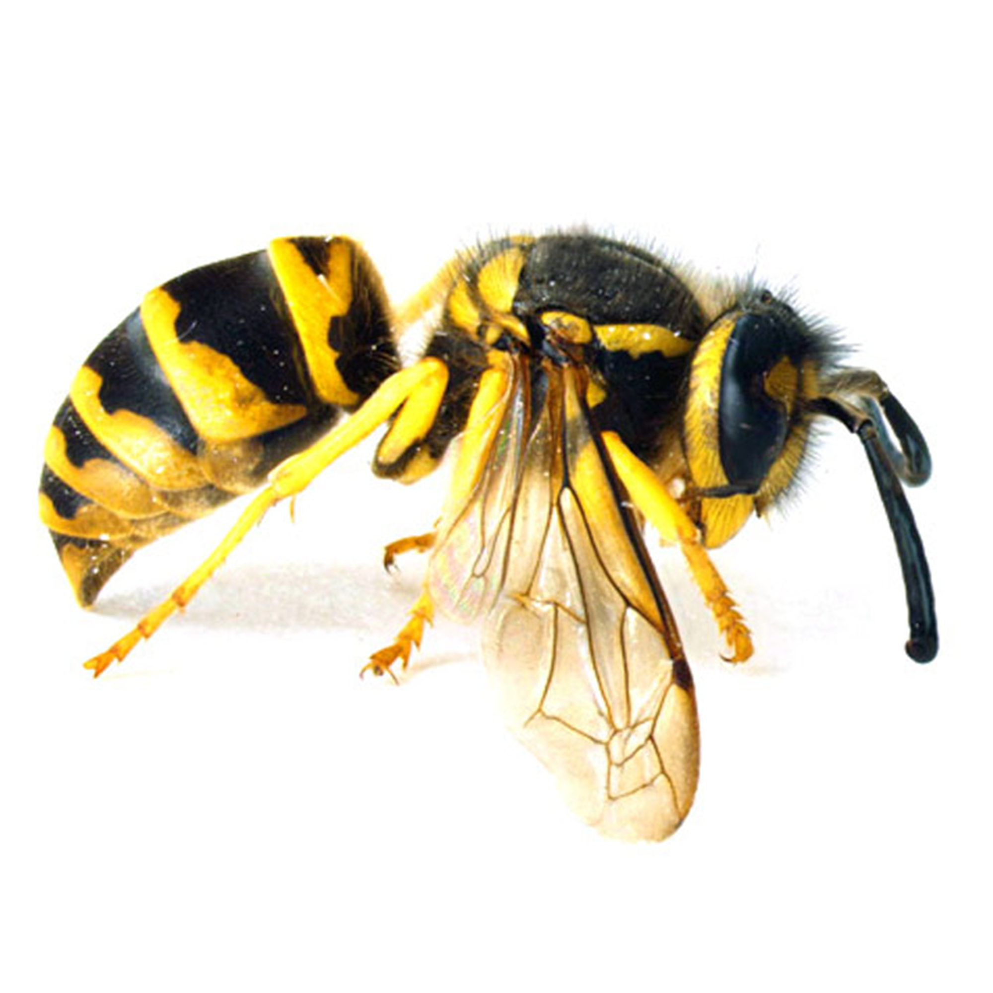
Nature can offer examples of colors that work well together, and also signify certain things like danger.


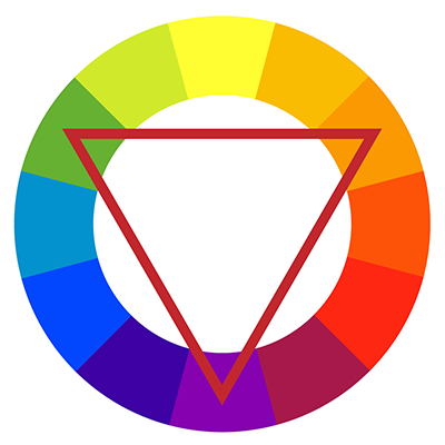
A triadic color scheme uses colors that are evenly spaced around the color wheel.
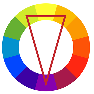
The split-complementary color scheme is a variation of the complementary color scheme. In addition to the base color, it uses the two colors adjacent to its complement.
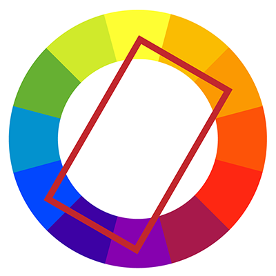
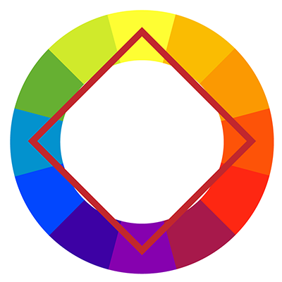
The rectangle or tetradic color scheme uses four colors arranged into two complementary pairs.
The square color scheme is similar to the rectangle, but with all four colors spaced evenly around the color circle.
Color Context
Certain color combinations can be distracting and potentially disorienting for viewers.
In the example below, the color red feels bright and alive on top of black but appears duller on top of white. It’s confusing and lifeless on top of brown, but brilliant on top of the green-blue.
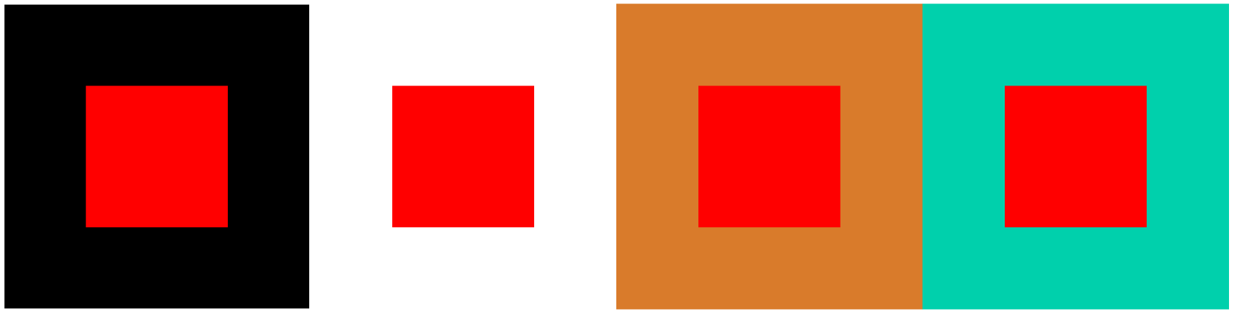
In the example below, the same rectangle appears to be two different colors when laid on top of different color backgrounds.

Beware of Optical Illusions!
Optical Illusions can be inadvertently created by placing combinations of certain colored shapes or lines together. These illusions can be highly-distracting and even physically-disorienting to the user. They should only be used when they connect specifically to the content of what you are designing.
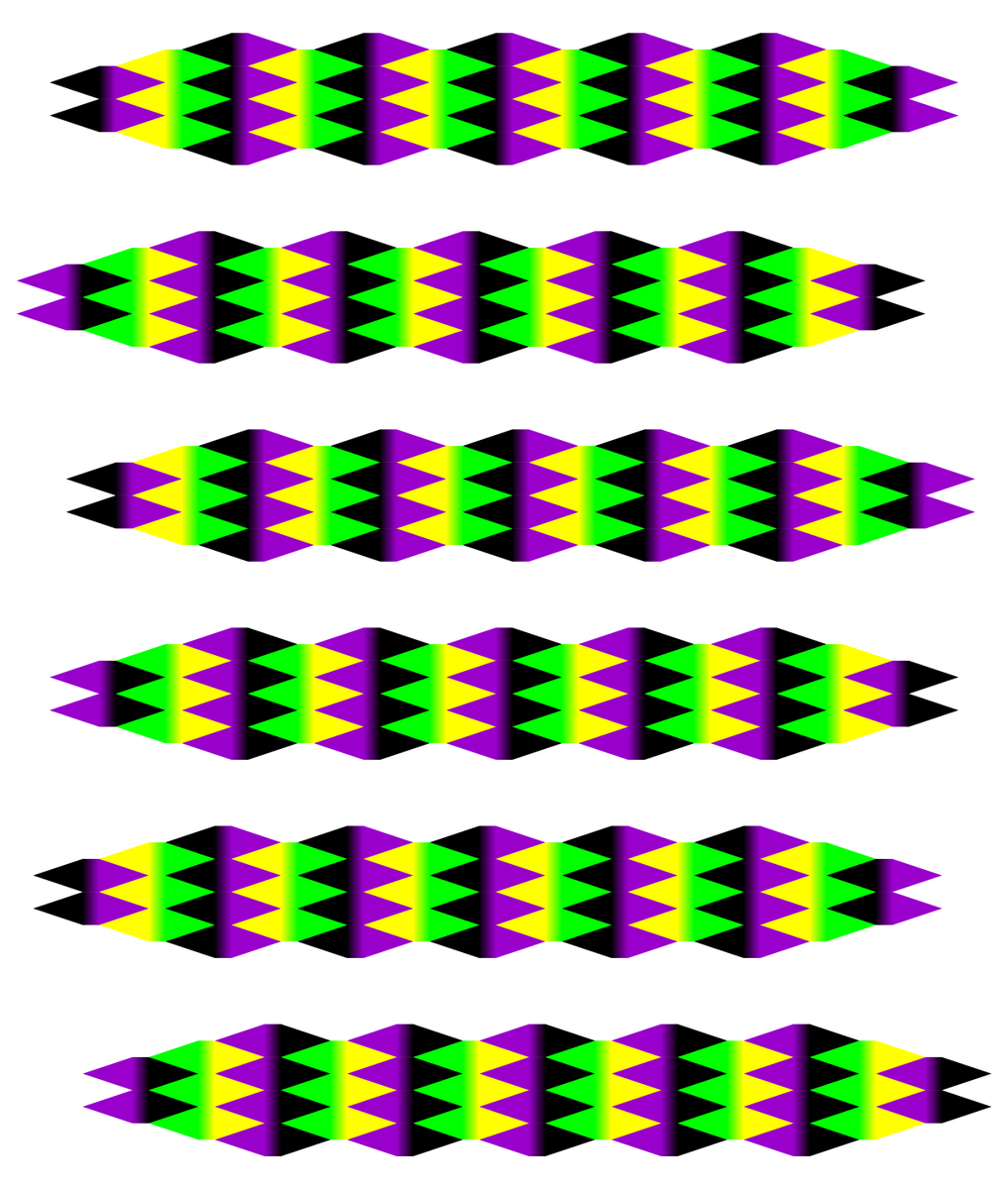
In the above example, you can see how the groups of shapes appear to slide back and forth as your eyes scan across them.
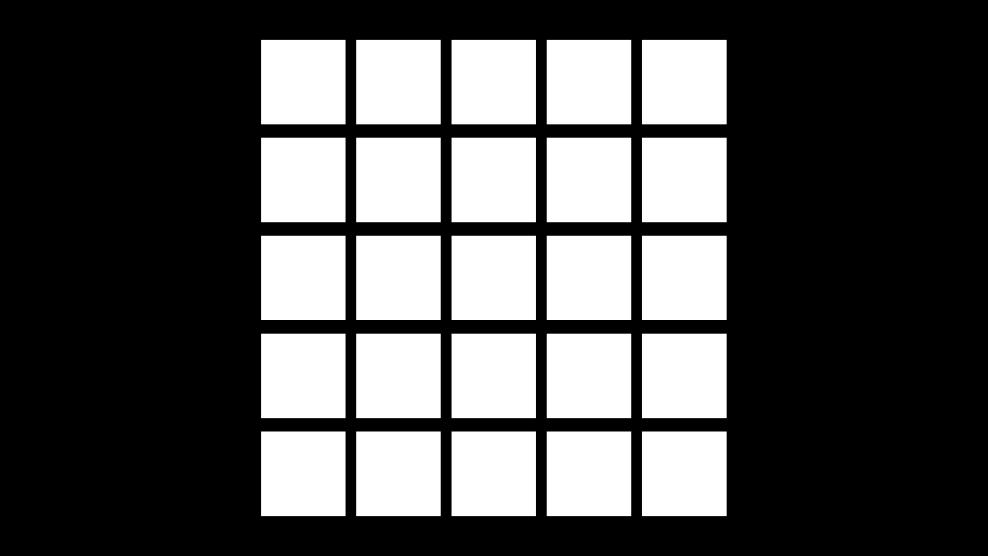
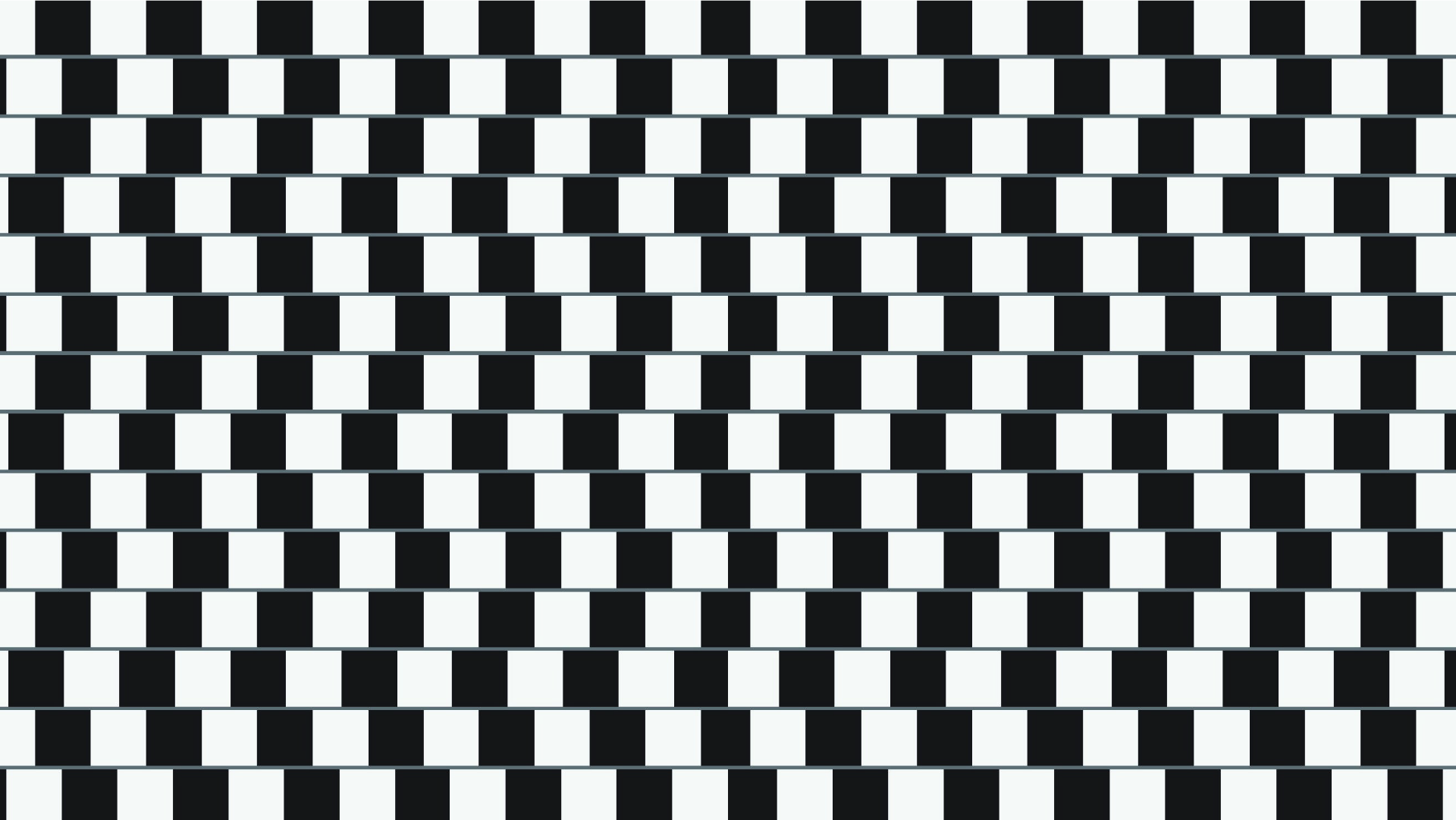 In the above example, the grey lines between the rows of alternating black and white boxes appear to be slanted. They are actually parallel to each other.
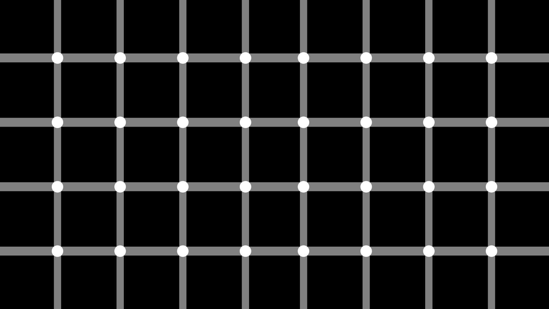
 In the above example, light grey dots appear at the intersections of the black lines even though they aren’t actually there.
 In the above example, the white dots appear white when you focus on them. But the dots surrounding those dots appear to turn black when they are out of focus.
 In the example above, the lines seem to wiggle up and down when a user scrolls up or down the page, which can be distracting and disorienting.