Before we turn to any software, we need to develop our ideas through sketching and iteration.
Sketching allows us to use our innate ability to visualize simple concepts using the drawing skills we have all had since we were children. Through iteration, we will repeat the design process to obtain successively closer versions to the solution to our problem—communicating our information.
Start Simple
When it comes to sketching, it doesn’t matter if you are “good at drawing.” That’s not the point. Our purpose is to quickly generate ideas that we can compare to others to find the strongest and most effective of the bunch. In order to do that, we want our first sketches to be low in quality so that we can focus on the overall idea. We want to ignore any ideas about fine detail at this point. The lack of detail will help us keep the ideas simple. Always, always, always keep the idea simple. Simple concepts are universal and will allow users/readers/viewers to more easily understand and relate to them.
There can be a difficult gap between starting from a blank page and getting a decent draft of an idea on paper. This can happen to the most experienced creative professionals.
“Being a writer is a very peculiar sort of a job: it’s always you versus a blank sheet of paper (or a blank screen) and quite often the blank piece of paper wins.”
―
That hesitation to begin sketching can often come from a designer’s lack of confidence in their skills. They may feel they are not skilled enough to produce anything original or “good.” To overcome this barrier, our first sketches will be as low fidelity as possible. They will be primitive and simple representations of form without much detail. These initial sketches are called thumbnails.
Our Ideas Aren’t Good… Yet
Thumbnail sketches help you eliminate ideas that you don’t like or that just don’t work. Most often, the first ideas we come up with are not good. They just aren’t. Full-stop. Accepting that fact is an important step for anyone in any creative field.
There are seeds of great ideas inside all of us, but they must be nurtured. A common misconception is that designers are just artists who just come up with great ideas on a whim because we are just that super-duper creative. If only it was that way. While everyone gets lucky from time-to-time, it is important for you as a designer to build a repertoire of creative processes that you can rely on in order to refine your ideas and produce quality work. Sketching is just one of those processes. You will learn others in this course. Once you master these processes, you can teach and guide others through them and become a leader in your field.
The Power of Play
Thumbnails will allow you to stumble onto small elements, features, curves, lines, and perspectives that you do like. One of the best parts about sketching, in general, is that it taps into the feelings of joy, wonder, and playful exploration that we had when we learned how to draw as children. Our minds never forget these feelings, but we can lose sight of them as we become “mature” adults. We want to rekindle and harness those feelings and use them to develop our ideas. Your mind and creative imagination will be activated once you earnestly commit to the care-free and judgment-free process of sketching. Try and lean into those feelings of exploration. It is like flexing a muscle, your ability will become stronger the more you do it.
Don’t be afraid to make 20-30 thumbnail sketches. Make 50. Make 100. You want to give yourself a wide range of options to choose from when it comes time to select the best ideas to develop further. This is about owning your vision as a designer. We are all unique in our perspective and personality. No one but you can think like you do or express ideas the way that you can. Thumbnails are where your vision first comes into view.
Think like a sculptor staring at a solid block of marble. Your idea is there, it is just a matter of chiseling away the unnecessary bits until your vision begins to take shape. Look at all the thumbnails you have in front of you and start eliminating the ones that obviously don’t work. Continue until you have all but the 3-5 most effective ones. From those, you will begin to narrow down a solid draft of your idea.
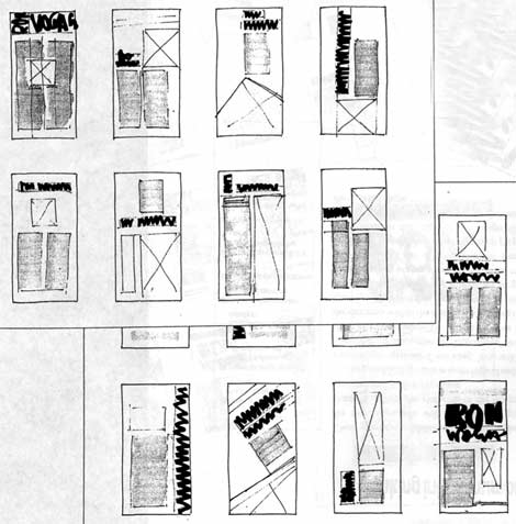
The Anatomy of a Thumbnail
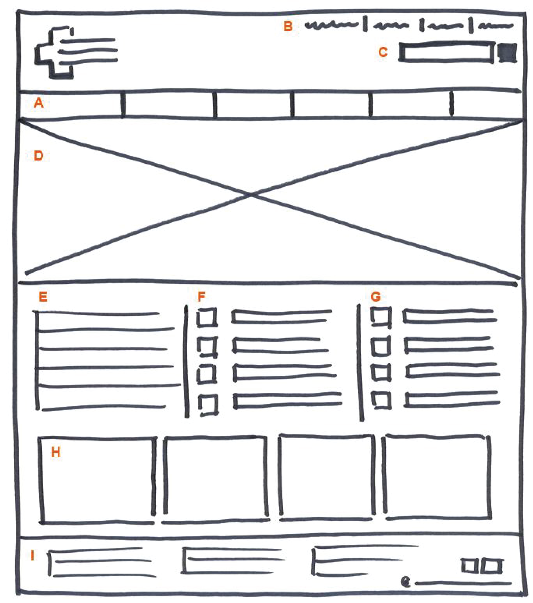
As their name suggests, they should be small. Maybe not literally as small as your own thumb, but small enough to limit the amount of detail that you are able to add to them. They should be the same rough proportions as the layout you will be creating. They should only have the main page elements—dominant and secondary images, main headline(s), secondary headline(s), body copy, any infoboxes—again, so you can focus on the overall idea.
You don’t need to use the actual words or image content of the layout. If you are working at a newspaper or magazine, it may not be available to you yet. Any images in your thumbnails should just be a rectangle with an X inside. Any display type can be labeled as “MAIN HEADLINE,” “SUB HEADLINE,” “PULL QUOTE” or something similar. All body copy can just be groups of parallel lines (see the examples below).
In the thumbnail examples above, the designer only places the text and images adjacent to each other. But in some of the examples below, you can see how they begin to experiment with overlaying text on top of the image areas. There is nothing wrong with this at all. However, you can only really do it if you know the content of the photos you will be working with.
As I mentioned above, in a deadline-driven publishing environment such as a newspaper, magazine, or website, you may not actually have the content you are designing for when you first begin the design process. Writers, editors, and photographers have to complete their specific tasks before you get access to the final content you will put on the page/screen. This is why thumbnails are so crucial. They allow you to develop a bunch of different ideas and options that have already gone through a couple of rounds of refinement via your design process. This gives you flexibility when you don’t know what the photos will look like or how long the story you are designing will be. You can just pick the best option to begin adapting to the content.

From Thumbnails to Wireframes
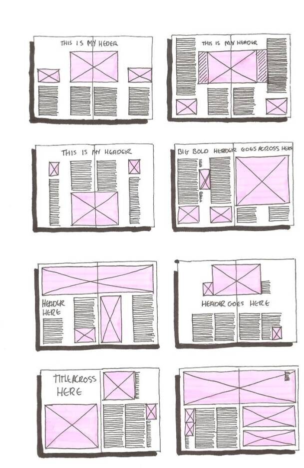
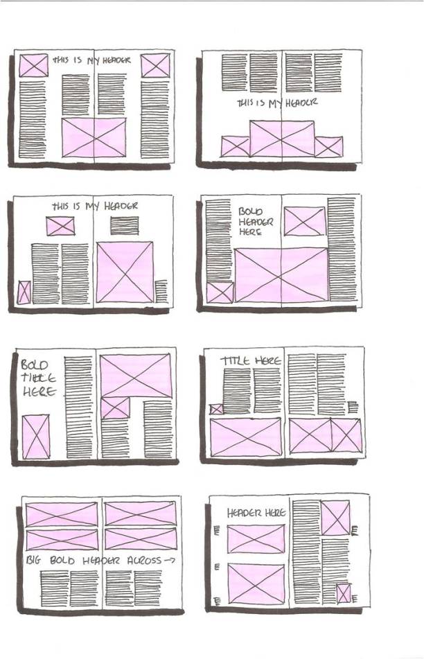
Once you’ve chosen a few thumbnail sketches that feel like they work for the idea, you will refine them with an increased level of detail. This is called a wireframe.
At this point, you are still just using rectangles with Xs to represent images and lines to represent text. But you can increase the size and level of detail of your sketches. It is good to still work small at this stage, maybe about 4-5 times as large as your thumbnails.
You can begin adding elements besides just images and text. Things like logos, captions, webpage menus, search fields, etc., can be added to the layout. So you can keep track of and organize your thought process, you can start labeling or annotating the elements on the page. This will be especially useful if you need to collaborate with or present your work to people on a team. One easy way is just to mark page elements with letters and write out the descriptions in the margins of the page.
Keep thinking about ways you can refine the overall design at this stage. Once we start increasing the level of detail, we may start to notice things that don’t work. It is ok to rework things a bit. Just always keep an open mind toward what works best for solving the problem.
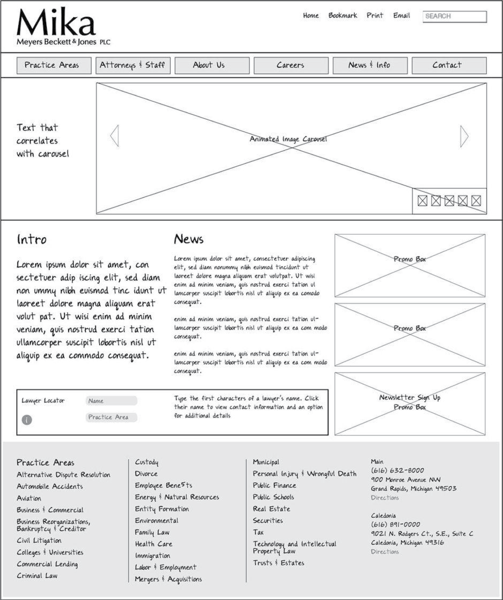
After iterating more and increasing the level of detail, we can start to see what the final version of the webpage could look like. Adding placeholder text allows you to visualize what the text in your layout could look like.
Mock It Up
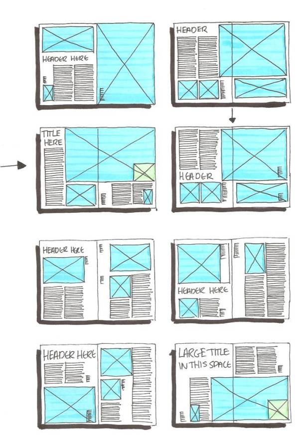
The next step after a wireframe is the mock-up or color comp. This is a more refined version of a wireframe with colors and imagery added. At this stage, the design is more or less finalized. You are adding color to see what works and maybe resizing a few things slightly.
Depending on what your final deliverable is, you may skip the mock-up process and just go straight to production. When designing websites and apps, color comps are usually a more standard part of the process.