Nailing down good a good range of color values in your design work is crucial. Having a good range of values will help you create areas of focus for your users/viewers/readers when you need to direct their attention to information. Lighter colors will pop against darker ones and vice versa.
Bad Color Values
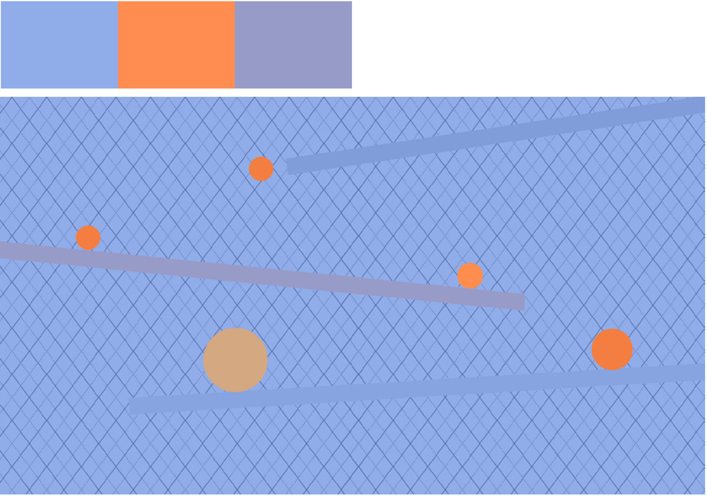
In the example above, our eyes can’t focus on the orange circles. That’s happening because the background and foreground elements are all screaming at the same value level. The background color is too similar in value to the orange balls. The diamond pattern is darker in value than the background and we are not getting much contrast between the background and foreground elements.
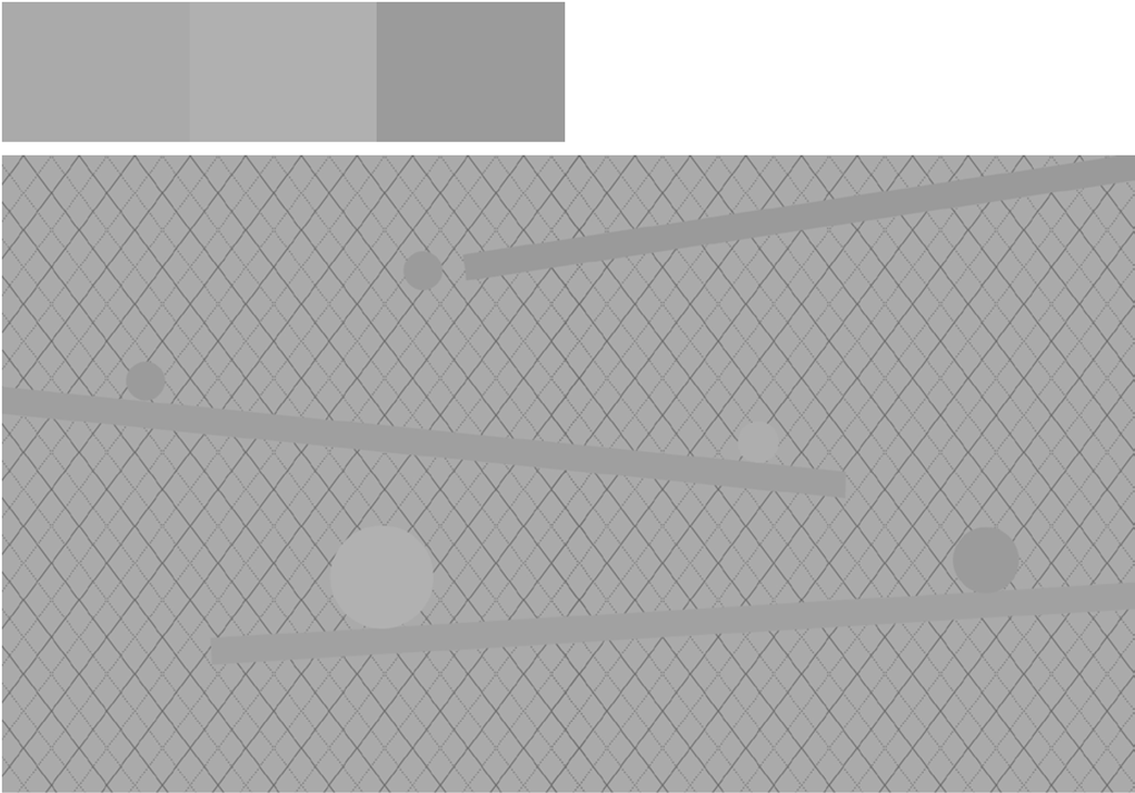
If you take the first example and change it to greyscale, you’ll see quickly that all of the gray values are too similar. What this image lacks is the proper value contrast.
Good Color Values
If we change the color scheme to make our blue colors much darker, the background and foreground elements now have separation in light and dark values. The difference in value creates contrast which allows the orange circles to stand out from the background and attract attention.
The circles clearly stand out from the background when you shift all the colors to greyscale.
Another Example
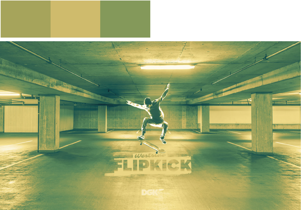 The image above has a poor range of color values.
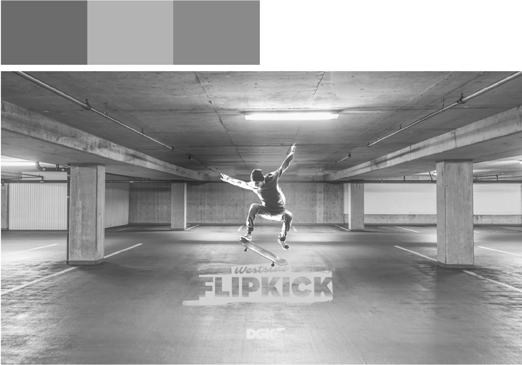 If you shift the colors to greyscale you can really tell how bad it is.
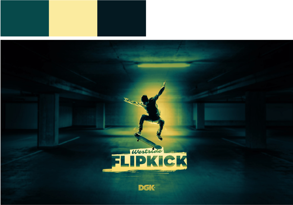 Making the shadows darker highlights the figure in the center of the image.
 Shifting the colors to greyscale shows the wide range of color values in this work. You still get a sense of what is going on in the image, but what the viewer needs to focus on is highlighted while everything else is de-emphasized yet still visible enough to set the scene and give us a little contextual information about the image.
When in Doubt, Use the Squint Test!
A quick way to test if your design work has a good range of color values is to look at it while squinting your eyes. If you have a poor range of values, everything will start to blend together as the image blurs. Try it with the first two images at the top of this page. The darker colored lines in the background coupled with the too-light orange color cause the circles to blend into the background when you squint your eyes.
With good color values, your colors should still stand out when you squint your eyes.

