Think of the pages in your layout as the frames in a cartoon strip. Construct it frame by frame, impression by impression. Use progression to develop and tell the story in a flowing manner.
Both single pages and spreads are events occurring in sequence. They do not exist independently, only in the context of the group. It takes time to perceive them, either front-to-back or back-to-front.
When readers turn the page, they remember what they have just seen on the page before and anticipate what may come next. As a designer, you have to think like a reader in order to make your layouts as effective as possible.
As designers, we tend to work on one page or spread at a time, flattened out on a computer monitor. This can work against us in our effort to design effective magazine layouts. The printed, physical form of a magazine is rarely flat. It bends and changes shape. Creating an effective design may require much more than just applying simple, cut-and-dry design fundamentals. We need to be constantly visualizing the layouts as a folded, accordion-like flowing space. It can be useful throughout the design process to print and fold your layouts into a half-sized rough draft. This can help you get a sense of how it would look once printed and how the designs work when folded.
How to Begin A Story: Text or Photo?
Ideally, you want to begin a story with a single spread. You should always try to avoid having two stories within a spread if there are no ads in the spread.
One story can “run” across consecutive spreads in a magazine, but how does a designer decide which pages to put either text or photos on? The answer is…… it’s complicated.
Let’s look at an example from Jan White’s “Editing by Design” (REMINDER: You should own this book if you are serious about designing magazines). In the example below, the story is about Ben Franklin’s preference for a turkey over an eagle as the U.S. national bird.
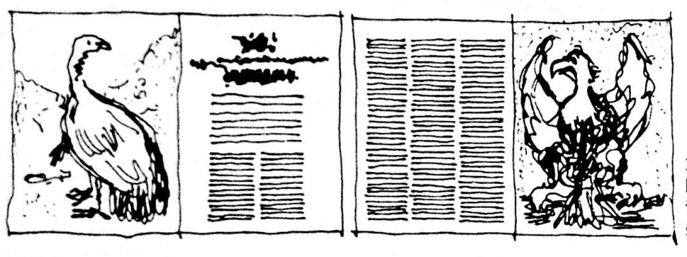 In this first image, you see one story running across two consecutive spreads. The story begins and ends with a photo and the text flows smoothly overleaf (across consecutive folded pages). This is actually not too bad to start.
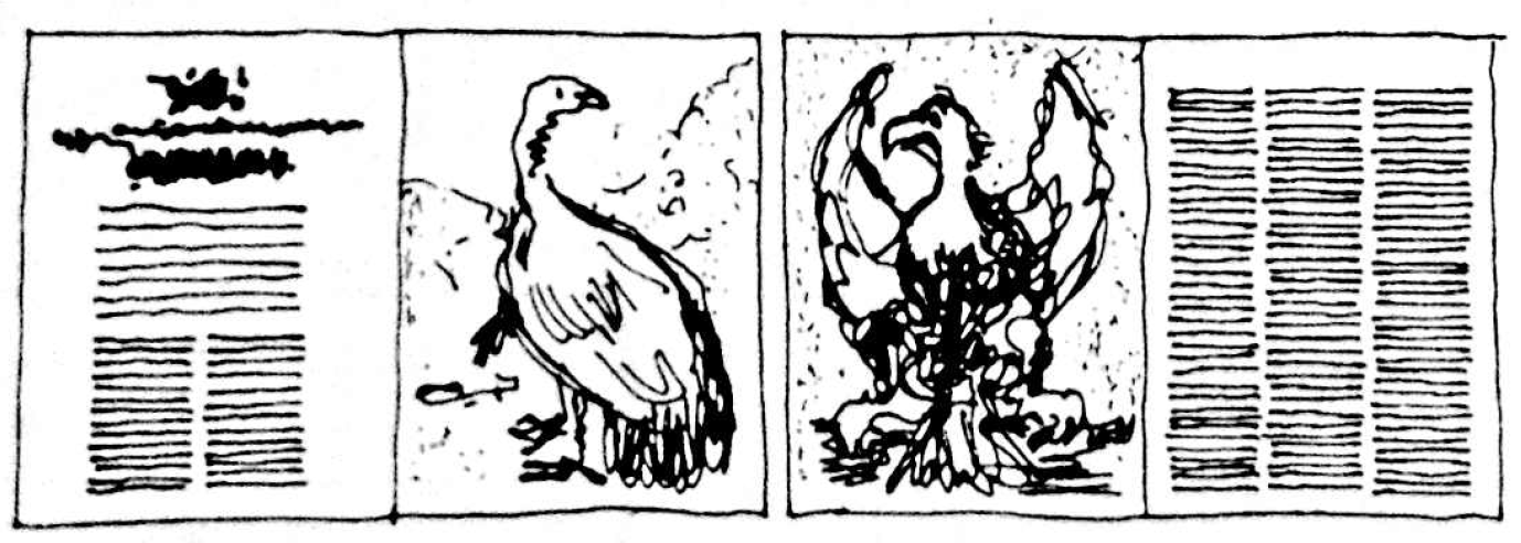
In this second image, the story begins and ends with text and the images are “back-to-back” on consecutive pages. This layout is weaker than the first. The two images of the birds interrupt the text and it is harder to compare the images of the birds because they are back-to-back.
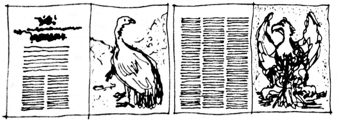
This third image utilizes the flow of the layout the most effectively. The layout is consistent across both spreads, and readers can easily compare the images from each spread. The story starts with text, which isn’t as exciting as a good photo. But it ends on a photo, which is good.
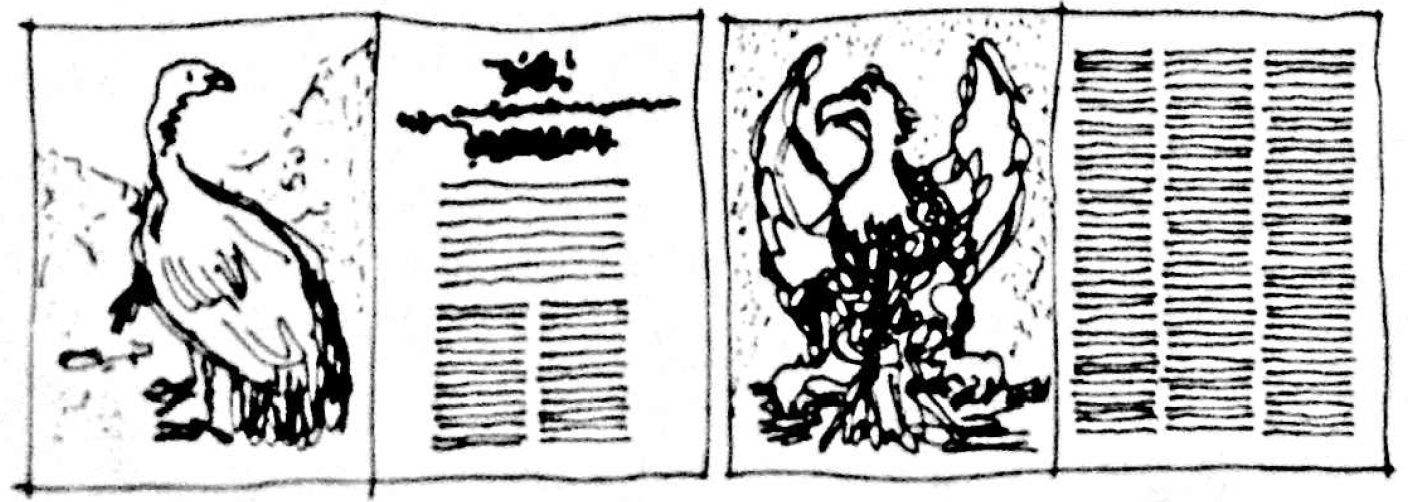 This last image has the story start strong with an image on the left and the text on the right. You can still compare the images of the turkey and eagle easily and the first spread makes the opening of the story more dramatic since it starts with a photo. It still splits the text, though. And the story just ends with text, which isn’t necessarily ideal.
So which layout is “correct?” It can come down to preference and editorial decisions, so really the answer is all of them.
However, the final two images are the most effective layouts for this particular story for the simple reason that they use a consistent layout across the story. It not only looks clean and well-organized but most importantly it helps the reader consume the information by creating consistency and satisfying their expectations when they see that consistency repeated.
When layouts are predictable, across single stories AND entire publications, it increases the publication’s credibility in the mind of the reader.