Ultimately, we have two goals when creating a piece of visual communication:
- Get the reader to pay attention to the content
- Guide them through the content
When communicating visually, it is important to know the strengths and weaknesses of the medium you will use to publish your message.
The Multi-Page Document
The multi-page format of a magazine is a powerful medium to use for story-telling. But we have to get to know the physical attributes of the medium as well as the psychology of the reader before we can harness that power.
Page Size
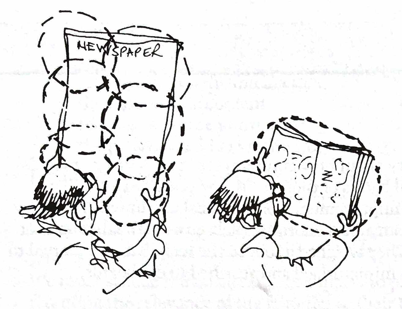
One trait that makes magazines so effective at story-telling is their page size. The page size of any published document affects what people see and how many “takes” they look at it.
For example, an unfolded broadsheet newspaper is overwhelmingly large and requires several takes to absorb all of the information. A magazine, on the other hand, can be absorbed in one take because our peripheral vision encompasses the entire thing at a normal viewing distance.
Spreads
It is important to always keep in mind that when designing magazines, a single page is never a standalone unit. It is merely one-half of the dominant shape of the whole—a spread.
The spread of a magazine is, by nature, split in half. Printed magazines are folded in the middle and have what is known as the gutter running down the inside of the spine.
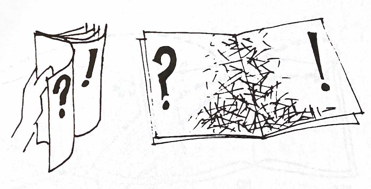 Readers naturally skim through magazines to decide what they want to read. Skimming almost always involves flipping through without opening the magazine all the way. Therefore, it is always important to put your most fascinating images and provocative words near the outside edge of the spread. Never hide a headline or image in the gutter of the spread.
The top-left and top-right corners of a spread are where readers look the most, and the bottom-middle is where readers look the least. Viewers always concentrate on the upper parts of a page when examining a magazine.
Left vs. Right as Editorial Content
The left-side pages of magazine spreads, or “lefts,” are ideal places to put our editorial content. This allows designers to display content near the edge of the page, where our headlines and images can hook the reader.
Advertisers tend to prefer the right-side pages of magazine spreads, or “rights,” to place their ads. People tend to look toward the right side of a magazine as they skim or flip through it so they can see what is on the next pages. Advertisers like these pages because they are the first thing a skimming reader sees when they turn the page.
Finding a Rhythm
It is always best to stay consistent with the placement of ads and editorial content across your magazine. Rhythmic placement of magazine content creates consistency, which builds into strength. A reader comes to expect that the editorial content is on the left, so it becomes easier and more efficient to consume the magazine’s content.
Having content and ads that flip back and forth from left to right creates a disrupted and weakened experience for the reader. BUT… there are always exceptions, which we will discuss in the ‘Sequencing A Magazine Layout’ section.
Guiding a Reader’s Attention
When looking at a magazine spread, a reader begins at the top-left and scans diagonally-downward until something pulls their attention away. By positioning certain elements within a neutral background, a designer guides where the reader looks.
The way we organize elements in space affects our readers’ reactions as they look at the page. If readers have to jump around a page to search for where the next paragraph begins, they will become frustrated and possibly quit reading. By keeping the text aligned, grouped together, and simple, we create an inviting layout that looks easy to consume on the surface. Remember: If a page looks like work for a reader, they’ll be less likely to read it.