When designing a layout, using a grid can help organize and anchor the elements.
Grids help with alignment and proportional relationships among the elements in a layout. They allow for a sense of familiarity and uniformity. They also help provide a sense of rhythm to the structure of your layout.
A Few Useful Definitions
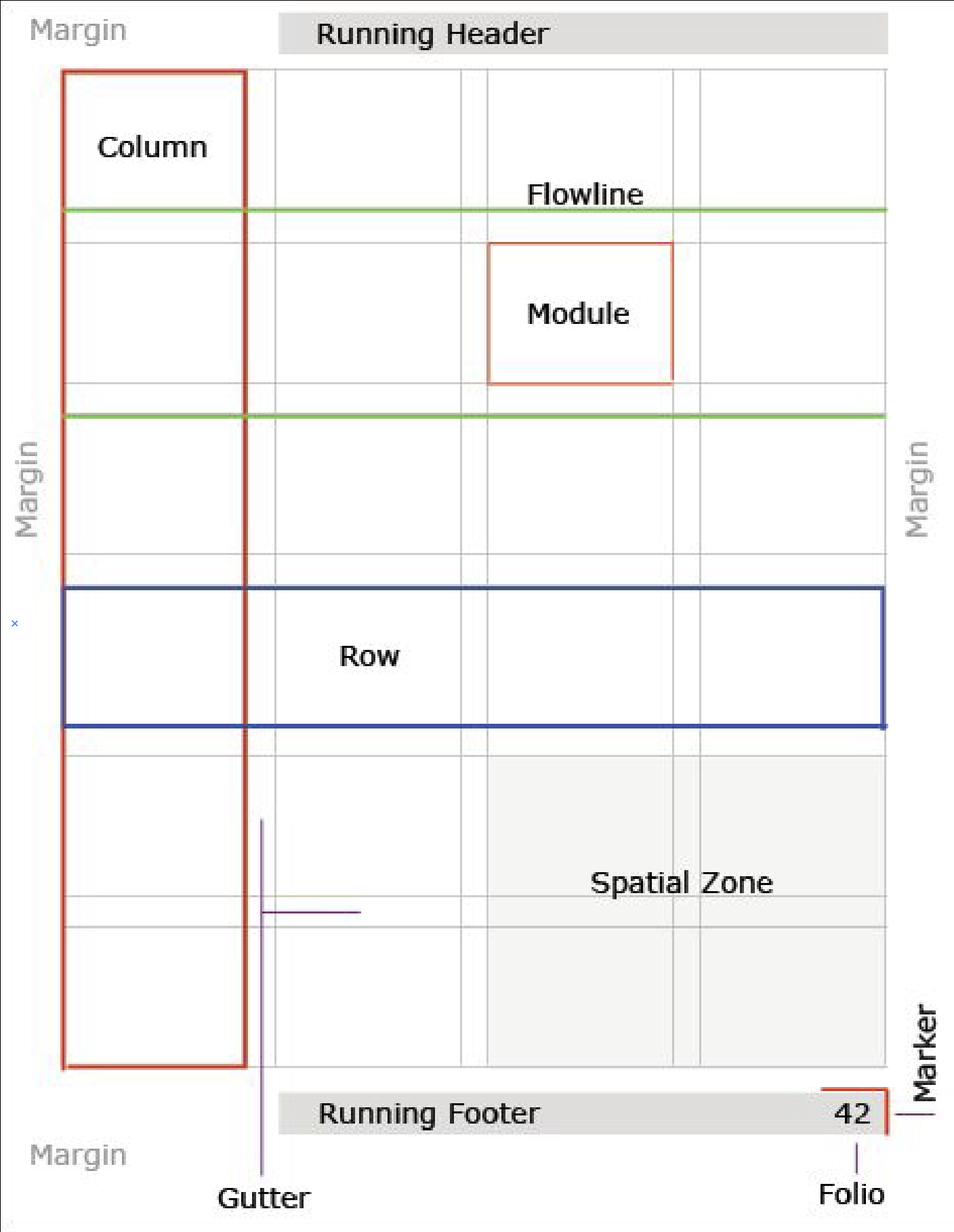 Header-Top section of a page
Row-Horizontal division of a page
Column-Vertical division of a page
Gutter-Empty space between gutters
Footer-Bottom section of a page
Folio-Page number
Margin-Outer edges of a page
Marker-Graphic mark to accompany the folio
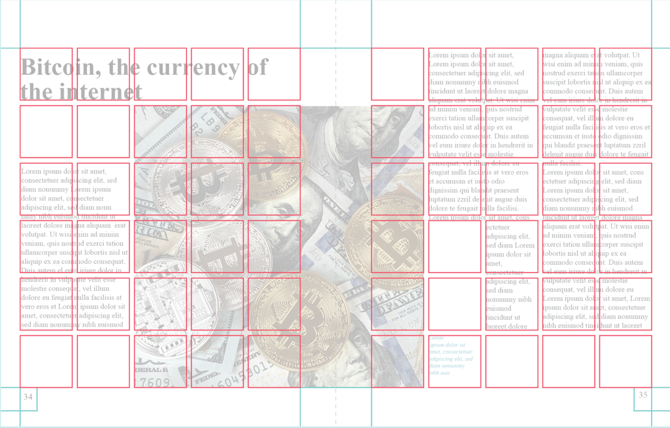
Module-Areas of various sizes created by the intersections of consecutive columns and rows.
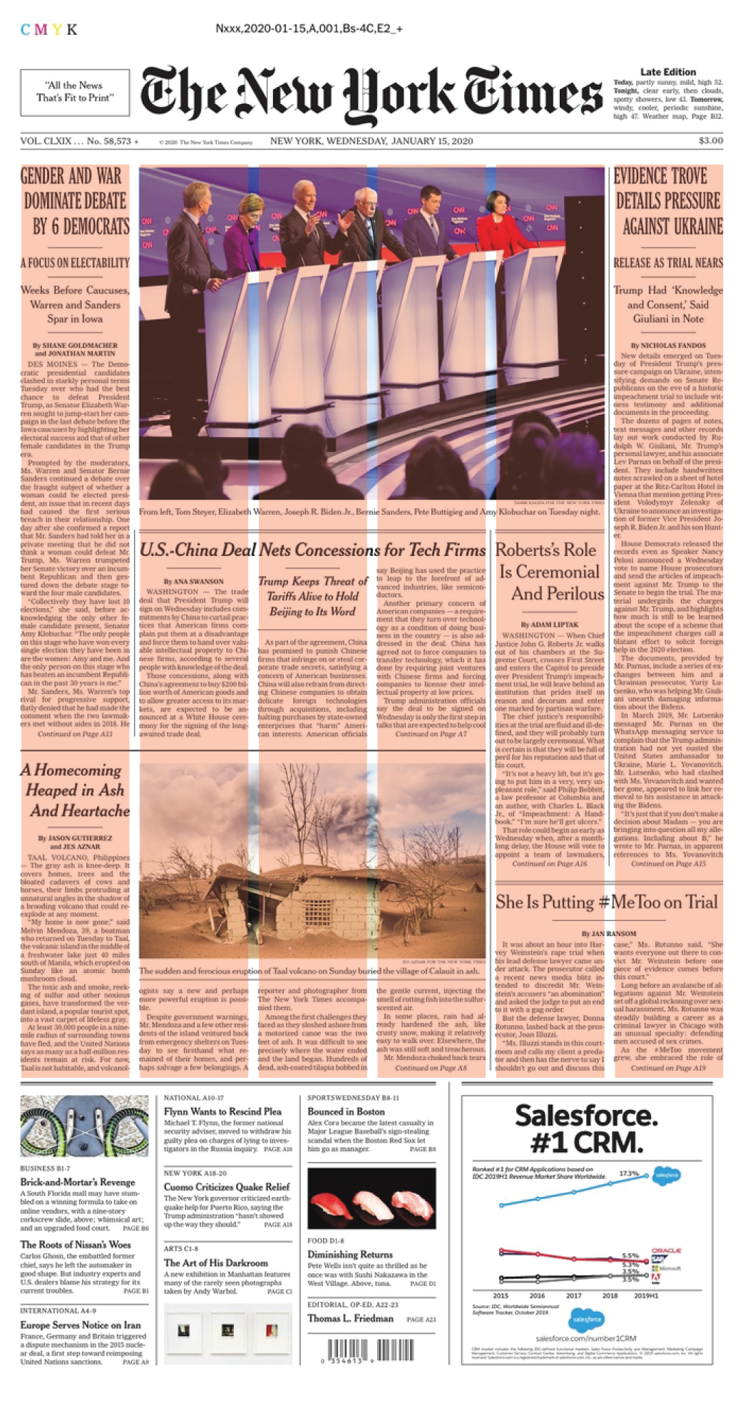
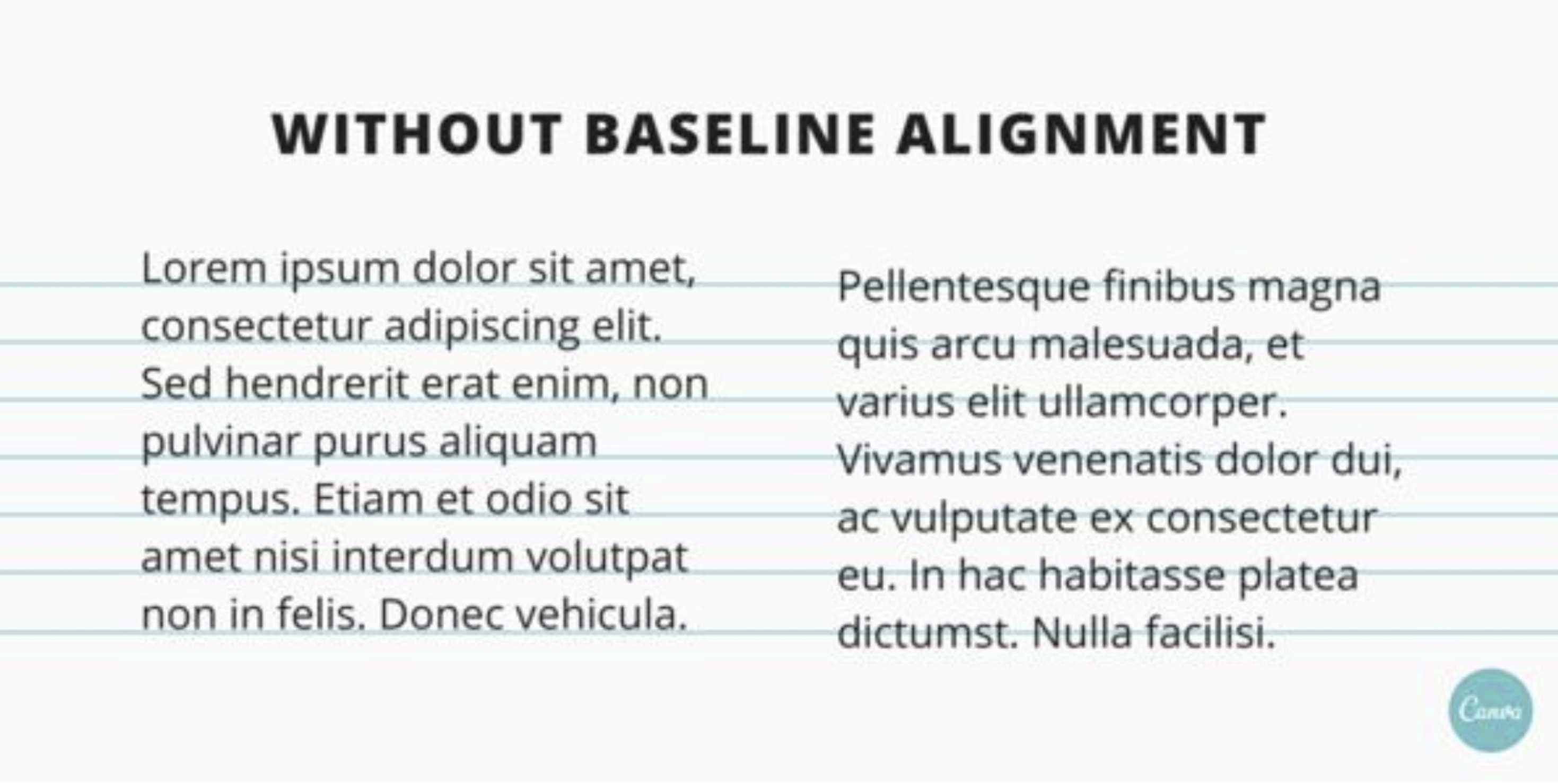
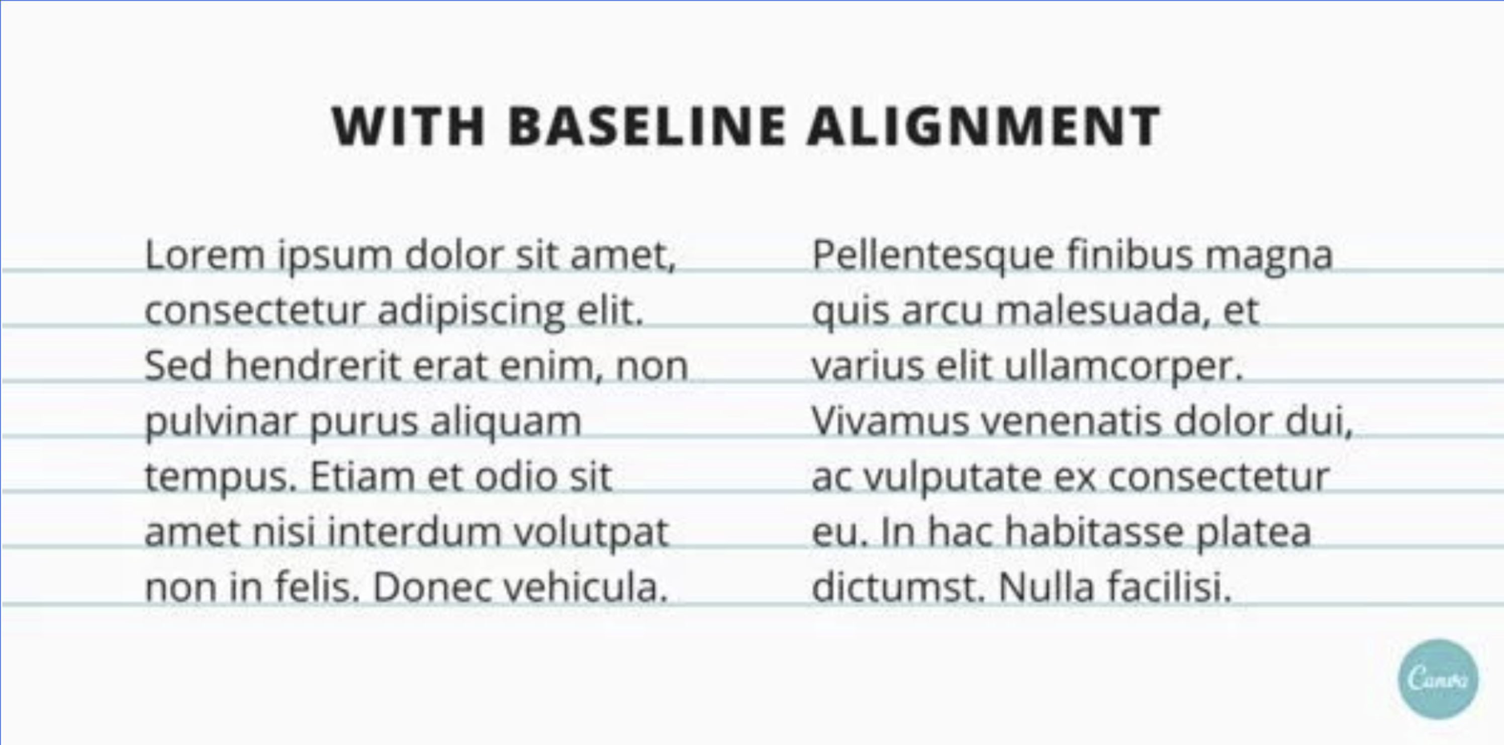
The Baseline Grid
The baseline is the line upon which text in a publication sits. The space between baselines within a document is called the leading. It is best to align all of your text to a common baseline grid. It gives a more consistent and organized look. Adjacent columns of text that aren’t aligned to the same grid can confuse a reader.
Types of Grids
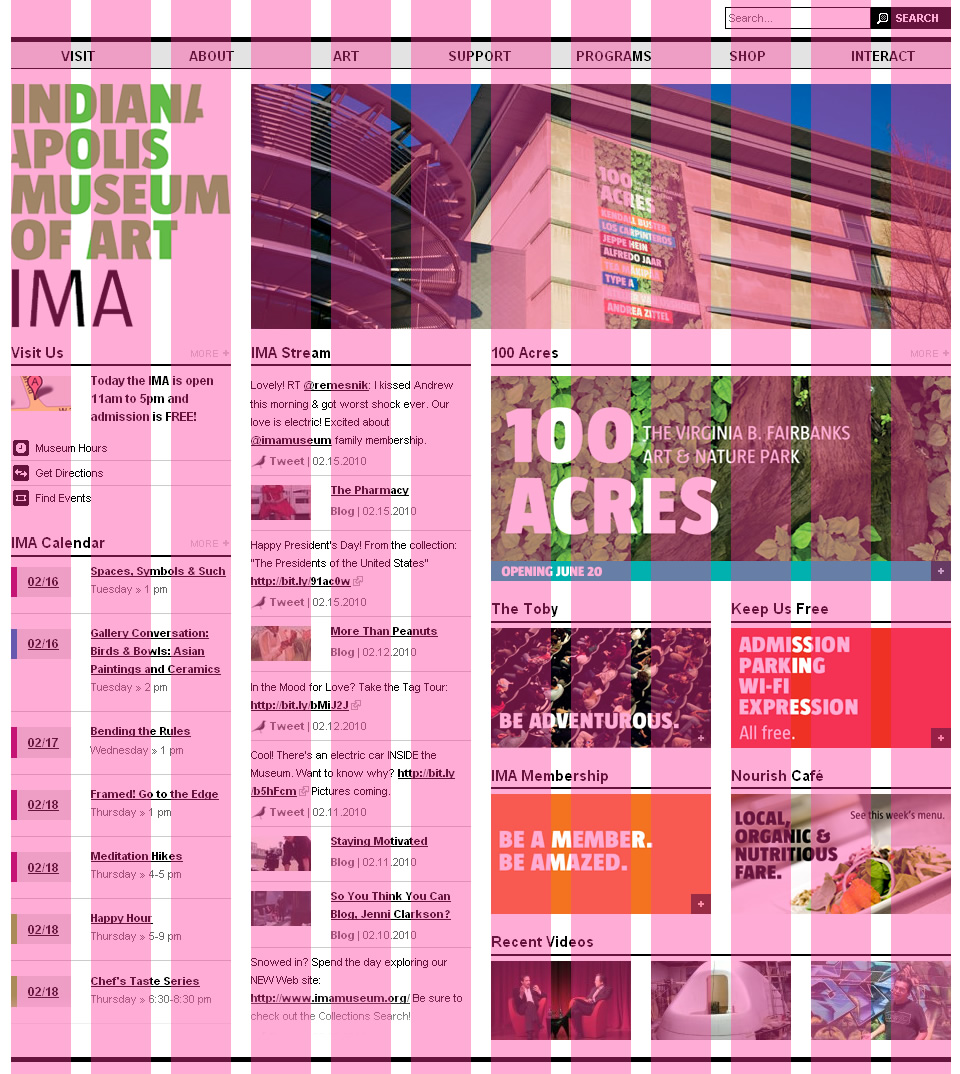
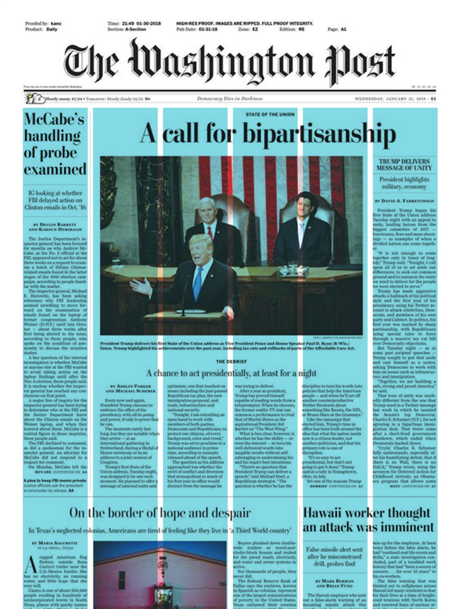
Column grid
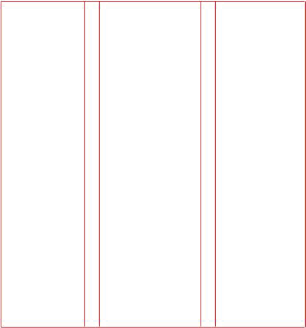 The column grid is the most-used type of grid. It works well when the information being presented is discontinuous—meaning it breaks and jumps to other pages inside the publication.
Modular grid
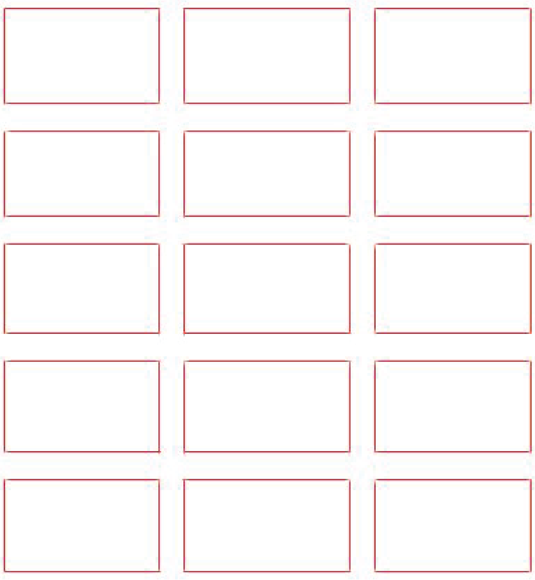 The modular grid is more flexible than the column grid. It allows for more unconventional designs while still maintaining a sense of order and continuity.
Hierarchical grid
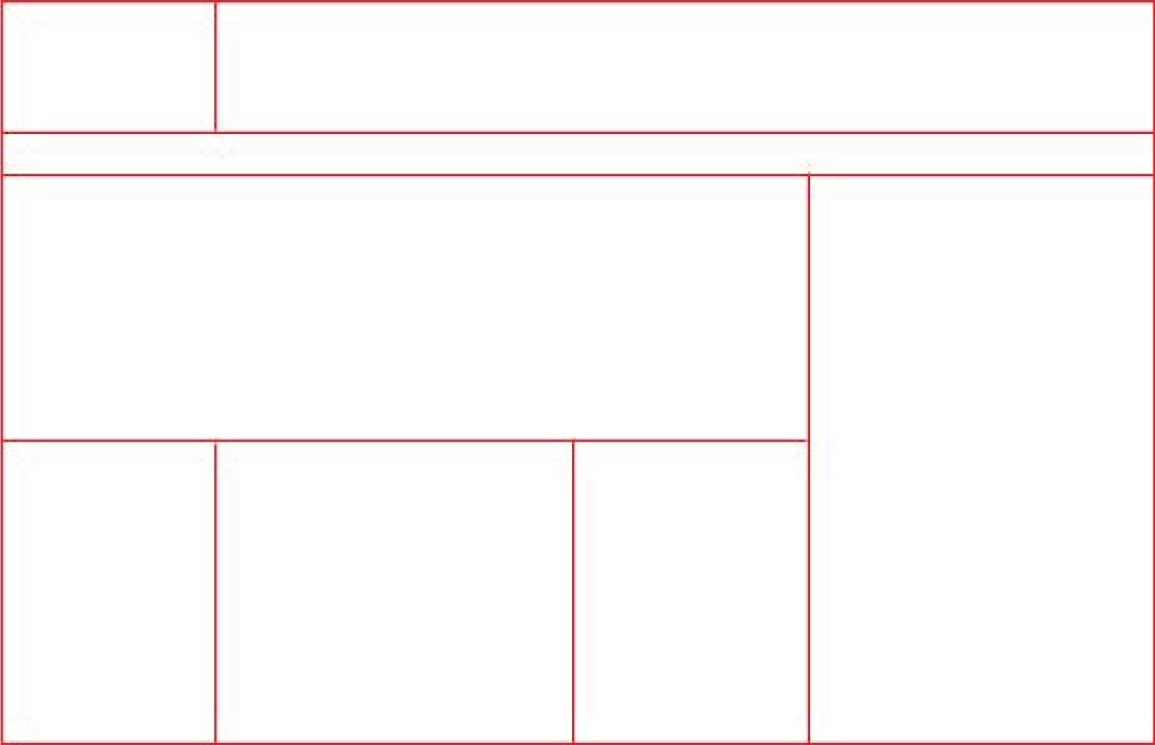 These grids can be designed somewhat organically. They tend to be created by Placing elements on a page and just seeing what fits together in the most effective way. They don’t necessarily adhere to an underlying structure and may not have columns that are evenly spaced or sized.
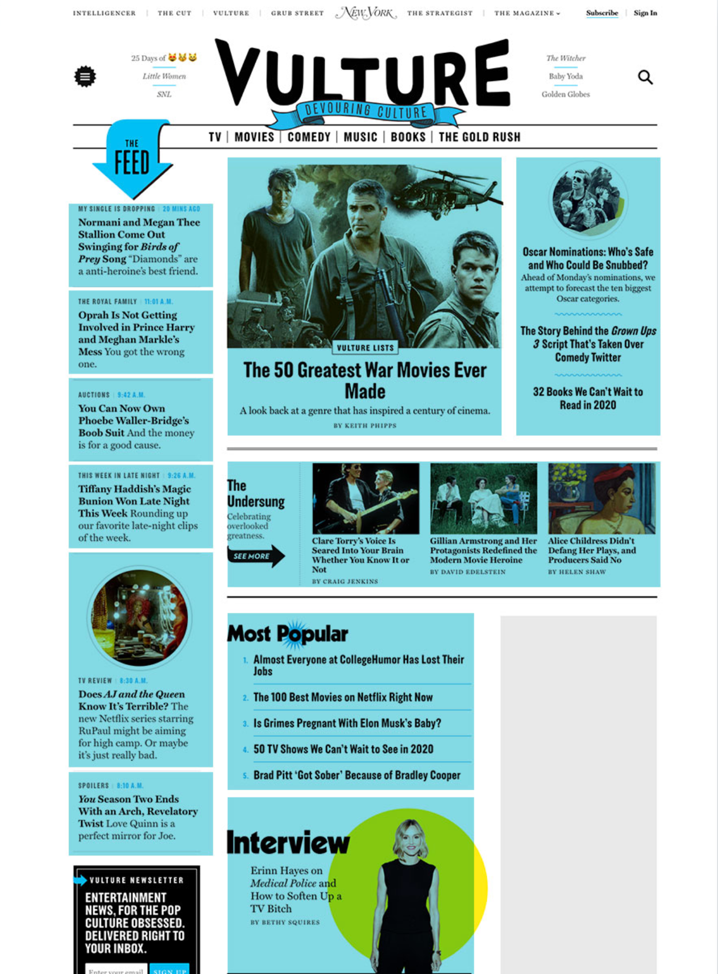
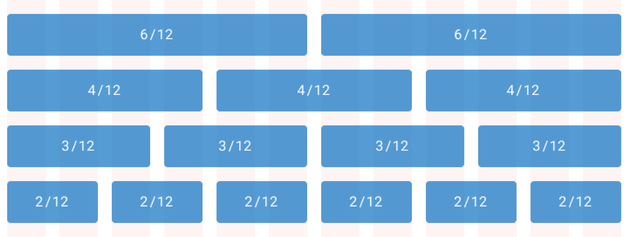
The Twelve-Column Grid
A 12-column grid is commonly used when designing layouts for web pages and applications. It can be divided into a variety of different combinations (see the image below) to help group or separate content into sections and subsections. Even if we aren’t designing for the web, a 12-column grid can be useful.