Key Take-Aways
- Areas with greater tree canopy coverage have cooler temperatures.
- Areas in closer proximity to buildings are at greater risk for the Urban Heat Island Effect.
- Intersections more heavily trafficked by automobiles are more susceptible to high temperatures.
- Impervious surface areas are at greater risk for trapping heat.
- Temperature can vary greatly depending on road side due to canopy shade, surface type, and time of day.
- Locations with older trees have larger canopies and more shade, reducing temperatures.
- Time of day and sun the position of the sun can alter temperatures greatly.
Comparing Heat Data taken on Separate Sides of the Same Street
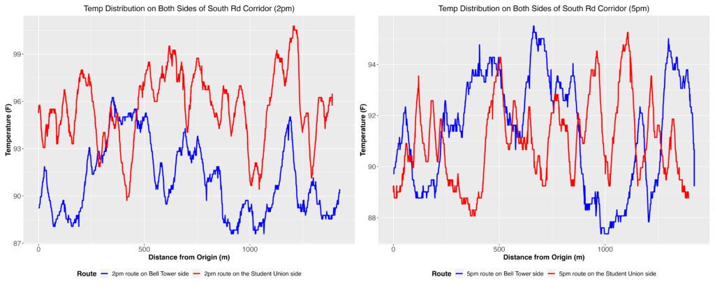
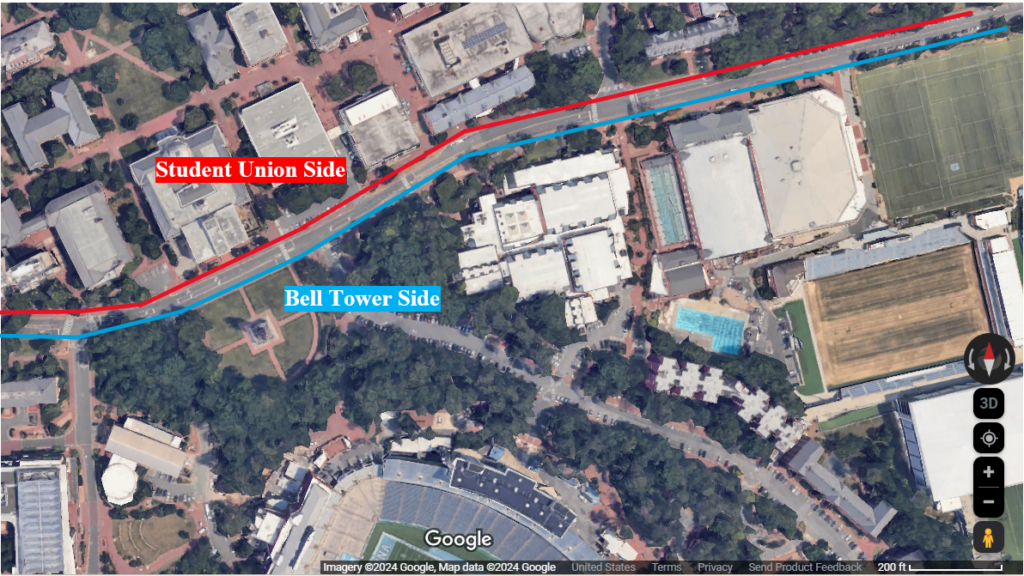
Our study aimed to assess the variation in heat data across different sides of South Road and how it evolves over time. The analysis revealed intriguing findings:
- Time-Based Variation: The graphs depict temperature differences between the Bell Tower side and the Student Union side of South Road at two distinct time points: 2 PM and 5 PM. Notably, the Bell Tower side appears cooler in the 2 PM graph, while exhibiting higher temperatures in certain areas in the 5 PM graph.
- Sun Position Influence: A plausible explanation for these temperature variations is the shifting position of the sun throughout the day. At 2 PM, the Bell Tower side may experience greater shade coverage or less direct sunlight compared to the Student Union side, resulting in cooler temperatures. Conversely, by 5 PM, the sun’s position may have changed, potentially leading to increased exposure and higher temperatures on the Bell Tower side.
These observations highlight the dynamic interplay between time of day, sun position, and temperature distribution across South Road. Further exploration of these factors could provide valuable insights into heat management strategies and urban planning considerations for optimizing environmental comfort in campus areas.
Comparison by Time of Day
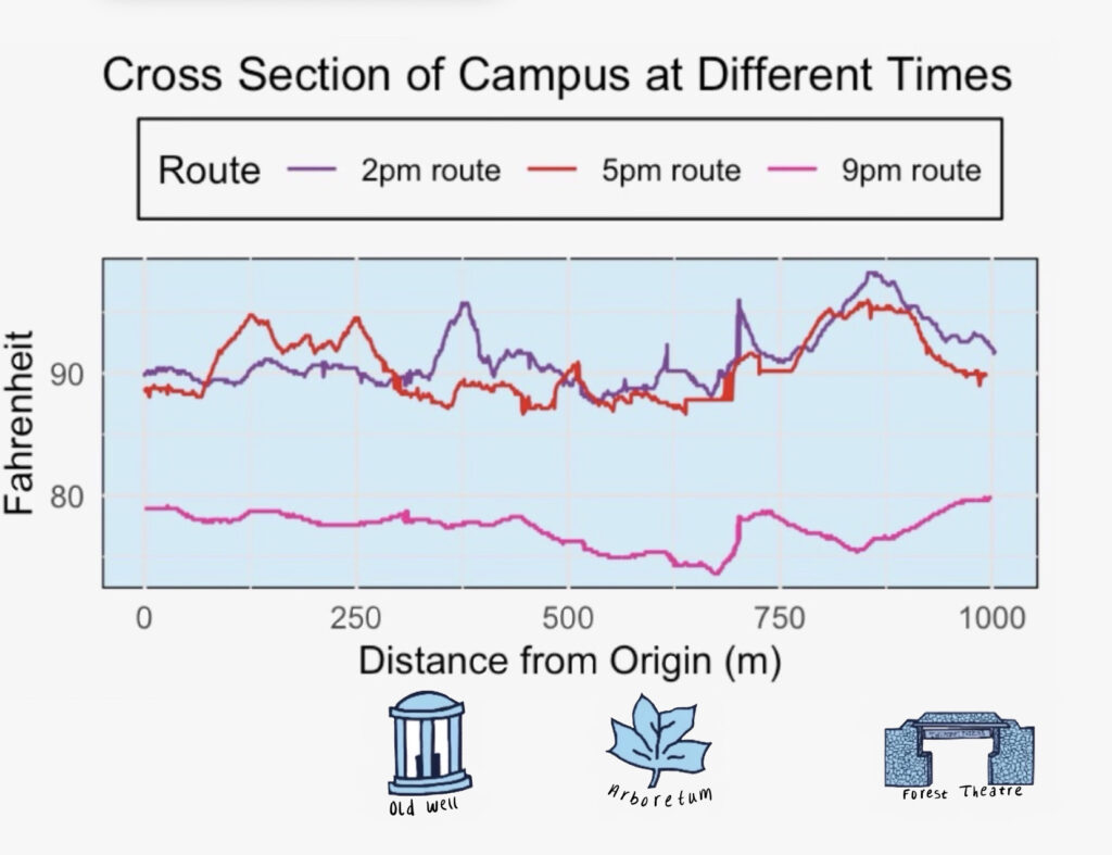
This graph illustrates a cross-section of campus temperature variations at three distinct points throughout the day (marked by icons displayed under the graph). Several notable observations can be made based on the data:
- The Old Well: At this location, a convergence is observed between the 2 PM and 5 PM routes. This convergence may be influenced by the tree cover behind the Old Well, as well as its proximity to pervious surfaces.
- The Arboretum: Similar to the Old Well, the Arboretum exhibits a convergence point, albeit at lower temperatures compared to peak values on their respective graphs. Notably, the 9 PM temperature is lower than the majority of the graph, suggesting cooler conditions in this area.
- The Forest Theatre: Here, a downward temperature trend is observed as the route progresses further into tree cover. Despite being situated along the Country Club Road corridor, the Forest Theatre route benefits from significant shade cover provided by nearby trees.
These findings underscore the importance of further investigating the relationship between surface type, shade cover, proximity to transportation corridors, and heat distribution on campus. Such analysis could yield valuable insights into mitigating heat-related issues and optimizing environmental comfort for campus inhabitants.
Final Heat Analysis
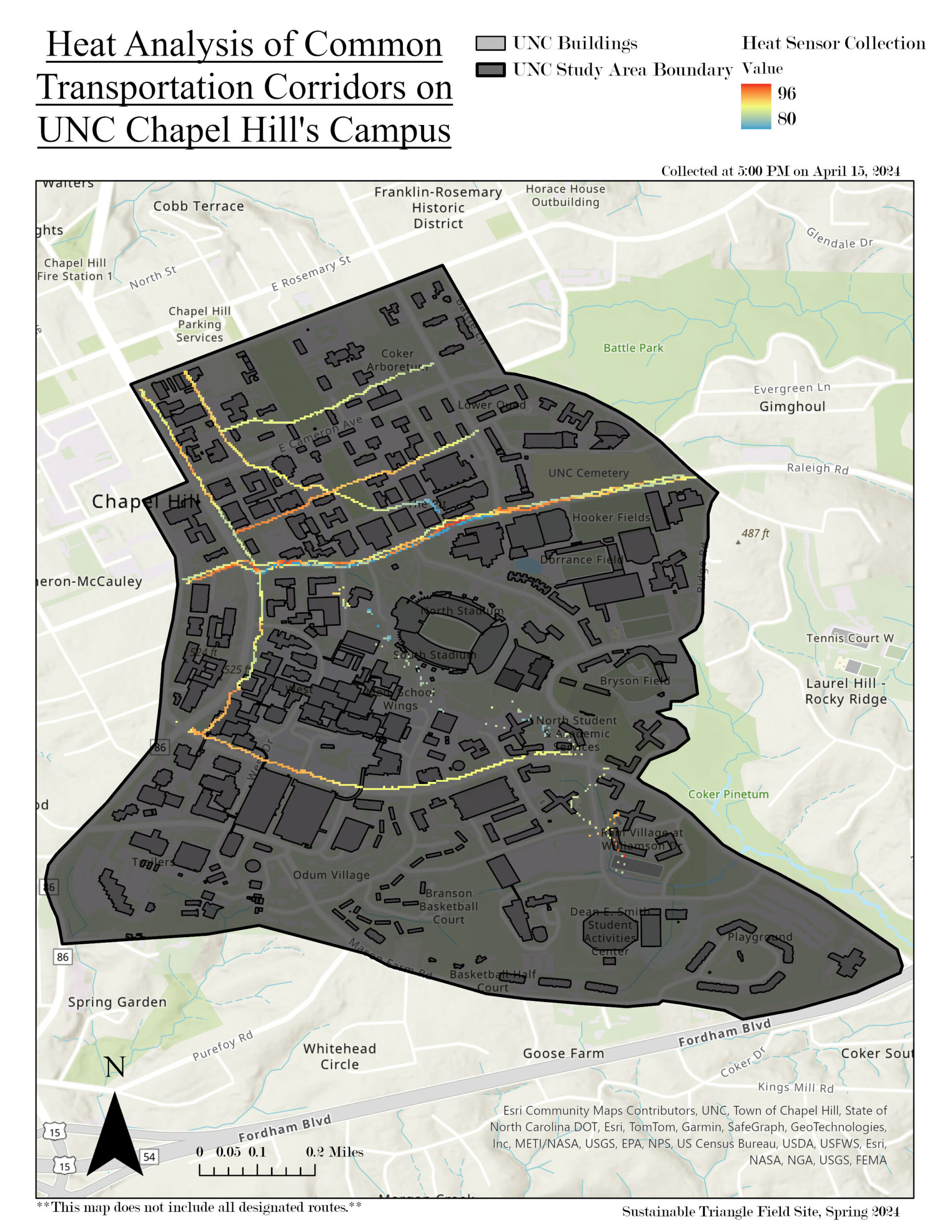
This graph illustrates the heat data collected on April 15th at 5 PM, showcasing temperature points across our campus. Each point represents a temperature measurement recorded by our heat sensors. While the west side tends to maintain consistent heat, pockets of cooler temperatures are evident along South Road and near the Student Union. We collected data along various routes to ensure comprehensive coverage. With a high temperature of 82°F for the day, this dataset will be used to create a detailed heat map, revealing hot spots and cool zones across campus.
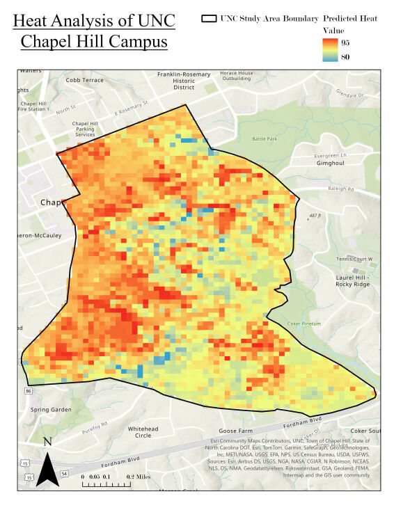
These graphs utilize the data from figure 5, supplemented by various factors outlined in our methods section, to construct a comprehensive heat map of our campus. Notably, the west side exhibits more consistent heat, likely due to its reduced tree cover, contrasting with the east where notable hotspots near Cobb Deck, Residence Hall, Hinton James, Rams Residence Halls, and Woollen Gymnasium emerge. The abundance of tree cover on the eastern side, particularly near Battle Park and the football stadium, may explain the cooler spots observed in those areas.
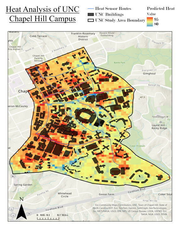
In figure 7, the routes traced mirror those in figure 5, offering insight into the direct areas covered by our heat sensors. Additionally, the inclusion of buildings in the analysis aids in interpreting the displayed data. For instance, hotspots like Cobb Deck can be attributed to its impervious nature and high concentration of vehicular activity, while cooler areas such as the arboretum reflect the influence of extensive tree cover and pervious surfaces
Limitations and Future Improvements
One limitation lies in the accuracy of our tree canopy data. Currently, our dataset could be enhanced by utilizing GPS tools to pinpoint the precise locations of all campus trees. Additionally, acquiring more comprehensive iTree canopy data in the future could strengthen our dataset.
Another weakness is that our data was solely collected during the spring season. This fails to capture how changes in humidity and temperature during the summer and fall affect the heat index on campus. To provide a more comprehensive understanding of heat distribution, future data collection should include multiple seasons.
Calibration discrepancies among physical sensors and variations in data collection methods may introduce inaccuracies in our heat data. To mitigate this, future efforts should involve having multiple individuals walking each route and ensuring consistent sensor placement.
Human error during data collection is another potential limitation, including issues such as incorrect data exporting and inconsistent sensor positioning. In the future, measures should be taken to standardize data collection procedures and minimize errors.
Our study was also limited by the predefined routes chosen for data collection, which may not accurately represent pedestrian behavior, including desire paths and various surface types. Improved communication with students and exploration of alternative routes could provide more representative data.
Furthermore, environmental factors such as wind, vehicular movement and proximity to steam tunnels can impact heat data collection, necessitating consideration in future studies. Finally, addressing variations in raster data resolution can enhance data consistency and accuracy.
In summary, addressing these limitations and implementing suggested improvements will strengthen the reliability and comprehensiveness of our data analysis.