Planets! We’re moving further back in the Solar System folks, how exciting! The Moon is gorgeous to look at, don’t get me wrong, but there’s much more to be seen in our own Solar System. For this task, we got to image four planets: Mars, Jupiter, Uranus and Neptune and make our very own color images of them. Let’s see how it was done!
Skynet Observations
As per usual, we begin our journey in Skynet with the observations of the planets. All of the planets were imaged using PROMPT 5 in Cerro Tololo Inter-American Observatory in Chile, and this telescope was used specifically in order to avoid ghosts (remnants of bright objects in images). I made sure that the Max Sun Elevation= -12, Min Target Elevation = 30, Max Moon Phase = 100, Min Visible Hours= 0.25, and the Min Moon Separation= 30. With the filters, we had to split up which ones would be best for each planet. For Mars and Jupiter, we utilized Halpha, U, and OIII filters due to how bright they are. Since the other two planets, Uranus and Neptune, are much fainter, we used the B, V, and R filters, which pretty much line up with the response of a human eye. On the exposures page, each planet had their own set of data to input on the number of exposures and the duration period for each filter. Mars had 10 exposures per filter and 1.2, .3, and .6 seconds of duration time for U, Halpha, and OIII filters respectively. Jupiter also had 10 exposures and 1.5, 1, and 1 second of duration time for U, Halpha, and OIII filters respectively as well. Uranus had a whopping 30 exposures per filter and 2.5, 1, and 1 seconds of duration time for B, V, and R respectively and finally Neptune had 10 exposures and 15, 7.5, and 7.5 seconds for B, V, and R respectively. We also selected the “interleaved filters” button on the bottom of the exposure page in order to alternate between the 3 filters. After that they were sent off to Skynet!
Image Processing: Jupiter
Since each planet has their own unique steps in the image processing sequence, I decided to split them up so that they each got their own spotlight. I’m choosing to start with Jupiter, however these starting steps are the same with all the planets. I first opened the reduced images in Afterglow, set the stretch mode to Linear, hit the bright target preset, and enabled sync orientations with the pixel coordinate mode (in order to ensure all of the images were properly fitted to the screen). Now, it was time to start aligning the images. I went to the Source Catalog Tab and enabled Source Markers, Centroid Clicks, and Planetary Centroiding. Then came the tedious process of going through each image of Jupiter and clicking near its center, which Afterglow corrects and ensures the point is actually placed in the center of the planet. Once all the images of Jupiter were marked, I clicked on the “Include sources from other files” button and checked to make sure they were all listed, it’s also interesting to note that, with all the marks visible, you can see just how much the telescope drifted when it was taking the images. I then selected all of the sources and clicked the merge button, which let Afterglow know that all of the marks/centroids belonged to the same source. The final step was to go to the aligner tab and actually align my images. I had to select all of my images, disable Mosaic Mode, select a reference image, enable Crop, disable Rotation, Scale, and Skew, set Mode to manual source and select my merged source, and finally submit the job.
After my Jupiter images were aligned, it was time to stack them. To do this I went to the Stacker tab, filtered on the OIII filter, and selected all of them. Then I disabled multiplicative, additive, and global equalization, enabled propagate mask, and submitted the job. I then repeated this process twice more for the Halpha and U filters. I then took the three new stacks, grouped them together, and colored each layer, with Halpha being red, U being blue, and OIII being green. Once the stacking was complete, it was time for messing around with the colors. I changed the stretch mode to Linear and raised the saturation very close to 100% so that the pixels didn’t appear artificially white. Then once I was satisfied with how it looked, I exported the image as a JPG, which automatically downloaded the image on to my computer.

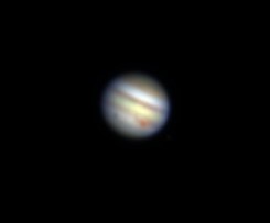
Despite the blurriness of the image above, it’s still possible to make out the distinct features of Jupiter. One very important and classic feature associated with Jupiter is the big red spot, which is a massive dust storm that has been present on Jupiter since scientists have been able to observe the planet. You can also see Jupiter’s distinct bands that wrap around the planet. There are light and dark bands, and these represent gas layers on the planet. There are three layers, with ammonia-ice clouds on top (which appear beige), ammonium-hydrosulfide-ice clouds in the middle (which appear various shades of brown), and water-ice clouds on the bottom (which simply appear white). Since Jupiter has a much stronger surface gravity (about 2.5 stronger than Earth), we are able to see the lower layers of clouds through the upper layers due to the layers being pressed together.
After getting my image of the planet, I moved on to viewing the moons. To do this I simply changed the stretch mode to Midtone, upped the saturation close to 100, and watched as the moons came in to view. I then went to Stellarium and inputted the date and time so that I could label the moons correctly.
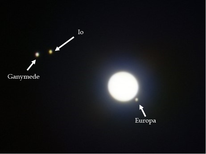
There are three moons visible in the image I took: Ganymede, Io, and Europa. While they don’t have much detail, you can see that Io appears much more yellow than both Ganymede and Europa, which is due to the fact that Io is volcanic and emits copious amounts of sulfur dioxide (making the moon appear yellow) whereas the other two are covered in ice, thus making them appear white.
Image Processing: Neptune and Uranus
When imaging Neptune and Uranus, the processes between the two of them are the same as Jupiter up until the color processing. For both planets, I aligned and stacked the images following the same steps mentioned above, the only difference being is that we used B, V, and R filters instead of Halpha, OIII, and U. With Jupiter, once we got our images back, we were able to use the percentile color balancing mode to get the general colors of the planet. However, since Uranus and Neptune are much fainter and further away, its necessary to use something called “photometrically calibrated color balancing.” For these two planets, we can achieve their natural colors by using the World Coordinate System (WCS). This system allows us to compare the background stars to catalog values. To use the WCS I first pressed the default preset button and then clicked on the red (R) stack, due to it having the most background stars. Then I navigated over to the WCS Calibration tab and set the mode to Platesolve and pressed “extract values from current image.” After I verified that the image now had coordinates, it was time to transfer the coordinates to the other two blue and green stacks. I selected all three images, changed the mode to “Copy”, and selected the red stack as the reference image.
After that, I viewed the combined group image and changed the color balance mode to “Histogram Fitting” and selected the photometric color calibration tool. Afterglow automatically selected all three of my red, green, and blue stacks, so all I had to do was press the measure zero points with field calibration button which aperture photometered every star across all the stacks and compared them to catalog values. Then I selected an image as my reference image and pressed the calibrate colors button. Before this function actually worked, however, I had to select a reference layer for Afterglow for the brightness and contrast controls. Since, both Neptune and Uranus are a blue-ish/green-ish color, this layer is where the planets are brightest, and so I used the blue layer as the reference layer for both and pressed “sync brightness and contrast in all layers,” which gave me the final result.

While this image of Neptune may seem like a plain blob, the color I brought out in the image does tell us a great deal about what the composition of Neptune is. Neptune is a blue planet, which is visible above, but why? Well, the reason Neptune is blue is due to the presence of methane in its upper atmosphere. The methane absorbs red light, and so it makes the planet appear blue.
To get both Neptune and Uranus’s moons visible, I followed the same steps as I did with Jupiter’s moons, switching the stretch mode to midtone and increasing the saturation until I could see the moons. I then entered in each images time and date for both planets into Stellarium so I could go through and label the moons.
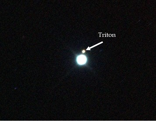
While Neptune has more moons than just the one labelled (14 total!), Triton is the largest and easiest to see due to its proximity to the planet. Triton has an icy surface with a landscape often called “cantaloupe terrain” due to all of its craters, geysers, etc. Triton also orbits Neptune in retrograde (which just means it moves in the opposite direction of Neptunes rotation) and has a thin nitrogen atmosphere (caused by the geysers).

Even though it seems like much of the color of Uranus was lost in the post processing, its blue/green color is still somewhat visible. Much like Neptune, this color is caused by methane in the atmosphere absorbing red light, causing Uranus to appear a blueish green. However, Neptune is more of a bright blue, whereas Uranus has a paler hue. This is most likely caused by something known as a “thicker haze layer.”
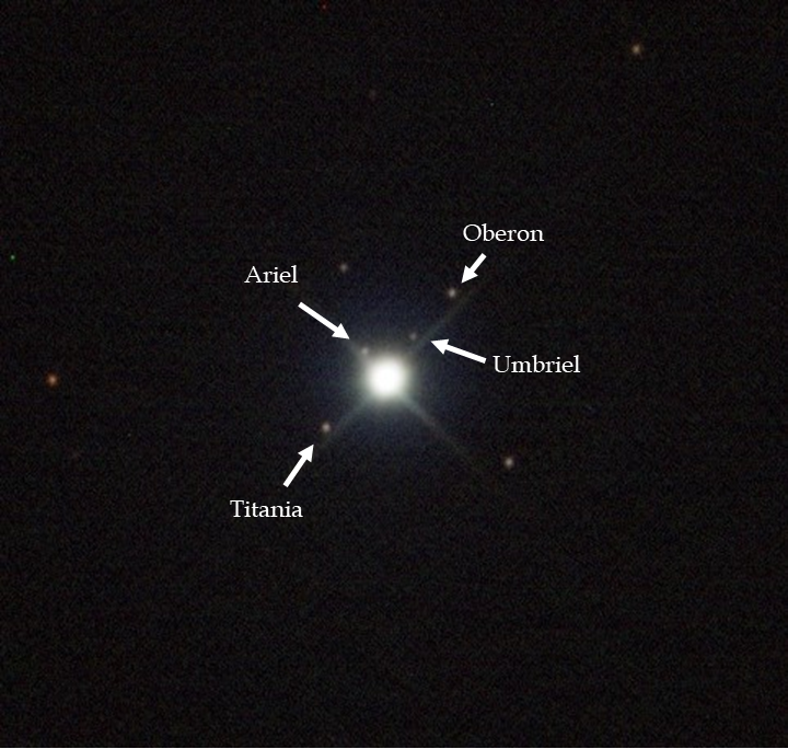
Uranus has a total of 27 known moons, however there are four in particular labeled above that are the easiest to spot: Titania, Oberon, Umbriel, and Ariel. Titania is the largest moon of Uranus, Oberon coming in only slightly smaller (making it the 9th largest moon in the solar system), Umbriel is the third largest moon of Uranus and is also the darkest of its moons, and finally Ariel is the fourth largest moon of Uranus and is also the closest moon to the planet.
Image Processing: Mars
With Mars, I also followed the exact same steps up until it was time to do image processing, meaning I followed all the same steps with aligning and stacking the images and used Halpha, OIII, and U filters just like Jupiter. However, Mars is the trickiest planet of them all to see its natural colors. Unlike Jupiter, whose colors are white/ close to white, Mars is red, which means I can’t just use percentile mode color balancing because it turns the planet unnaturally white/yellow. As well, since Mars does not have enough background stars, we can’t use WCS to photometrically color calibrate like how I did with Uranus and Neptune. With no other option, I had to turn to manual color balancing and adjust the red, green, and blue filters by hand. First, I changed the color balance mode to “histogram fitting,” and selected the Halpha layer as the reference layer (because it’s the brightest) for the brightness and contrast controls. Then I changed the stretch mode to “midtone” and went to the OIII and U layers to adjust the layer scale box. This value is automatically set at 1 so I simply moved the value up and down a bit in each layer until Mars actually looked like the Mars we know and love. Once I was happy with the final image, I once again hit the export the image as a JPG button.
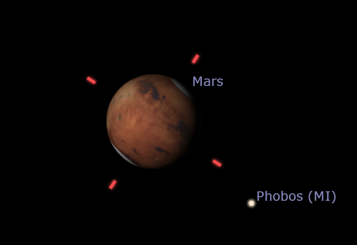
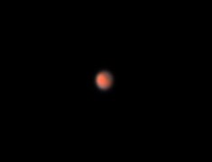
Thanks to manual color balancing, I was able to produce a final image of Mars that had its iconic rust color. Mars’s color comes from the oxidation of iron in the rocks on the surface, as well as the large amounts of dust that get swirled around in the atmosphere. Another important feature of Mars is its poles, which are difficult to see in the image above due to its distance. These poles are at both the northern and southern ends of the planet and are caused by CO2 and water ice.
Honorable mention to my groupmates Delanie Mitchell and Nathan Flinchum for allowing me to use their Mars and Uranus images respectively, as well as Professor Reichart for allowing me to use his Jupiter and Neptune images after we were the only group to not receive our Jupiter data.
Social Media Post
