Contents [hide]
Initial Prototype and Learner Testing
Introduction of the initial prototype
The Home page of the website includes three parts, a rotating image to catch the eye, a four-step progression path, and a test of the study strategies students currently possess.
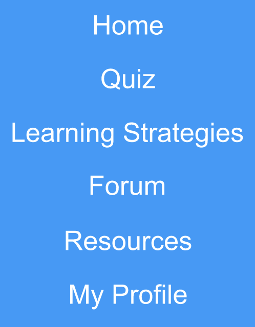
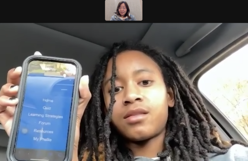
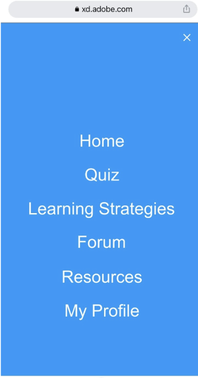
The navigation consists of six sections, Home, Quiz, Learning Strategies, Forums, Resources, and My Profile, with the home page as described earlier.
The purpose of the Quiz is to understand the learning strategies that students currently have so that the website can adapt to recommend appropriate content to the learning strategies that students lack.
The Learning Strategies page provides students with research-proven high and low effectiveness learning strategies in accordance with the ICAP framework to help students gain a comprehensive understanding of the effectiveness of the strategies they are using and to help them use effective learning strategies in their future studies.
The Resources page includes articles, videos, Apps, and academic research papers on learning strategies.
Initial Tester
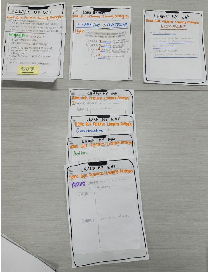
Goal: Testing user-friendliness
Testers: Two 19 years old students
Setting: Dormitory with a paper prototype.
Data collection: notes, observation, informal interview
Testing Feedback
Home page questions: Maybe remove question 2 as it may not be appealing to the target audience. Maybe combine questions 1 and 3 together
Quiz page: Describe the purpose of the quiz
Add Forum to the main menu/tabs
Resources: Email template – add AI prompts on how to personalize/customize this template with a specific request for the learning advisor
Revised Prototype (The Second Time) and Learner Testing
Revisions based on the Testing Feedback
Home page
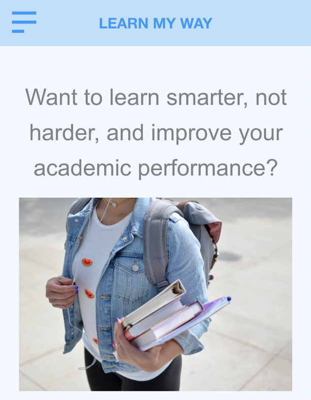
Only one issue was retained to make it concise, which was “Want to learn smarter, not harder, and improve your academic performance?”
Quiz page
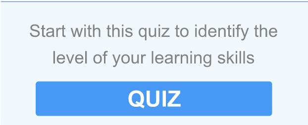
Add the purpose of the quiz to persuade the student to finish the quiz.
Forum page
Add Forum to the main menu/tabs: Forum area could help students relax and would like to communicate, which is also an efficient way for students to improve their learning.
Other Revisions
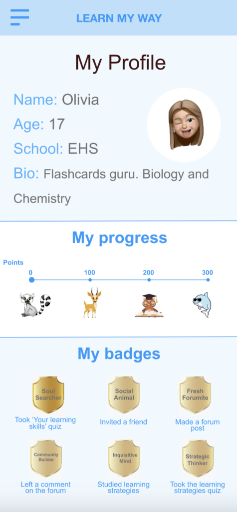
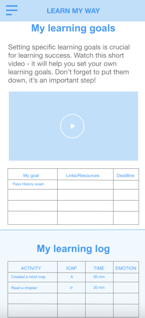
Add My Profile page where the system generates its own profile, including basic student information, the student’s four-step progression path, badges, etc.
Revised Prototype (The Third Time) and Three Learners’ Testing
User Testing #1
Student Profile
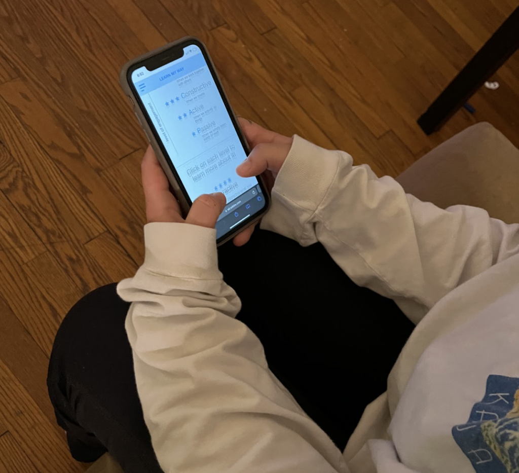
A 19 year old student at UNC practiced using this prototype in an apartment. No directions were given on how to use it (to avoid biases). The only thing told to the student was the prototype is an application for senior high school students.
Tester feedback
- Add a function to give badges to other users. This way point system can be used to track progress through the website, and badges can serve primarily as a social learning component.
- Add a new section in Resources – “Learning Techniques” or “Study Methods” with detailed info about each activity eg. “How to make mind maps”, “How to succeed in a group project” etc. The tester said: “it’s nice to know which learning activities are more effective than others, but it will be helpful to have some guidance on how to use them properly, especially something like mind maps and so on”.
- On the Learning Strategies page, there are so many examples for each ICAP level, so much text that people are likely to skip through some. It might be better to make a graphic with keywords that will be clickable. When you click, it shows a more detailed description.
- On the Forum, make an option of creating a private forum for a particular school (like GroupMe and Patio).
- Make sure that when people post on the forums, their level is displayed next to their name and pic.
- Change pic in Home for something fun, maybe the animals.
User Testing #2
Student Profile
A 18 year old student at Durham College practiced using this prototype on zoom. Brief introduction about the purpose of this product was given and no directions were given on how to use it (to avoid biases).
Tester Feedback
Color: She suggested using different colors instead of just blue.
Subject: She suggested that we can add subjects as an option to navigate. Students can choose a subject to learn the useful suggestions.
Interactive: She thought the page can be improved to be interactive. →
User Testing #3
Student Profile: A 21 year old student at UNC practiced using this prototype in an apartment. No directions were given on how to use it (to avoid biases). The only thing told to the student was the prototype is an application for senior high school students.
Tester feedback
Overall the different sections she thought was clear and all of the information we provided about ICAP was helpful.
The layout was easy to use, changing the design (colors/adding pictures) could be something to keep in mind for the look of the app
AI could be something that we add, but could go without. There are lot of resources for the students to access.
Revisions based on the Testing Feedback
Extract keywords for Learning Strategies to make it easier for users to read.
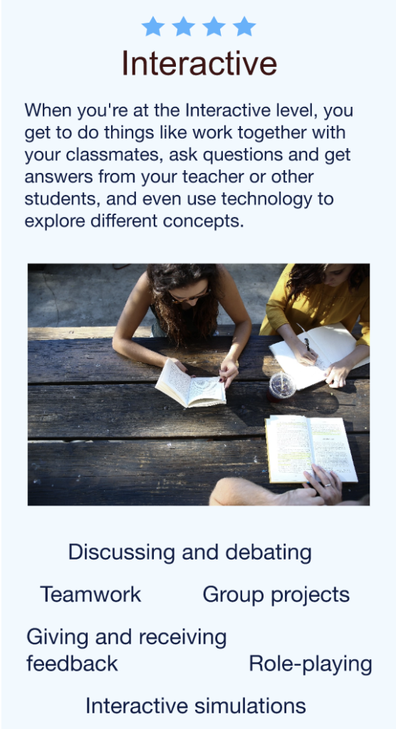
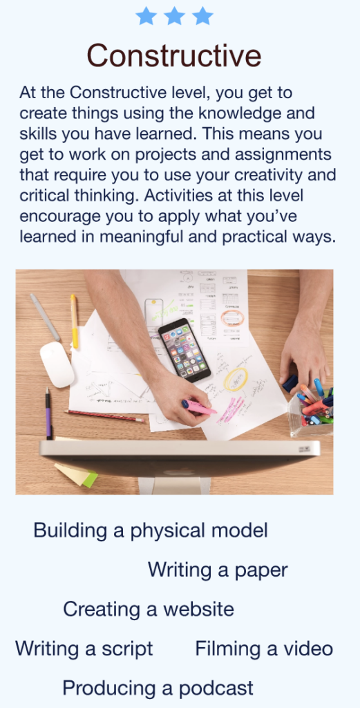
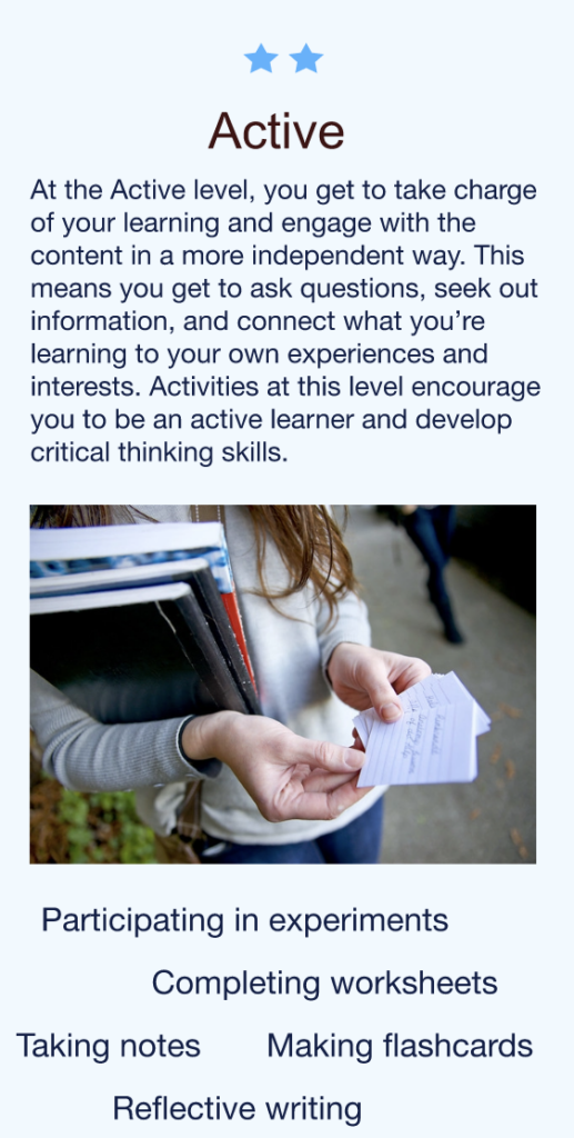
Changed the overall color of the prototype and created a landing page.
Adjusted the layout of the navigation page to make “Learning Strategies” easier to notice.

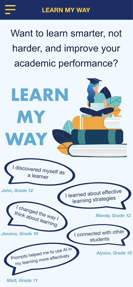
Changed the Intro Page to make it concise.
Access the Revised Prototype using the link