YouTube Thumbnail Reflection – Faith Mitchell
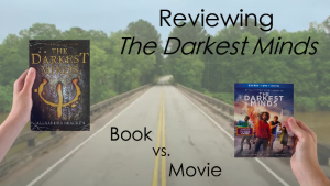 I designed my YouTube thumbnail the way I did because I had seen other thumbnails on YouTube with hands holding things like books or other objects, and I thought it would look cool. Then, I thought that a plain white or colored background would look a bit boring, so instead I included a background from the movie trailer, along with a few words written in easy-to-read black font. I tried to reach an audience who likes watching book and/or movie reviews/comparisons, kind of like a BookTube channel. But there are a lot of other approaches I could have taken. As far as this design goes, I think I could make the hands, book, and movie bigger, include my face, change the font to a more interesting and fun one, change the text, change the background, and make it more The Darkest Minds themed. I am not quite convinced that the design of my thumbnail is eye-catching enough or that it screams YouTube, so I definitely want to improve that moving forward. One other approach/design I think would be cool and accomplish this would be to, instead of just having the hands holding the book and movie, I could use a picture of me pretending to hold the book and movie in either hand and have them floating above my hands (to match more with the personal aspect of YouTube/BookTube since it would have my face in it and to match with the superpower aspect of this YA book-to-movie adaptation). This was my first time working with Adobe InDesign, so I still need to get more comfortable with it and try out some more things.