Not to point out the obvious, but my blog posts have been primarily about the Moon. Don’t get me wrong, I love the Moon. The Moon is pretty cool. But it’s time to switch things up. Let’s dive into planetary astrophotography!
First up, I will be talking about Uranus.
I want to start off by crediting and thanking my groupmate, Nathan Flinchum, for allowing me to use their exposures in my blog post. So, what are the specifics about these Uranus exposures? These exposures were taken with the PROMPT-5 telescope located in Cerro Tololo Inter-American Observatory in Chile. Since Uranus is pretty far away, it is difficult to resolve the planets fine detail—so in other words, our telescope was only able to capture its “natural” color. For Uranus, we opted to using the filters B, V, and R due to its faint appearance. The B filter attempts to capture the blue tint, the V filter for green, and the R filter for red. The usage of these filters was for the attempt to replicate the color of Uranus that we see with the human eye. The number of exposures taken with PROMPT-5 was 90, with each filter having 30 images, and the exposure duration for each image for filters V and R being 1 second while the B filter had 2.5 seconds. Also, the field of vision (FOV) for PROMPT-5 is approximately 9.9 archmins with a pixel size of 1016×1017 pixels.
What steps were taken after the exposures were received back by PROMPT-5? Well, after importing the observation into Afterglow, and setting the ‘Stretch Mode’ on ‘Linear’ for all of the exposures, I placed a ‘Bright Target present’ to better showcase the planet. After this quick adjustment, I made sure to align, and then stack the 3 different filters used on the exposures. Something to mention about the aligning process what that it acquired a special step—source calibration. The need for this is because the planets were too small to capture on the specific algorithm used for aligning. So, basically, with the use of source calibration was, I was able to find the center of each image and align them accordingly. Also, the stacking for Uranus enabled us to “stack for depth” (as stated my Professor Reichart) so that we can see the vague details, like Uranus’s Moons. One of the last steps in this process was ‘Color Mapping’ the 3 different stacks for each filter to better enhance its color in the layer that they produced (shown in Figure 1). But, to be quite honest, the image produced only showcased Uranus, and I think its Moons ought to be brought to light as well. So, after that lengthy process, I decided to alter the ‘Stretch Mode’ to ‘Midtone’ and to place the ‘Bright Target’ on the layer (shown in Figure 2). Then, after a little bit of ‘Photometrically Calibrated Color Balancing’ (which helps to achieve Uranus’s natural colors) and some refining of the brightness levels, I produced the image below—Figure 2.
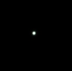
In Figure 1, you can see a bright source with is a tad bit blurred and grainy—it’s Uranus. Although the planet’s blue-green color did not come through all the way on my final product, I do think the reasoning for Uranus’ coloring is too interesting to not mention. As Uranus is a Jovian planet (means that it does not have a solid surface as it’s made up of many different types of gases), the reason for its color is due to the large amounts of methane gas that reflects blue light. Ranging from the most abundant element gas in Uranus’ atmosphere: hydrogen, then helium, followed by methane.
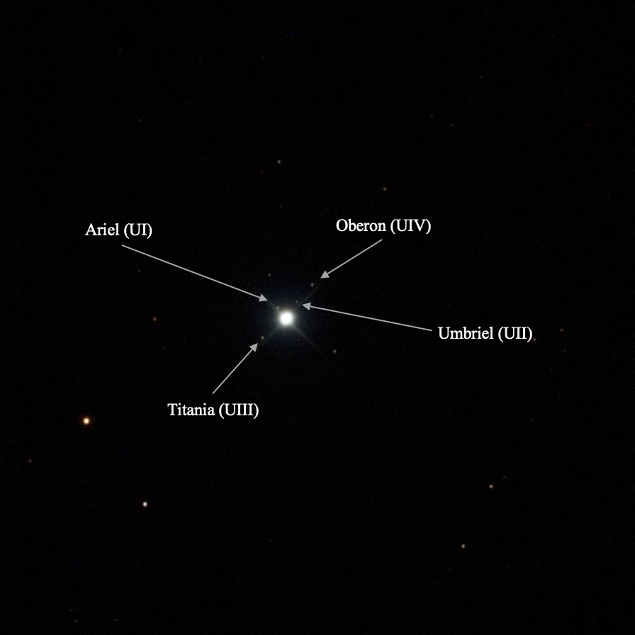
Around Uranus, as shown in Figure 2, the different light sources are Uranus’s moons. Although the planet has many moons, not all of them are portrayed in Figure 2. A few moons of Uranus that are more distinguishable are Ariel, Umbriel, Titania, and Oberon (listed from closest to the farthest in distance from Uranus). Oberon and Titania are the 2 largest out of the 5 major moons—Umbriel and Ariel are the next 2 largest. These moon’s densities range from 1100 to 1700 kg/m^3 with a possible composite mixture of rock and ice.
Next up, Neptune!
Now, I want to credit my professor, Daniel Reichart, for allowing me to use his exposures in my blog post. Now, let’s dive in. Just like Uranus, these exposure for Neptune were taken with the PROMPT-5 telescope located in Cerro Tololo Inter-American Observatory. More similarities between Uranus and Neptune is that due to its far distance and being faint in comparison to other planets, we only are presented with a color (which after the same lengthy process used for Uranus, you can see a relative “natural color” for Neptune as well). For Neptune, I also chose to use the filters B, V, and R with the hopes to enhance Neptune’s “natural colors” with their actual red, green, and blue radiencies. The number of exposures taken with PROMPT-5 was 30, with each filter having 10 images, and the exposure duration for each image for filters V and R being 7.5 seconds while the B filter had 15 seconds. Also, the field of vision (FOV) for PROMPT-5 is approximately 9.9 archmins with a pixel size of 1015×1016 pixels.
The steps taken after receiving the exposures back from PROMPT-5 are the same as those that were taken with Uranus. The reason for the same process for both Uranus and Neptune follows along the lines of being similar in composition and mass, along with sharing the same trait of being very distant from Earth. The result of the process with the ‘Percentile Color Balancing’ used in the beginning steps is shown in Figure 3. Then, as the process for Uranus and Neptune acquired an extra step in Afterglow—the use of ‘Photometric Calibration Color Balancing’ to attempt to achieve their “natural color” which is shown in Figure 4. The reason why this final step works for Uranus and Neptune is because in their stacks, there is a sufficient abundance of background stars to compare their catalogue values. Figure 4 also is the result of changing the ‘Stretch Mode’ to ‘Midtone’ to better showcase the moons.
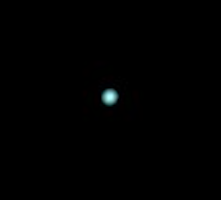
As you probably can already assume, the bright source of light in Figure 3 is Neptune. When looking at Figure 3, as we are given a blue-ish planet, you may wonder why Neptune appears this color. The reason for this, just like Uranus, has to do with its composition in its atmosphere. Neptune is also a Jovian planet that is has the make up of many gases—one of such being methane. Although Neptune’s atmosphere is primarily made up of hydrogen, the smaller amounts of methane is what gives the planet its color due to its absorption of red and infrared light, and its reflection of the blue light from the Sun.
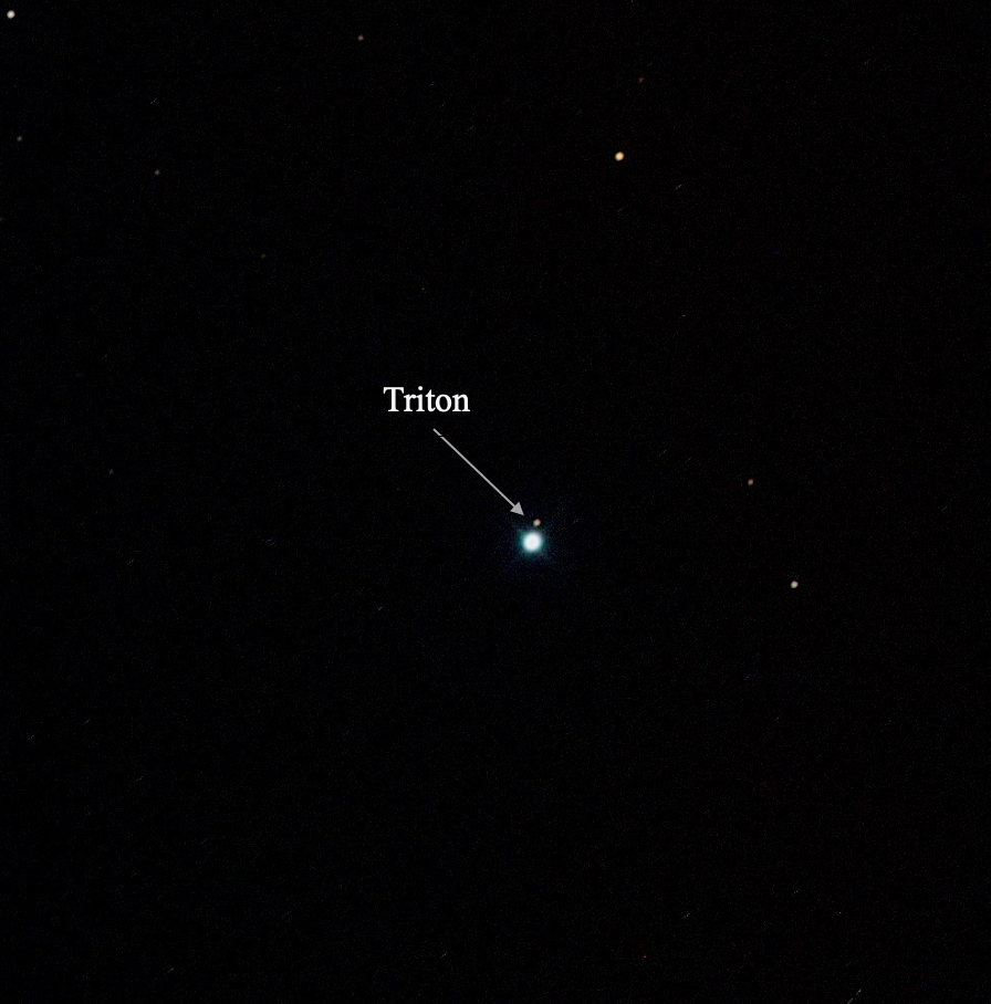
Not to point out the obvious, but Figure 4 only shows 1 out of the many moons that Neptune has. Fun fact: Neptune has 14 Moons which definitely is not as many as Uranus’ 27. This moon shown above is Triton, which is Neptune’s largest moon—roughly 2700 km in diameter. Triton is also classified as one of the 6 large moons that occupy our outer solar system. Also, Triton obtains a relatively thin atmosphere that is composed of nitrogen and has a surface that is mostly made up of ice.
Coming around the corner… Jupiter!
Per usual, I want to credit where I got the exposures before I dive into the good stuff. A special thank you again to my Professor, Daniel Reichart, for allowing me to use his exposures. Alrighty, now let’s talk about Jupiter! So, just as the other planets, we took these images with PROMPT-5, but there is something different with Jupiter than Uranus and Neptune—Jupiter is closer to Earth. This means that PROMPT-5 was able to capture more details on the surface of the planet and can see more visibly the color. Basically, for planets like Jupiter, these “relative colors” captured with the telescope are still applicable due to being able to see the planet’s color discrepancy.
What about the filters used for Jupiter—are they the same ones used with Uranus and Neptune? Well… that’ll be a no. The filters used for Jupiter were OIII, Halpha, and U. Just like the Moon, Jupiter is too bright to image with the regular blue, green, and red filters. The number of exposures taken was 30 with each filter having 10 images, and the exposure duration for each image for filters Halpha and OIII being 1 second while the U filter had 1.5 seconds. Also, the field of vision (FOV) for PROMPT-5 is approximately 10 archmins with a pixel size of 1019×1019 pixels.
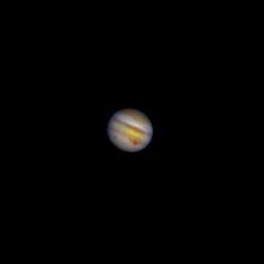
Were the steps taken to process this image different than Uranus and Neptune? Hmmm… well… technically… yes. But, there’s not too much of a difference. And to save any confusion, I’ll just explain the process. After importing the exposures into Afterglow, I placed the ‘Stretch Mode’ on ‘Linear’ for all of the exposures, I placed a ‘Bright Target present’ to dim Jupiter’s brightness so that we can see its amazing detail such as the Great Red Spot! I proceeded to align (utilizing source calibration once again), and stack the 3 different filters used on the exposures. After getting a clear image with just Jupiter (shown in Figure 5), I decided to follow the steps to better show the four satellites of Jupiter (shown in Figure 6). I changed the ‘Stretch Mode’ to ‘Midtone’ for all of the exposures and increased the ‘Saturation Level’ to 100.
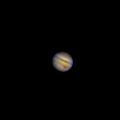
The final product of Jupiter, as shown in Figure 5, captures many details. Not only can you see the variation in colors of Jupiter’s atmosphere, but you can see the largest storm in our Solar System—the “Red Spot”! When you look at Figure 5, you see these seemingly “bands” of colors that consists of pale yellows and tans amongst many other colors. The reason for these series of “dark belts” and “bright bands’ is because of Jupiter’s composition and the convective motion in the atmosphere. These “bands” of clouds on Jupiter follow a east to west flow pattern due to the planets fast rotation. But what’s the reason for these “band’s” color? Jupiter obtains three layers of clouds: ammonia-ice clouds on the outside, ammonium-hydrosulfide-ice clouds in between, and water-ice clouds below. The ammonia ice produces a tan color, the ammonium-hydrosulfide-ice clouds is different shades of brown depending on the temperature, and the water-ice clouds produce the white color you see in Figure 5. How we can see these different layers of Jupiter is due to its strong gravitational force—which is approximately 2.5 times greater than Earth’s!
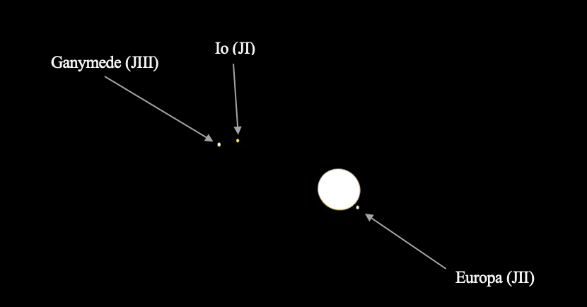
Out of the many moons that Jupiter has, PROMPT-5 was able to only capture Io, Europa, and Ganymede (ranked from closest to farthest from Jupiter in orbit at the time of the observation). They are considered to be the ‘Galilean moons’ which are the 4 largest out of Jupiter’s moons. Other notable mentions are that the moons were named after lovers of the Roman god Zeus, the Galilean moons roughly have a circular orbit that is consistent with their rotation due to Jupiter’s strong gravitational pull, and the densities of the Galilean moons lessen as they get farther from Jupiter—yet their mass does not follow the same trend. Also, while Europa and Ganymede consist of (in different amounts) iron/iron sulfide cores with a rocky mantle an icy surface, Io also has the same composition but has no layer consisting of ice. Io, as seen in Figure 6, appears to have this yellow glow, which is due its composition of sulfur and molten rock.
Last, but not least… Mars!
The exposures for Mar were, just like the other planets, taken with PROMPT-5. I want to note that due to Mar’s distance from Earth, the telescope was unable to capture any of the planet’s detail. But, luckily, we were able to capture the planet’s reddish color. The filters used to capture this color were OIII, Halpha, and U. Just like Jupiter, Mars used these filters due to it being too bright to image with the regular blue, green, and red filters; hence, the decision to use lower-throughput filters on the planet. The number of exposures taken was 30 with each filter having 10 images, and the exposure duration for each image for filter Halpha was 0.3 seconds, OIII with 0.6 seconds, and the U filter with 1.2 seconds. Also, the field of vision (FOV) for PROMPT-5 is approximately 9.9 archmins with a pixel size of 1017×1011 pixels.
The process of calibrating the exposures for Mars doesn’t stem too far away from how the planets mentioned previously were done. Just like for the process with Jupiter, once I imported the exposures into Afterglow, I placed the ‘Stretch Mode’ on ‘Linear’ for all of the exposures, I placed a ‘Bright Target’ preset. I then followed the routine of aligning with the help of source calibration, and stacking the filtered exposures in the pursuit to achieve the planet’s relative color. But in this pursuit, I did not get the color I wish for. So, I decided to do a bit of manual color-balancing of my own to try to adjust the red, blue, and green levels. All that this process took was changing the ‘Color Balance Mode’ on Afterglow to ‘Histogram Fitting’, selecting the ‘Halpha’ filter to be the reference layer (to help promote Mars reddish color), and then finish by adjusting the levels of color for each of the 3 filters. I was able to achieve the final product below in Figure 7.
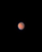
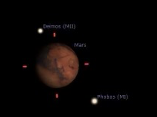
Let’s talk about color. Why does Mars obtain this reddish color—or some color that looks like rust—as seen in Figure 7? Well, the soil and rocks is predominantly made up of iron. Overtime, as the wind on Mars resulted in the erosion of the soil and rocks and the dispersal of the iron all over the surface, a layer of dust formed. This layer of dust then reacted with oxygen and created the color we see today—rust! Unfortunately in Figure 8, as we get to see a more detailed image of mars at the time of our observation, we are not able to get a more distinctive glimpse of the ice caps on mars as hinted at in Figure 7 with the blue tint. However, in Figure 8, we are able to see a more detailed surface on Mars. Also, something cool to mention, Mars experiences many dust storms (some of which are considered to be the largest in the Milky Way Galaxy), and is why the planet appears to have a red-colored sky.
Social Media Post Preview:
