Optical Imaging of the Solar System
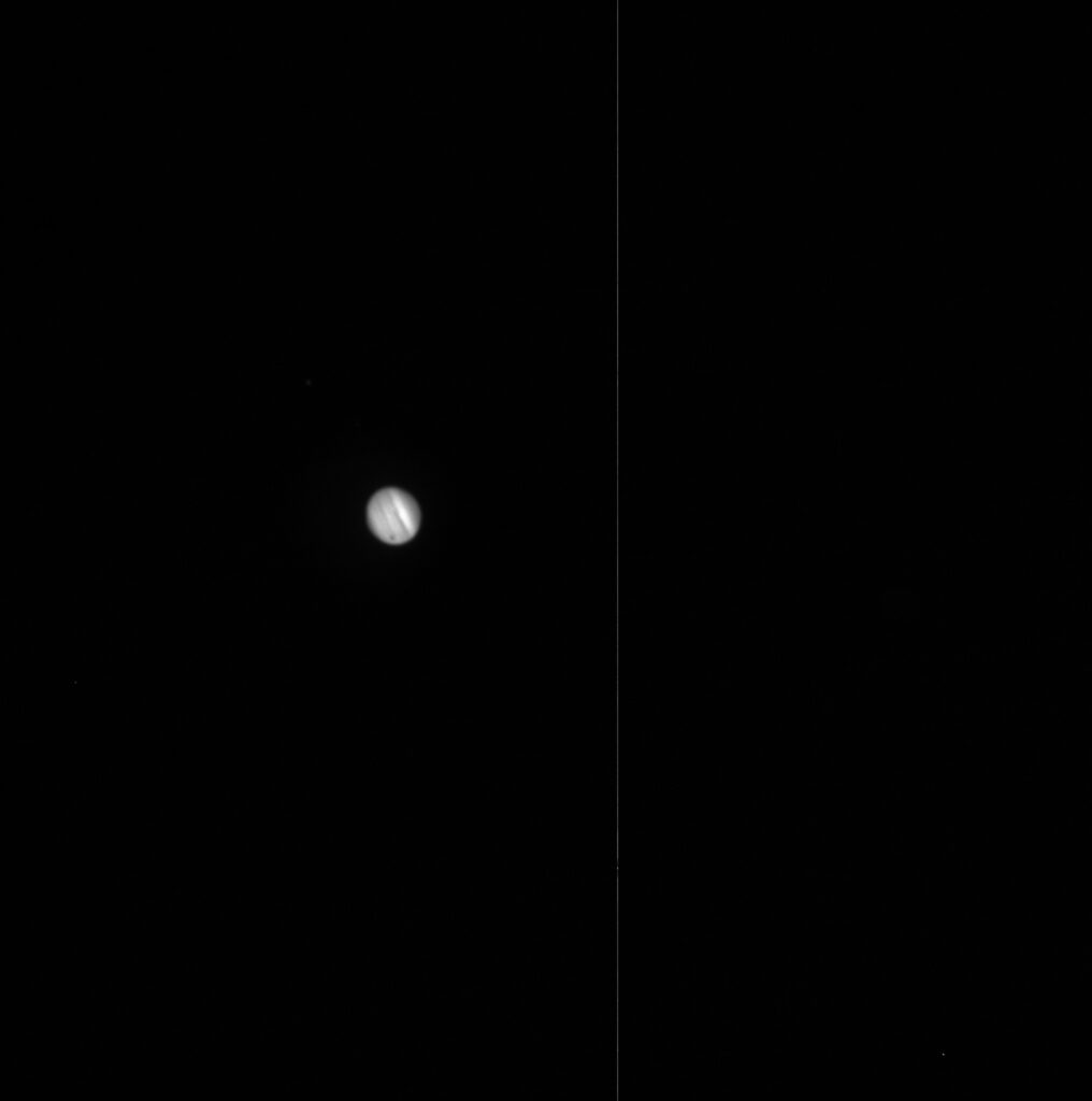
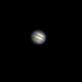
What you see on the left is my first ever picture taken with Skynet. It was a single image, taken six months ago in the OPIS (Our Place In Space) lab, in a generic filter with the only editing being the click of the “Bright Target” button in Afterglow. This was my first astronomy project, in which I did essentially the same thing with each planet of the Solar System. The most recent project we did in Astronomy 110 made me especially happy because it allowed me to recreate every image in the project not only in much higher detail, but in full color as well! On the right you can see a comparison of my first and newest images of Jupiter and see just how much I’ve improved since then! This is my process of how I made that picture, along with all the other planets in the Solar System.
Jupiter
The images of Jupiter that I used were taken by a groupmate of mine (each member of our group was assigned a different planet), so after collecting her data into Afterglow I began processing the images. I started by using the Source Catalogue’s planet centroiding tool to find the center of each image, and then the Aligner tool to align each found center onto each other. This aligns the planet as exactly as it could be, since the telescope sometimes create drifts as it or the celestial objects move across the sky.
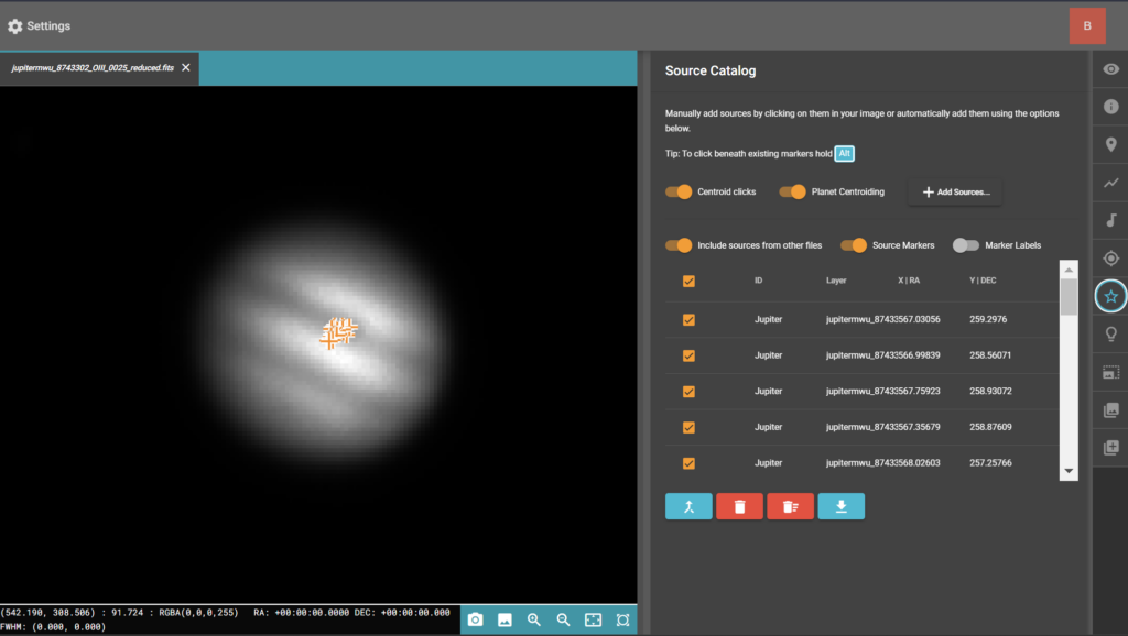
I then proceeded normally as one would to create color images: by stacking together all images taken in the same filter using the Stacker tool, and then grouping the images together after recoloring them into their respective filters.
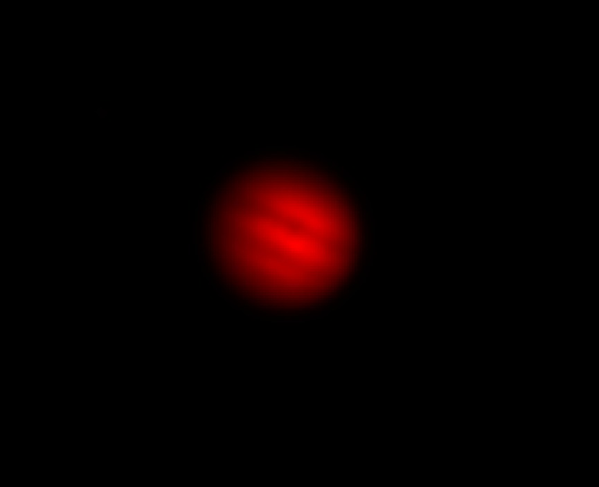
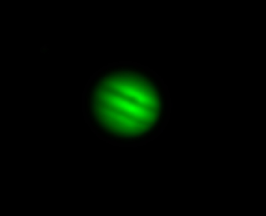
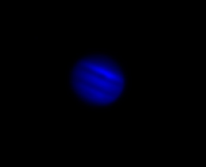
This is the final stacked image that I got after tweaking a few small settings in the Display window to bring out as much detail as possible:

The distinct stripes of the planet are caused by a combination of gasses, as well as strong winds on the planets. The colors are due to the various components and densities of the gasses in the planets, while the stripe pattern itself is due to the intense winds — caused by the rotation and size of the planet. The great red spot (seen very faintly on this image), is the largest storm in the solar system. The storm is multiple times bigger than the entire Earth! The storm is fading, however. Over the last few years, scientists have seen it shrinking! It’s awesome to think that one day, one of Jupiter’s most defining features will be entirely gone!
Mars
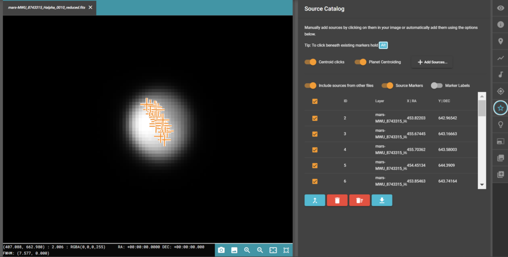
To get Mars data, I submitted an observation in Skynet for 30 images: 10 in the Halpha filter, 10 in OIII, and 10 in U — the basic 3 filters for color anthropography. When they came in, I opened them in Afterglow and used the same process as I did for Jupiter to process them. I centroided on each image and aligned each centroid together, stacked each image of each filter one by one, grouped all three stacks, and changed them to their respective colors. Below is the final image I received.
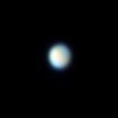
Now from a single glance, you can already see that something is a little wrong. The way Afterglow balances color is that it brightens each pixel until the brightest spot is white. Since the brightest spots (or bands) of Jupiter are white, this is just fine, but for Mars, we need to use another color method. To fix this, I changed the color mode to Histogram Fitting, gives more flexibility as to which colors show the most. By making the halpha layer the reference layer (since we know Mars is mostly red), this will balance each color in respect to the red colors. Doing this, we get a proper result:
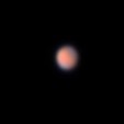
I then, as the final step, found Mars on Stellarium to get a better feel for the actual color of Mars. I then made TINY adjustments to the red and green stack images (I didn’t mess with the red since I was using that as the reference and it would screw everything up) to get the color to match a little better with Stellarium’s image. The difference isn’t much, but it made me very satisfied with the final result:

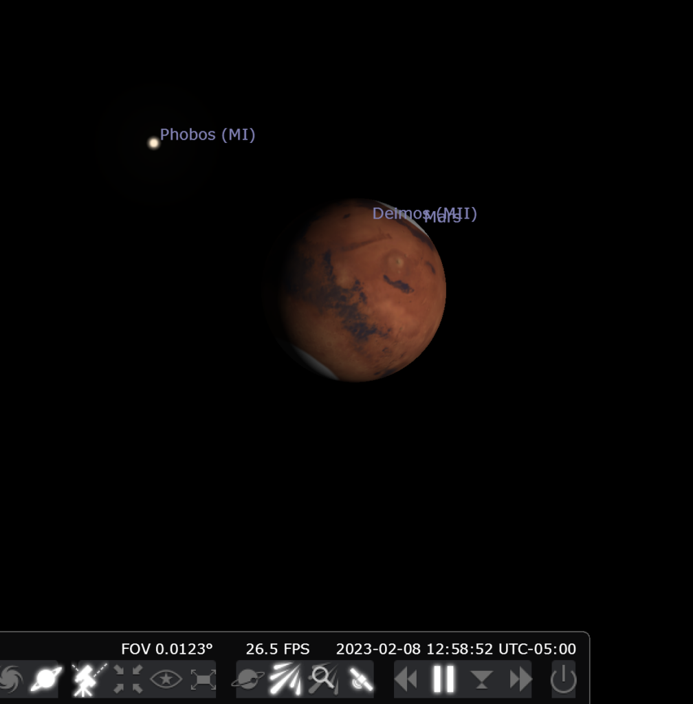
There isn’t much difference from the previous image, but the subtle difference there is is enough to make the color more genuine to my eye. The red color that defines the planet comes from the high iron content in the planet’s soil. The small lighter spots on the poles of the planet are ice caps, which make Mars a prime candidate to check for the existence of life. The small haze around the Skynet image is partially due to blurriness of the image, but also due to the thin atmosphere around the planet that doesn’t show up well around the Stellarium image. Something I find interesting about Mars’ atmosphere is that due to its chemical makeup and how thin it is, sunrises on the planet actually look blue!
Uranus and Neptune
The process of editing Uranus and Neptune was identical, so I’ll describe the process I used for both. I used the observations gathered by my other groupmate for Uranus, and the data gathered by Dr. Reichart for Neptune since Neptune was getting a little difficult to image at the time we submitted the requests. We then used the same centroiding method in Afterglow to align all the images, and then stacked each image into is respective filter before grouping them into one. This is where things get different though!
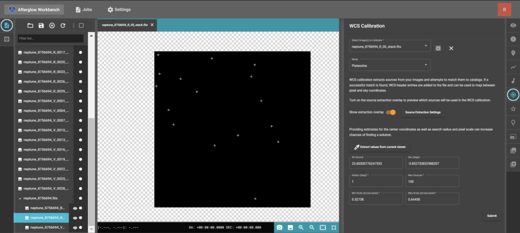
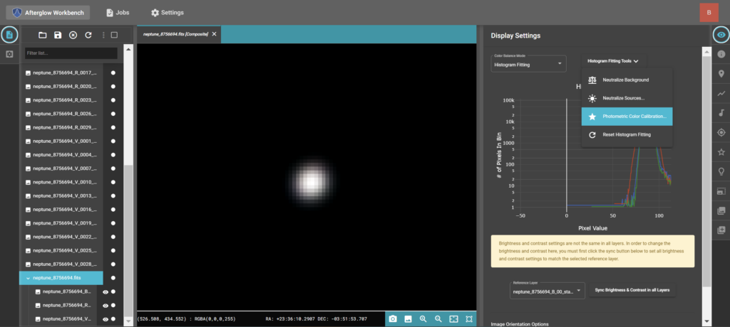
I selected the WCS (World Coordinate System) calibration tab on Afterglow, selected a stack image to calibrate on, and used the platesolve mode. I extracted the RA (Right Ascension) and DA (Declination) coordinates from the image and then used the copy mode to copy those values to the other stacked images. What this does is scans the stars in the image, and compared them to the stars in a map of the sky to find exactly which stars the image contains as well as the coordinates in the sky the image is pointed on. Then in the display tab with the group of images selected, I changed the mode to Histogram Fitting. I then selected the fitting tool called “Photometric Color Calibration,” which allows me to adjust the colors in our images to catalogued values, thus getting us very accurate results!
After some final tweaking of each image, below are the final results of both Uranus and Neptune. Something I find very interesting is that Neptune actually came out greener than Uranus. I’m not entirely why this is the case, but Neptune IS greener than what people normally assume it to be, so with some atmospheric blurring (the data was collected as Neptune was quite low in the sky as a bit of a panic move) and less images taken than Uranus (less detail will show that way), this could explain the odd color.
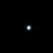

The greenish-blue of both planets are caused by the chemical makeup of their atmospheres. The methane in the gasses reacts with sunlight, giving off their distinct colors. The reason Uranus is more pale than Neptune is due to the density and opaqueness of their respective atmospheres. Uranus’ atmosphere is about twice as opaque as Neptune’s, meaning that the colors show up less saturated. This then makes Uranus appear more pale and Neptune much more vibrant in comparison!
The Moons of the Solar System
The final part of this project is to reveal all the moons of the various planets I imaged! To do this, I simply edited a small setting in the display tab for each picture minus Mars (its moons are too small to see) to bring out the moons, and it yielded the following results:
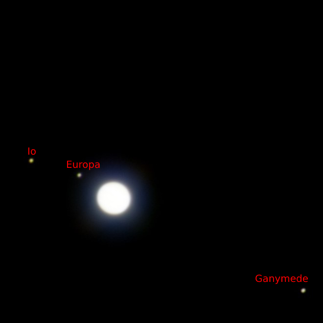
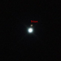
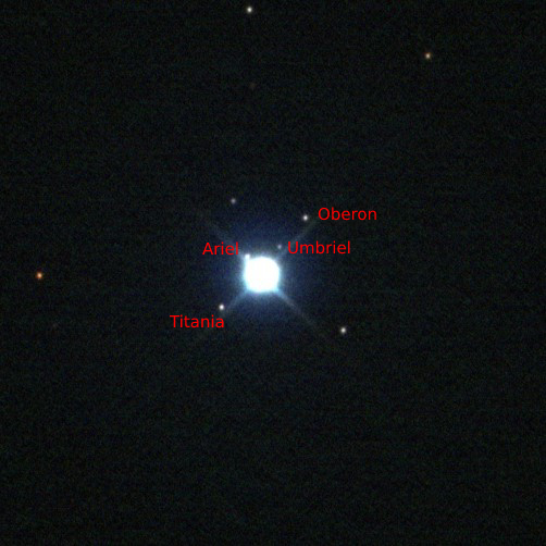
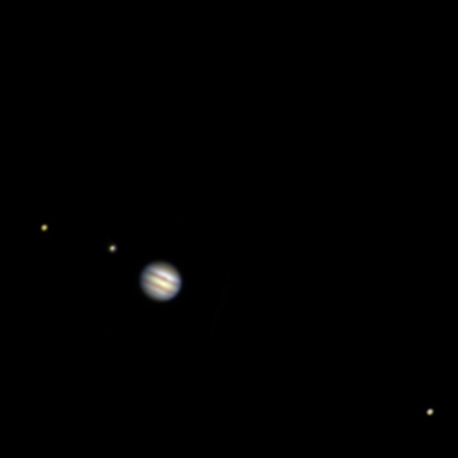
Something else I’d like to mention is that my groupmate who gathered the Jupiter data had the brilliant idea to take the full color image of Jupiter and layer it onto the image of Jupiter with its moons so you could see both results at the same time! I’m so jealous that she thought of this before me, because it really almost looks like just a photo taken straight out of the sky!
